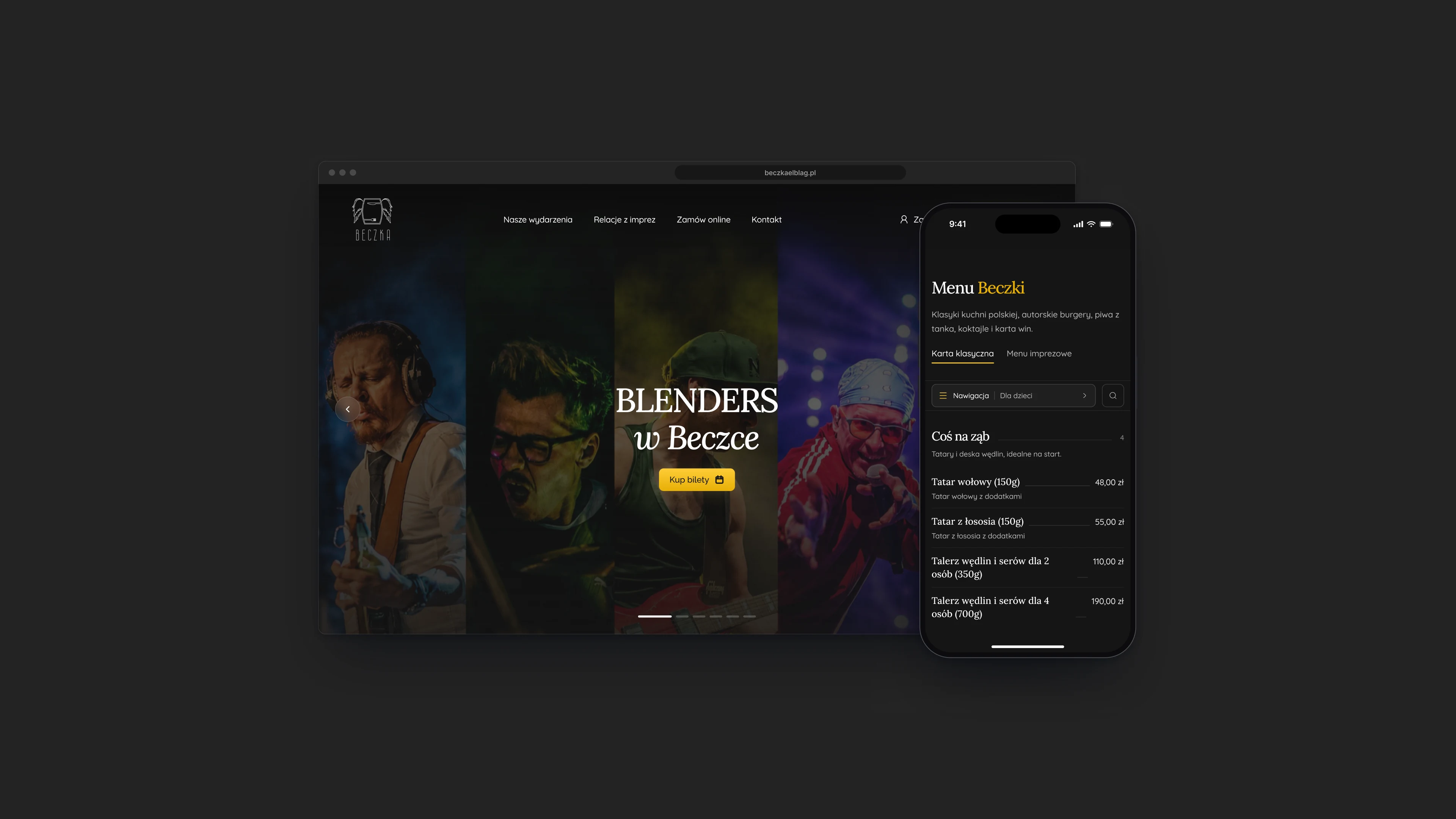
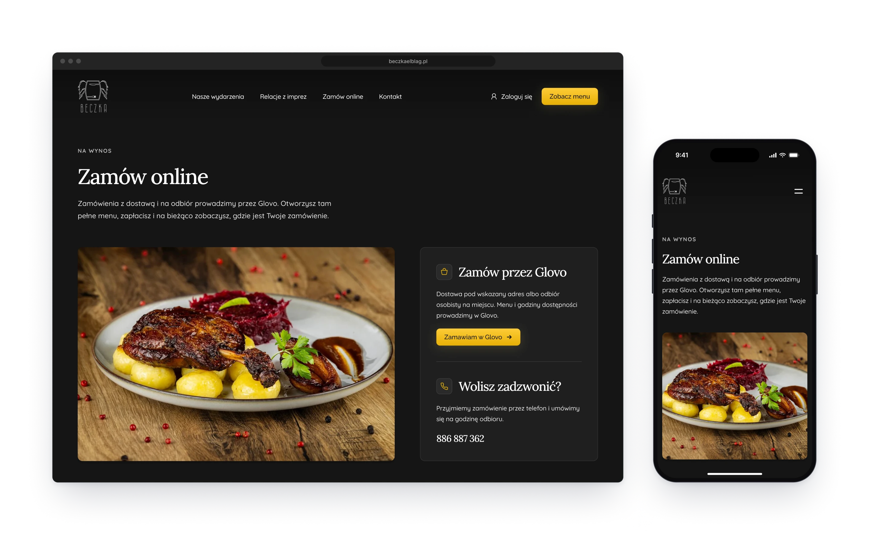
Beczka is a restaurant and pub in Elbląg that doubles as a concert venue. I designed its website: a home page that leads with the next shows, concert pages that sell tickets on the spot, a menu you can browse and search, and a page for ordering food to take away.
Beczka is two places in one: a kitchen people come back to and a stage they come to for one night. The site gives each its own pace. A concert gets a big photograph, a date and one button, because it sells for a few weeks and then it is gone. The restaurant gets a menu set like a printed card, because that is what people open the site for on every other day.
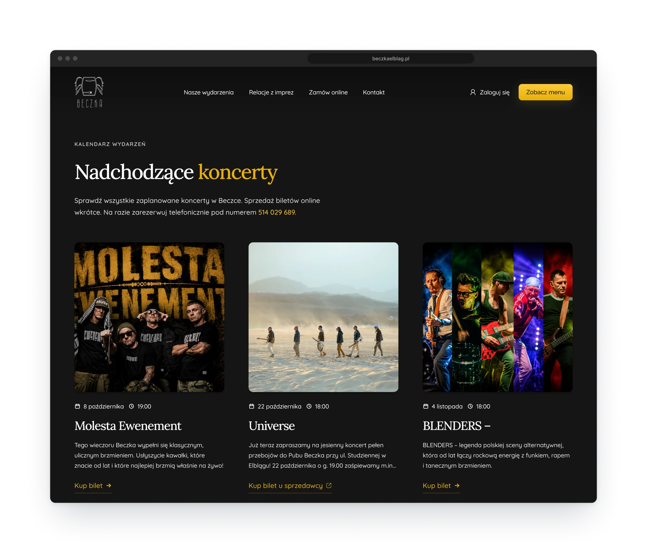
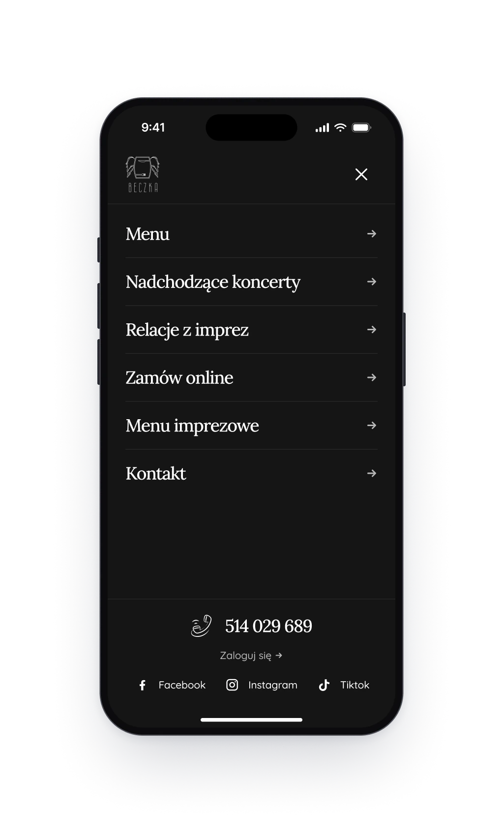
Fig. 02Left: the upcoming concerts. Right: the navigation on a phone.
Design decision
Three screens from poster to ticket
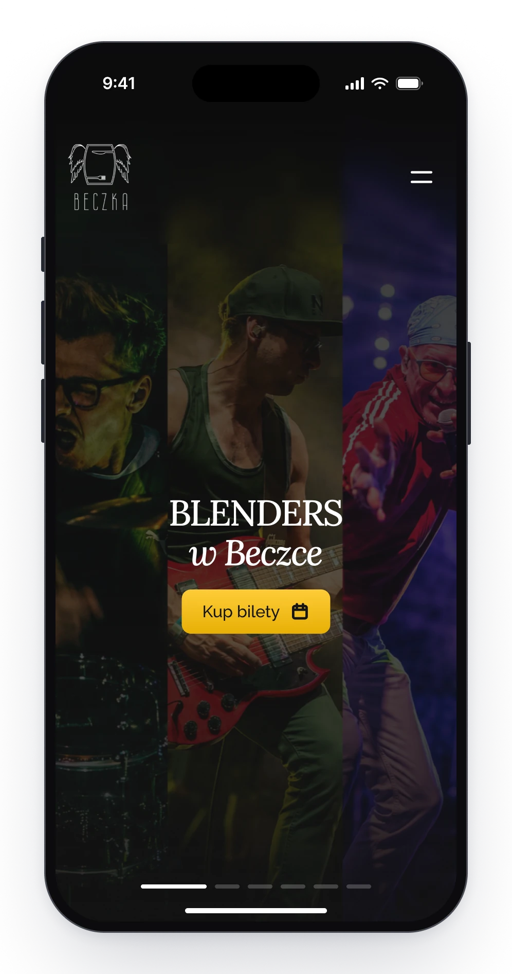
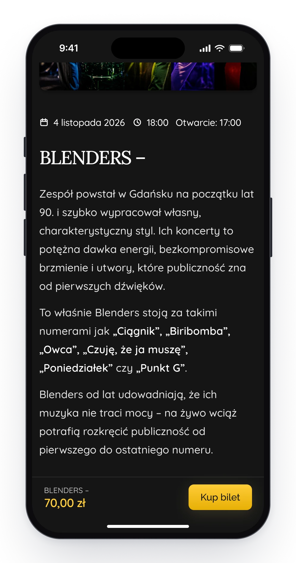
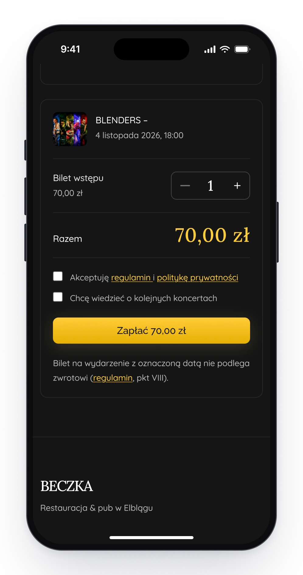
Buying a ticket takes three screens. The home page opens on the next concerts, each with a button for tickets. On a concert's page the price and that button stay at the bottom of the phone while you read about the band. The order is a single page: the ticket, how many, the total and one button to pay.
The home page opens on the next concert.
The price and the button stay on screen.
The order: how many, the total, pay.
Design decision
A menu that reads like a card
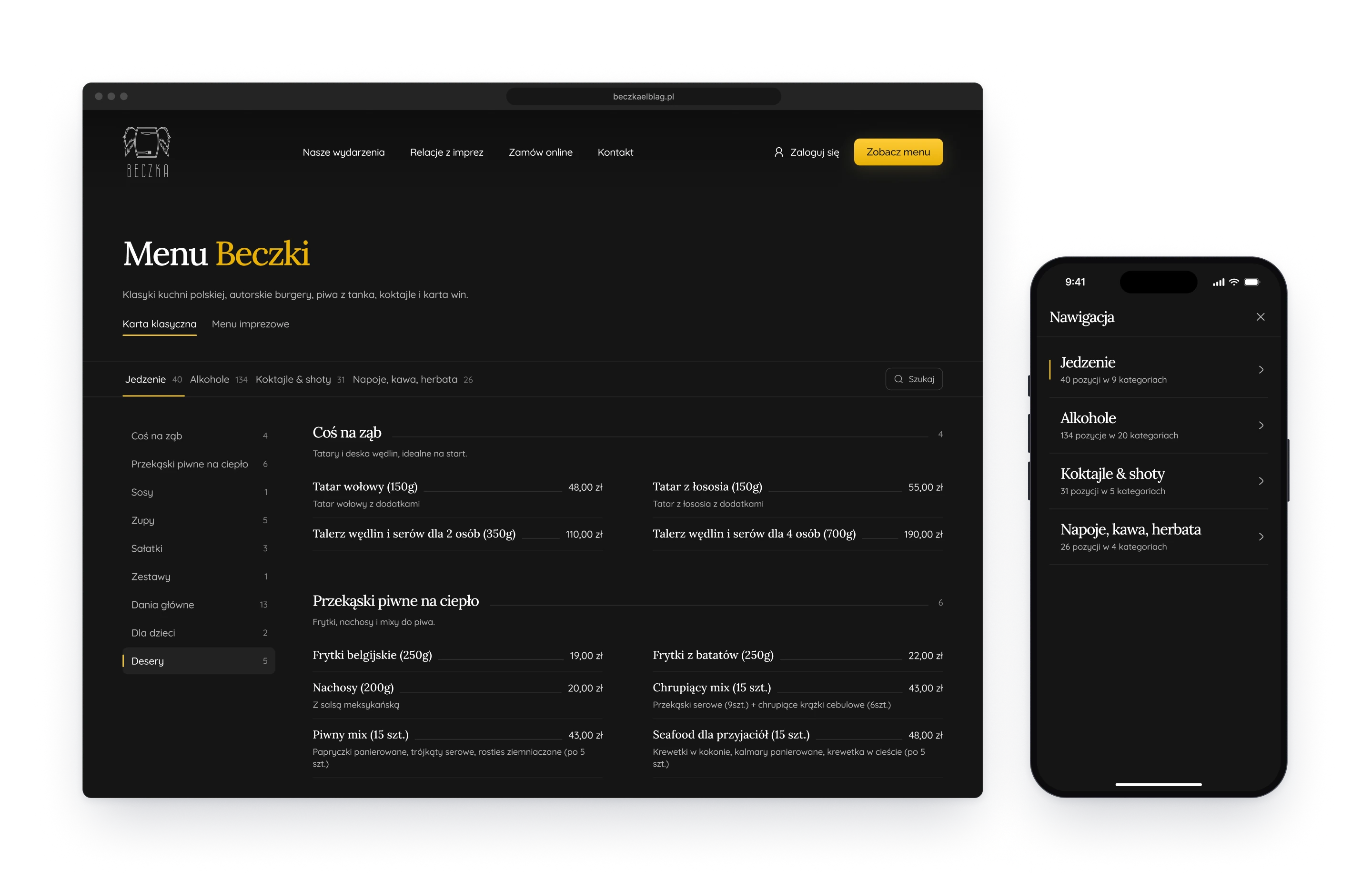
The kitchen and the bar list over two hundred items, so the menu is a page of its own. It is split into four parts with their counts, each with a list of sections and a search field. Every line gives the dish, its weight and its price, joined by a thin rule, the way a printed card does.
The menu on a desktop, and its four parts on a phone.
Components
One filled button, one job
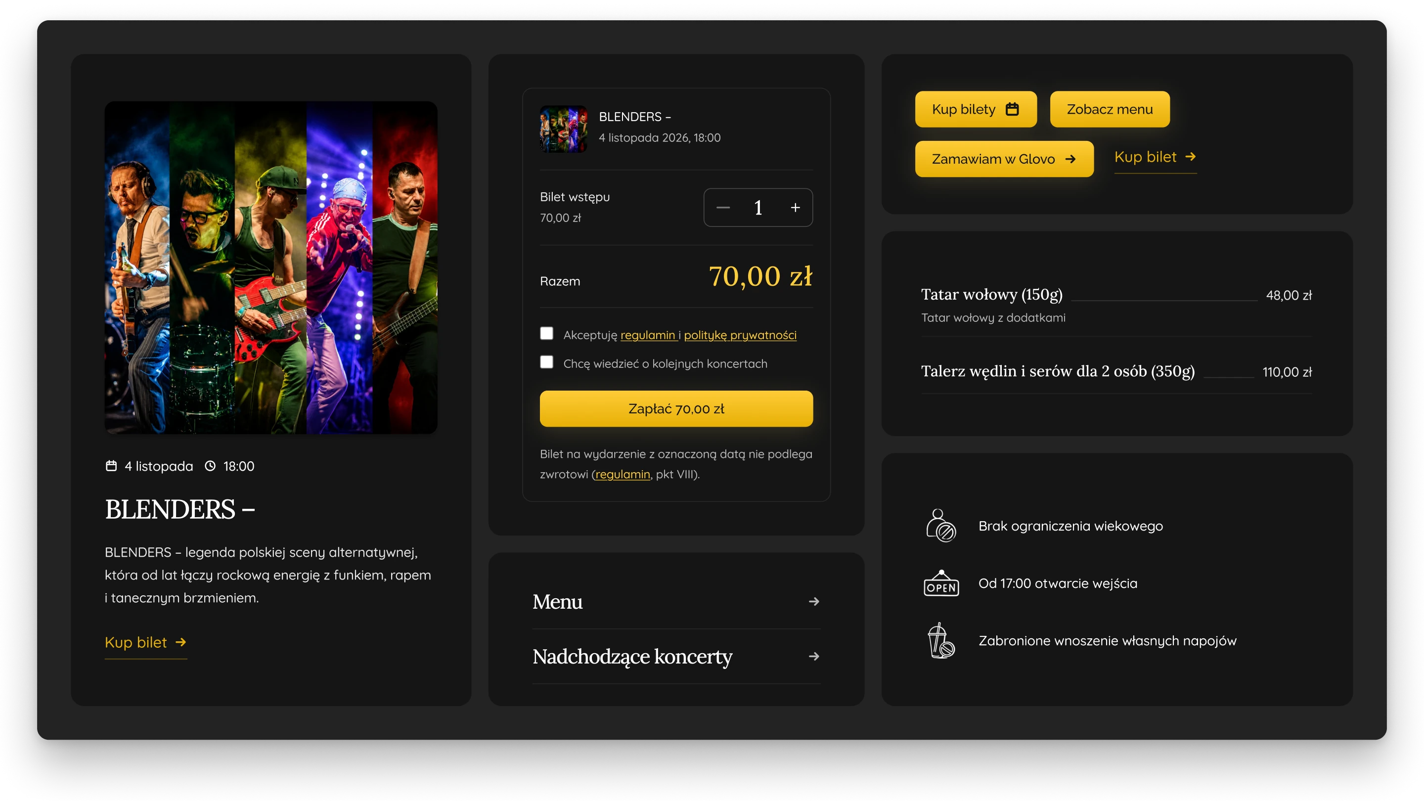
Every page is built from the same few parts. The filled button is kept for one job, the step that moves you forward: a ticket, the menu, an order, the payment. A text link in the same colour does the lighter work. Cards, list rows and the concert rules with their drawn icons repeat from page to page.
A concert card, the order summary, buttons, menu rows and concert rules.
Fig. 03Ordering to take away: one photograph, one button, one phone number.