Finansowanie Firm helps companies get a loan, a lease or money to grow, also after a bank has already said no. I designed its website: a landing page that leads from the problem to a first call, a page that explains the process, and the stories of clients told with their amounts.
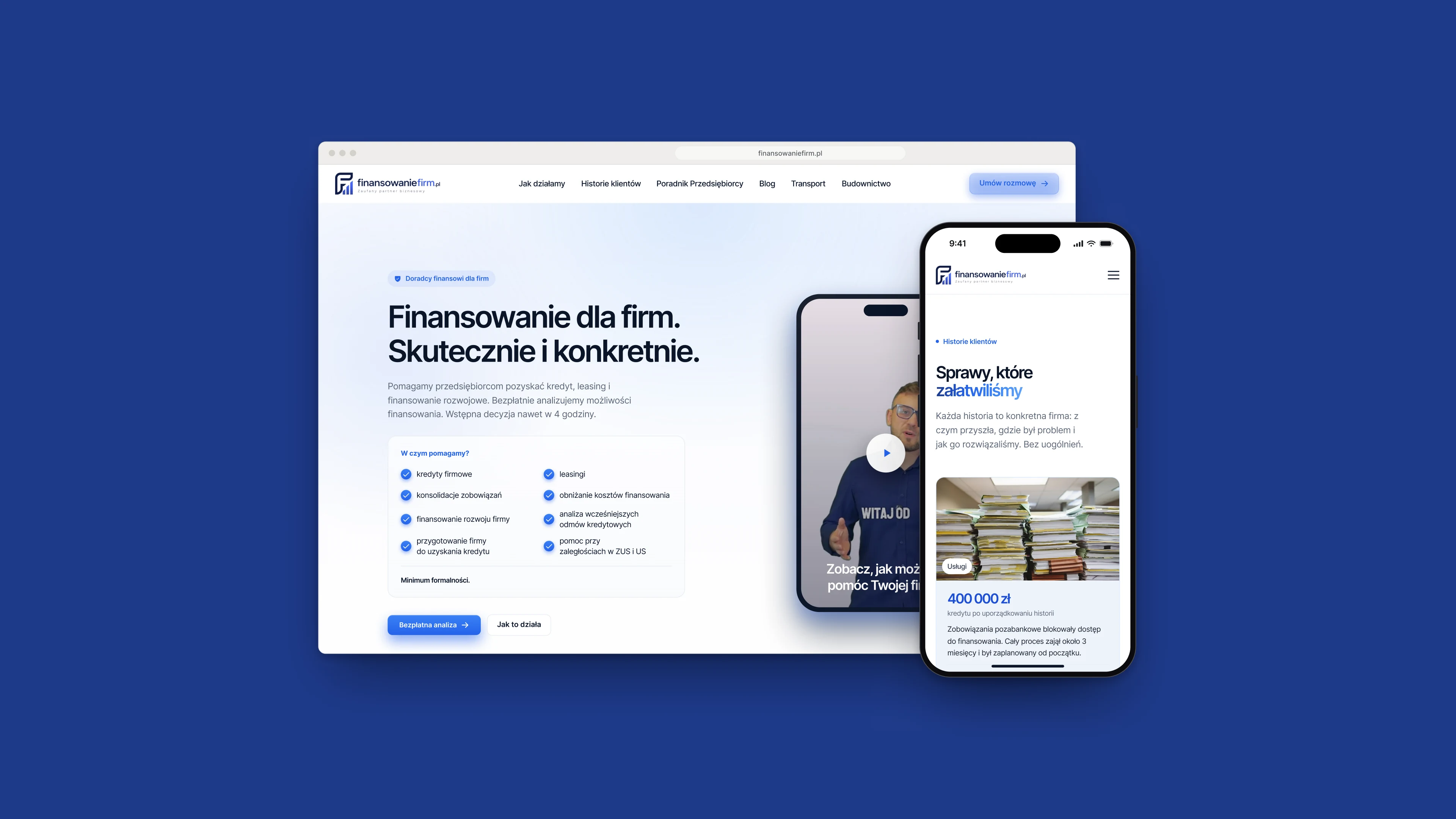
Fig. 01The home page, and the client stories on a phone.
Notes
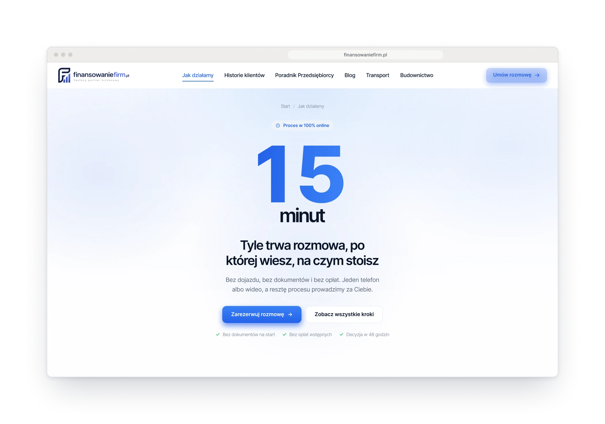
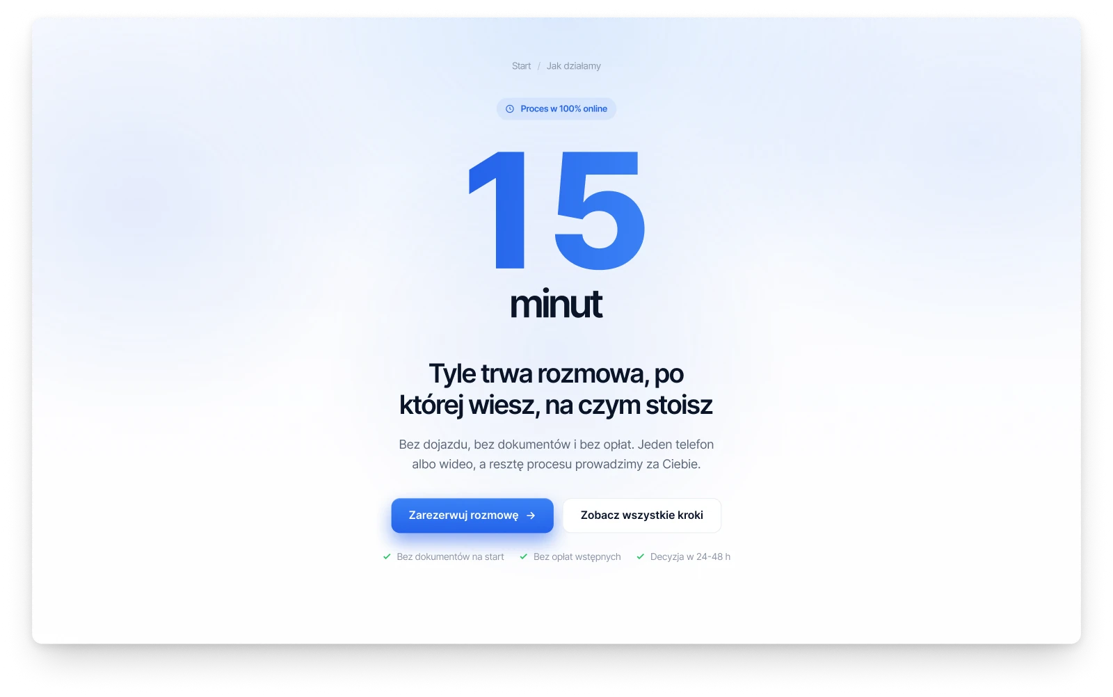
An owner who needs money for the company is not looking for a brochure. The site answers what gets asked first: can you help in my situation, how long will it take, and who has been through it before me. So the home page opens with the cases the advisers take on, the process page opens with a single number, fifteen minutes, and every client story starts from its amount.
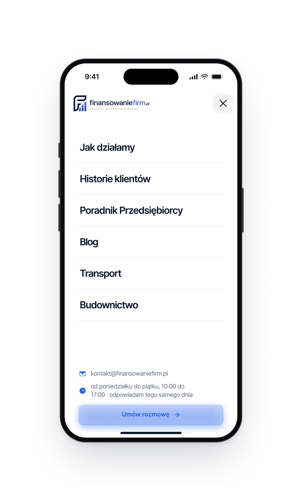
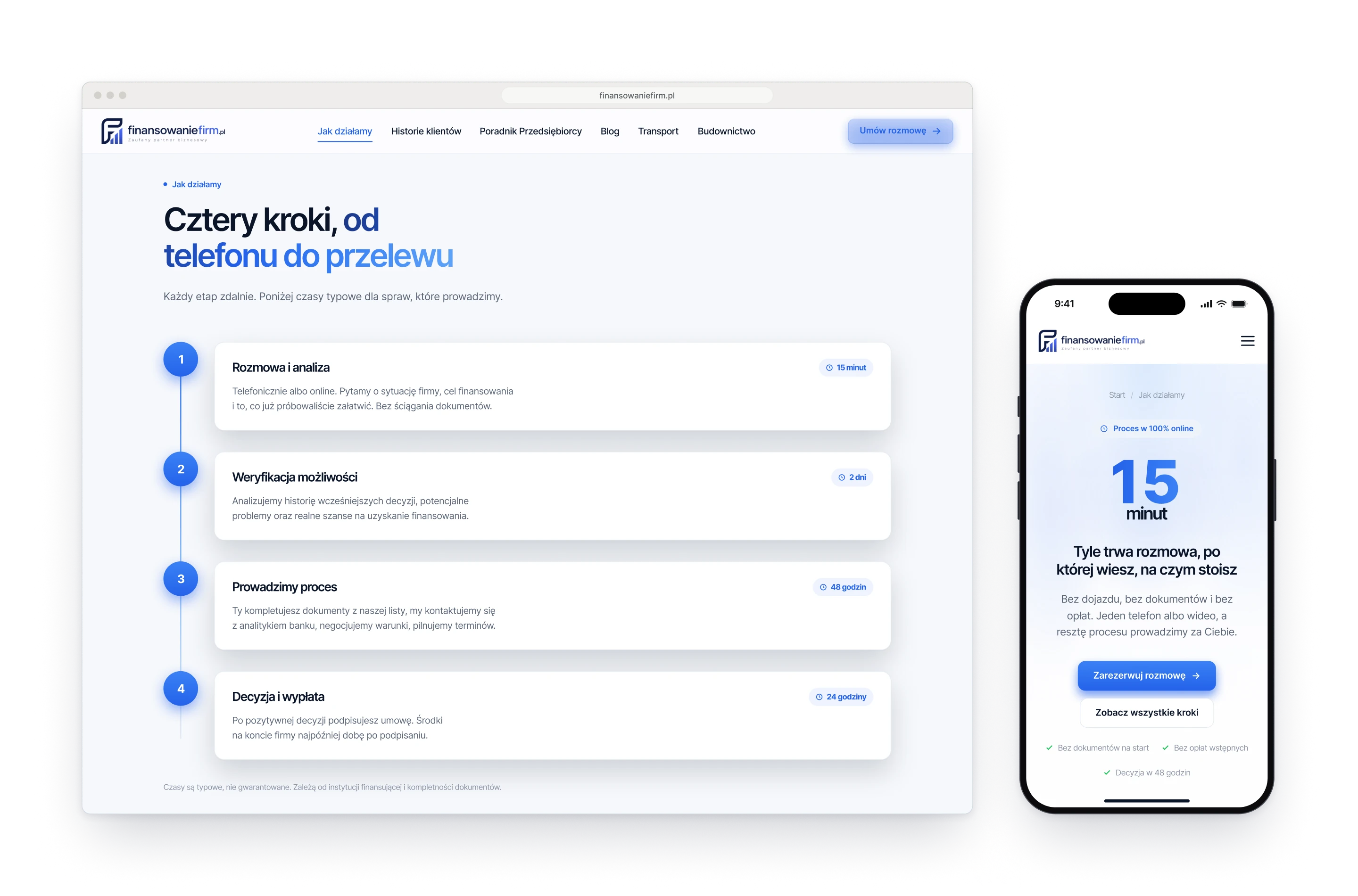
Fig. 02Left: the process page opens with one number. Right: the menu on a phone.
Design decision
Three questions instead of a form
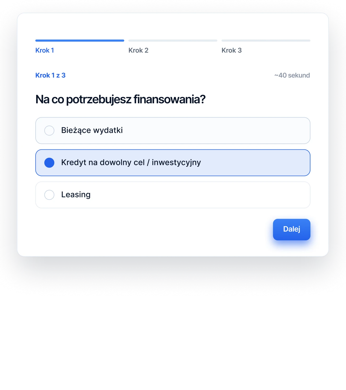
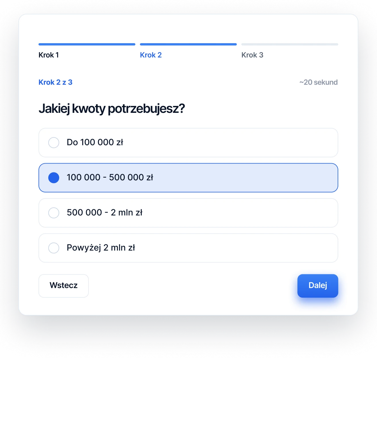
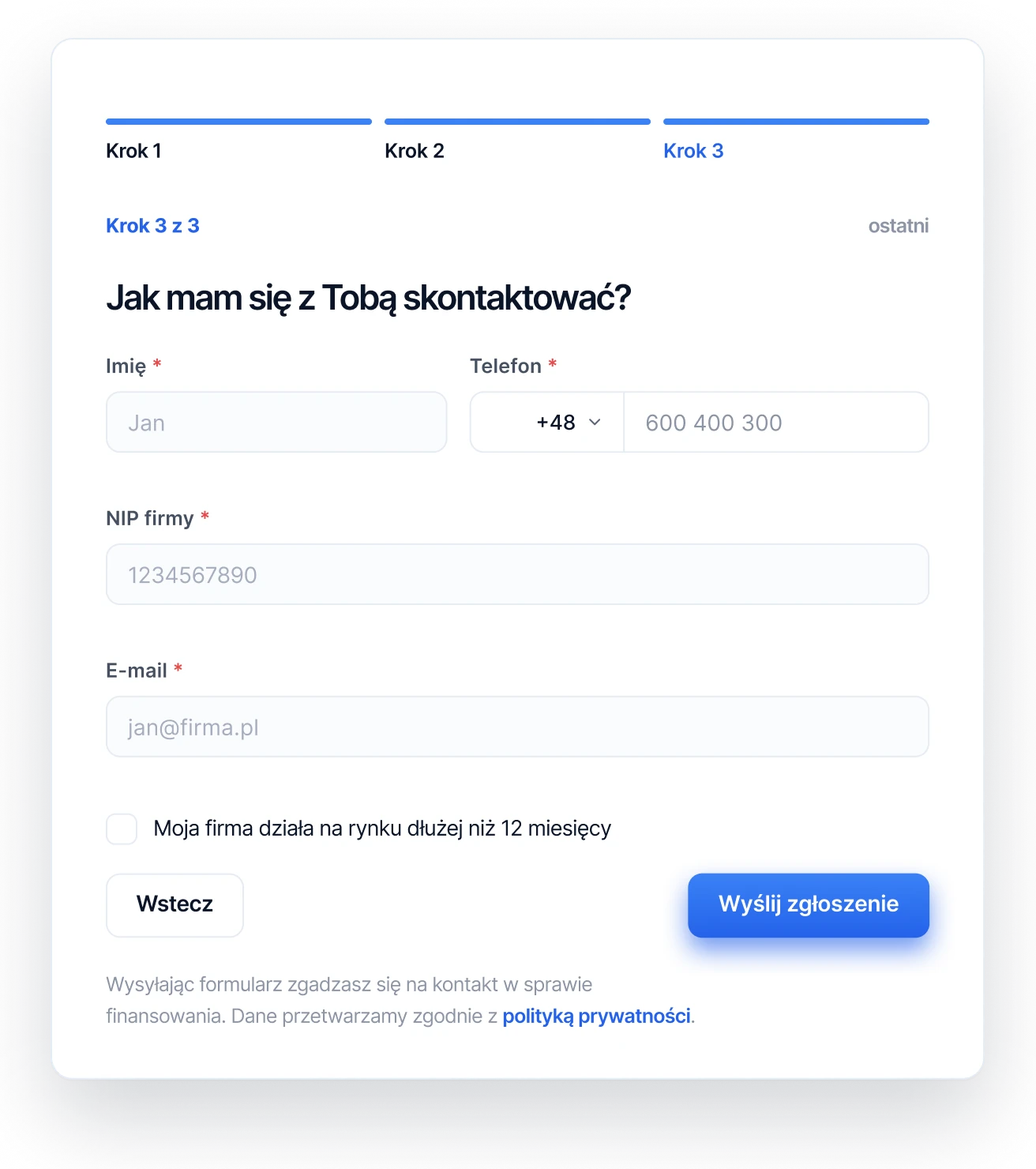
The site promises a conversation, not paperwork, and the form keeps that promise. It asks three things, one at a time: what the money is for, how much, and where to call back. A bar shows how far along you are, and the contact details come last, once the hard part is already answered.
First: what the money is for.
Then: how much.
Last: where to call back.
Process
Three openings before one number
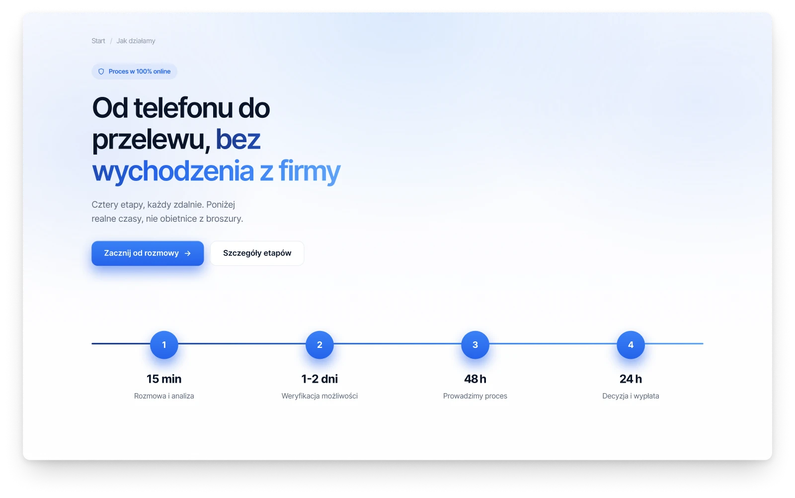
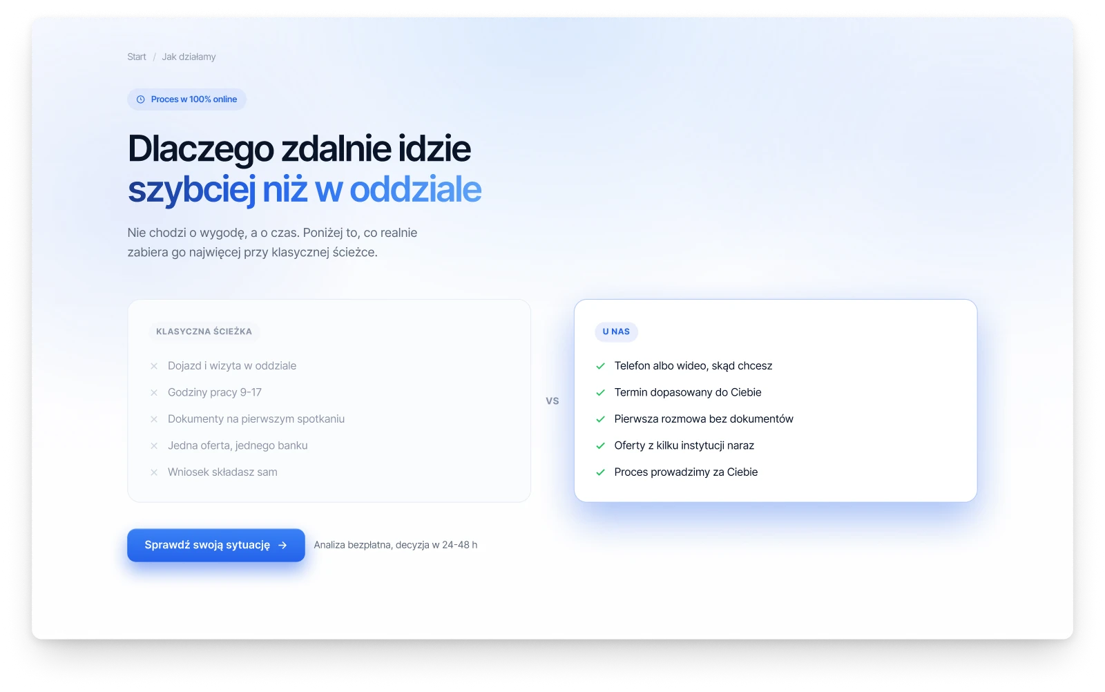
The process page went through three openings before it got its number. One led with the fifteen minutes, one drew the path from a call to a transfer, and one set remote work against a visit to a bank branch. The counter went live, and the path became the next section of the page.
A: the counter. This one went live.
B: the path from a call to a transfer.
C: remote against a bank branch.
Components
One button, named by what it does
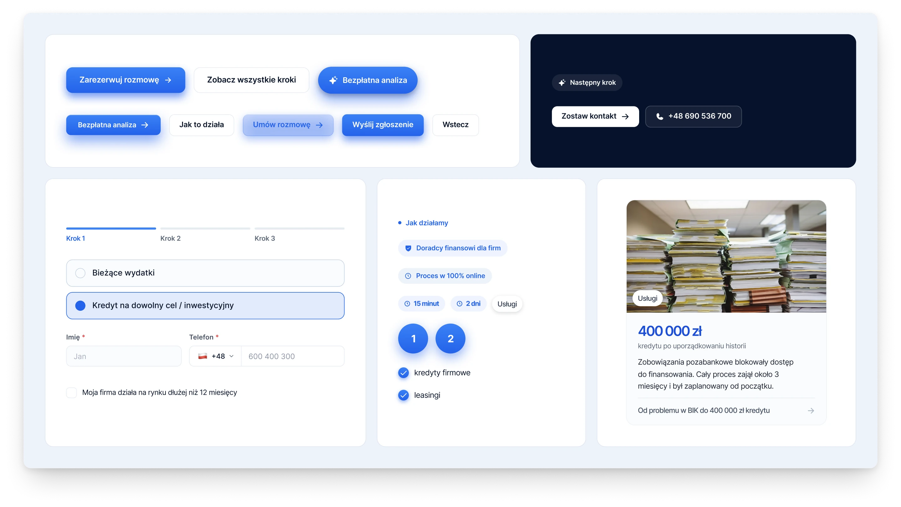
Every page is built from one small set of parts. There is one button, in one size, and its versions are named after the weight of the action, not after a colour: the main action is blue on a light page and white on navy. Fields, labels and the story card are drawn once and reused.
Buttons, fields, labels and a story card from the site.
Fig. 03The process, step by step, with the time each one takes.