Case study 02 / 03UX · UI · Design system · Build

Aporia Pro

Internal tool2026

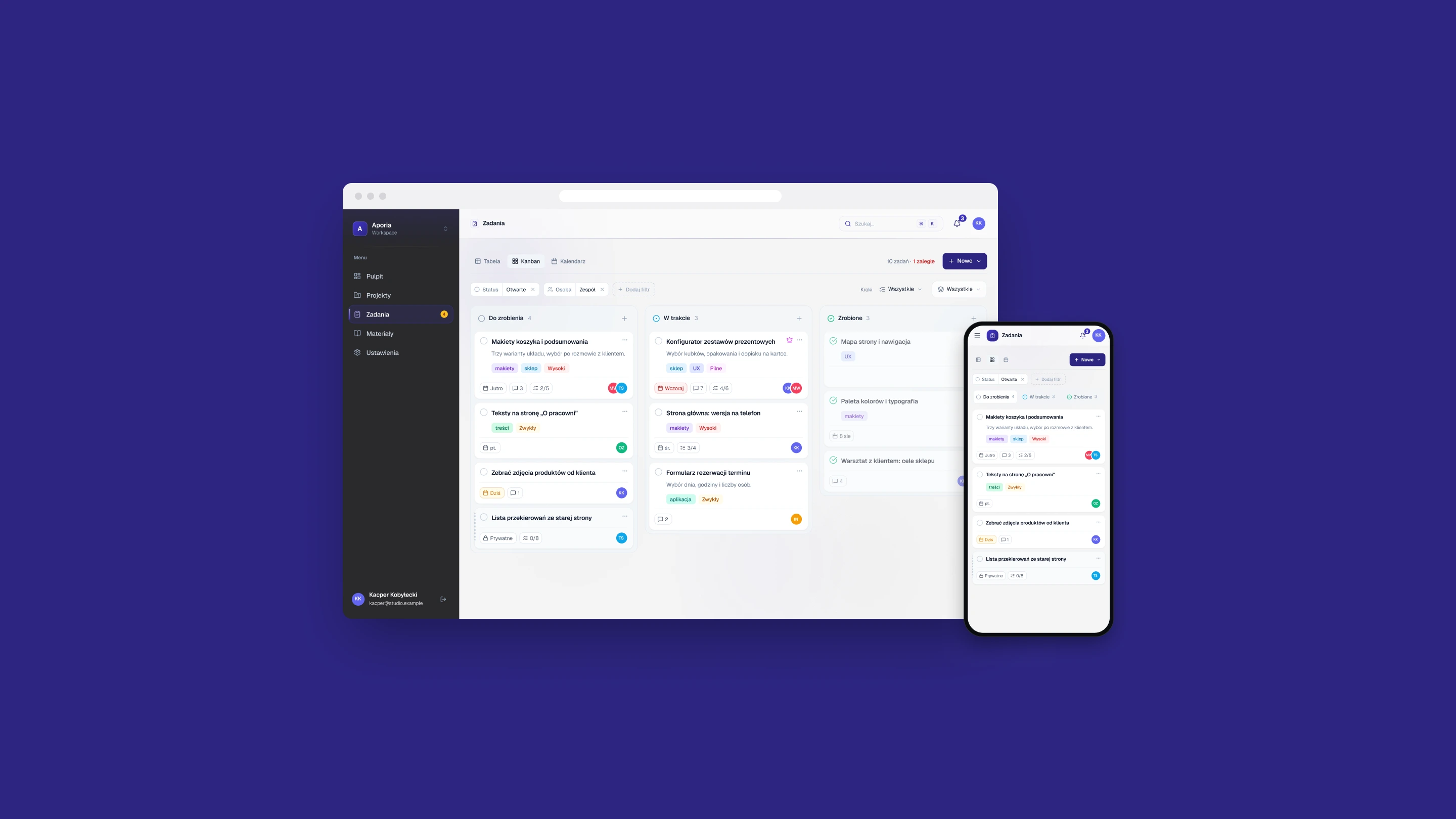
A work tool for a small team: tasks, client projects and the plan for the week in one place. I designed it and built it myself, and it was also my engineering thesis. The project is private, so the data on the screens is invented.

The Aporia Pro task board in a browser window and on a phone, on an indigo background

Client
Internal product
My role
UX/UI design, concept and build
Timeline
March to August 2026
Scope
Tasks in three views / Client projects / Work sessions / Design system / Workspace colour

(01)

The project

Context

Aporia Pro is an internal work tool for a small team. Tasks, client projects and the plan for the week live in one place, so nobody has to keep them in sync by hand.

I did all of it: the concept, the UX and UI, and the code. It was also my engineering thesis, and I built many things in it in order to learn. The clearest example is colour, described below.

The project is private and nobody outside the team can log in. That is why the people, clients and numbers on the screens are invented, and why many of its features are not shown here at all.


(02)

The problem

Problem

One task shows up in a table, on a board and in the week's calendar. It has to stay one task, and be changeable wherever you meet it.

A task carries a status, a priority, people, a deadline, tags, steps, a checklist and a discussion. It can belong to a client project or stand alone, be shared or private, and be pinned to a block of time. Each view shows a different cut of the same record, in a different amount of space.

Constraints

  • Three views of the same tasks: table, board, calendar
  • Tasks inside client projects and outside them
  • Team work and private work side by side
  • The same screens on a phone
  • One brand colour per workspace, without losing what other colours mean

(03)

Key decisions

Decisions

One colour repaints the whole tool

Context
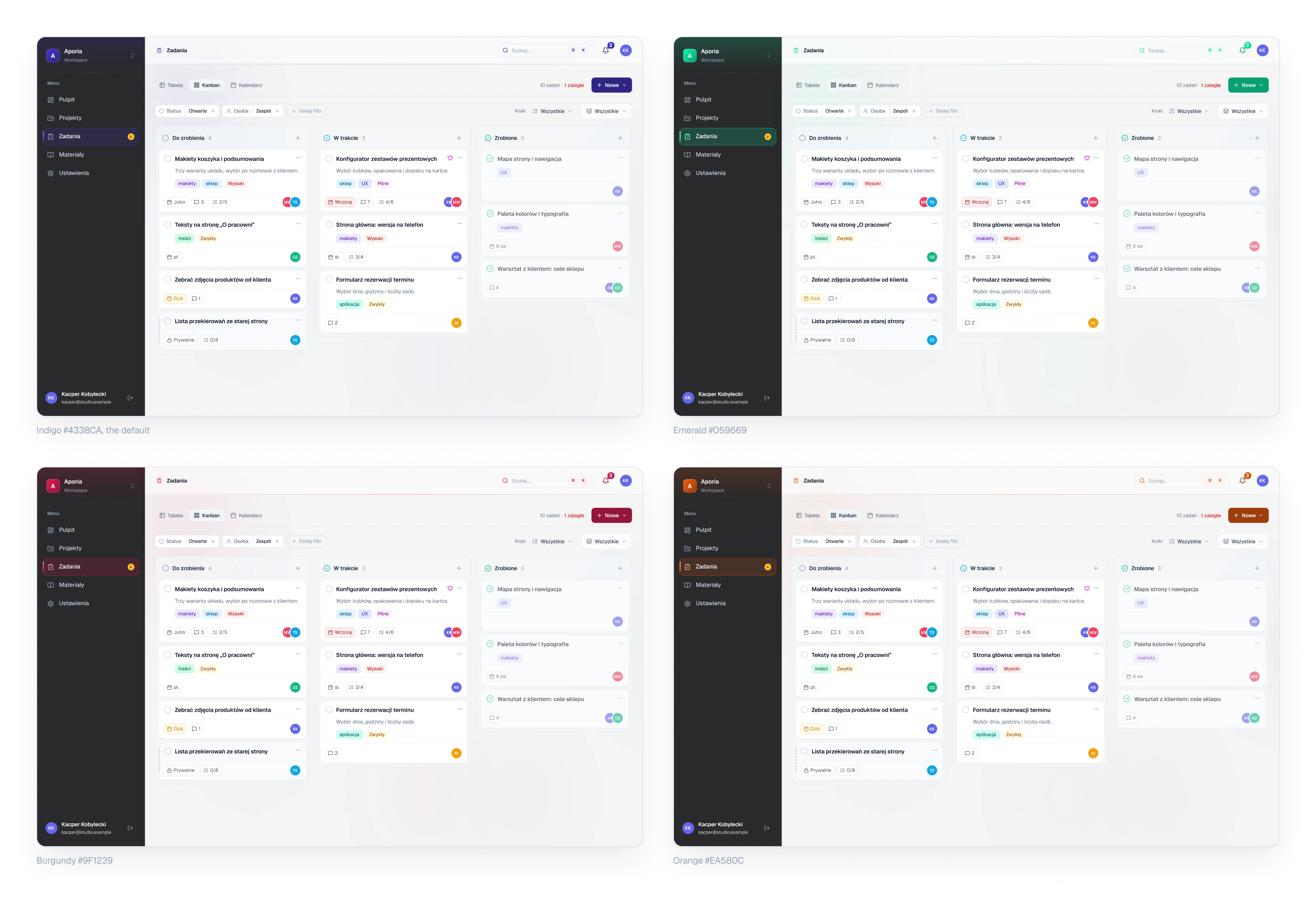
Every workspace has one brand colour. I wanted to understand how colour scales work, so I did not take a ready palette. This part was built on purpose, as an experiment.
Decision
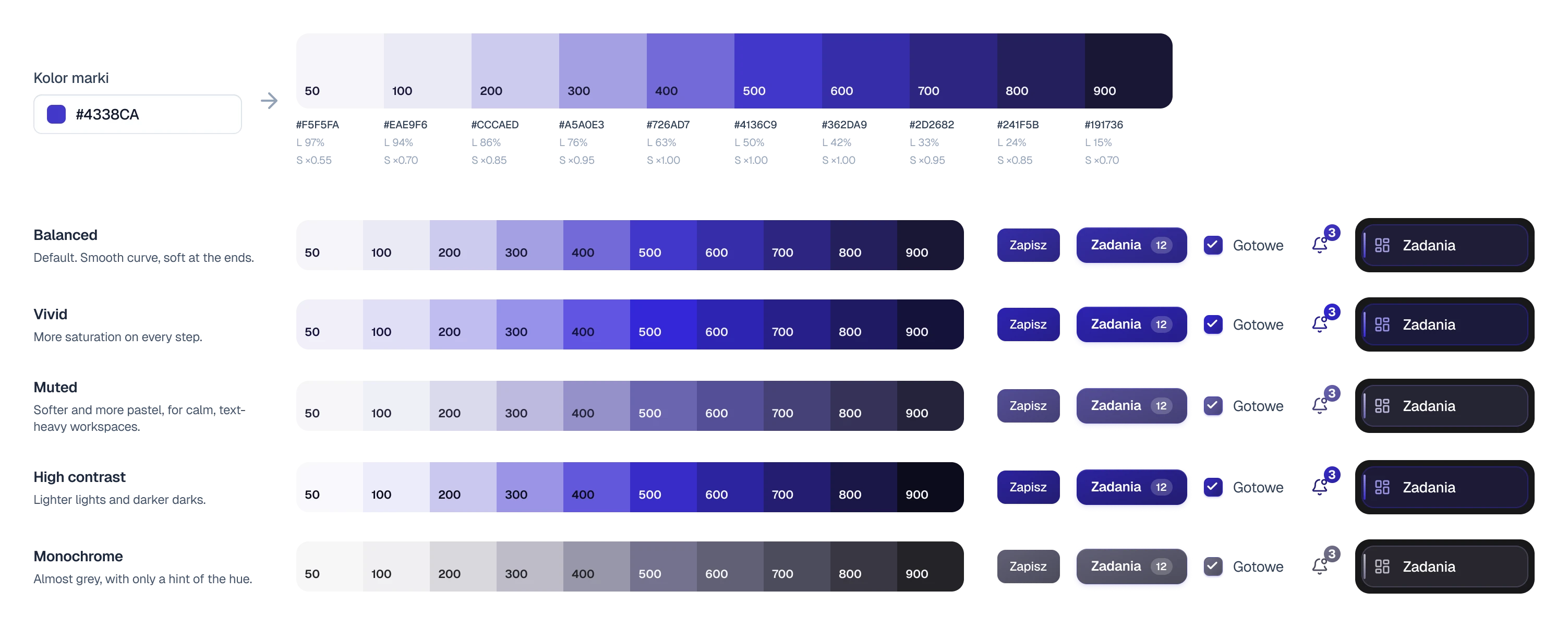
I wrote the generator by hand. One hex goes in and ten shades come out: the hue stays, lightness follows a fixed curve from 97% down to 15%, and saturation is turned down at both ends. Five characters, from vivid to almost grey, tune the same colour. The sidebar tint, the active item, buttons, tabs, counters and the glow in the background all read those ten values, so nothing is redrawn.
Trade-off
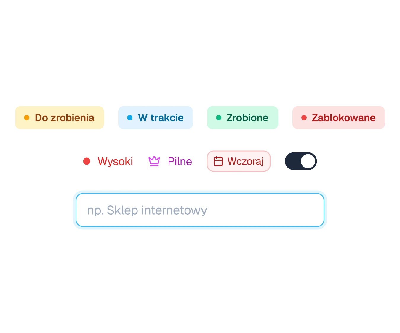
The brand colour cannot mean anything. Status, priority, late dates, errors and focus keep their own fixed colours, so a burgundy workspace cannot make a late task look fine.
The same task board in four workspaces, indigo, emerald, burgundy and orange
Fig. 01The same screen in four workspaces. Only the brand colour was changed.

A task starts as one line and is changed where it stands

Context
A task has ten or so fields, but it begins as a few words.
Decision
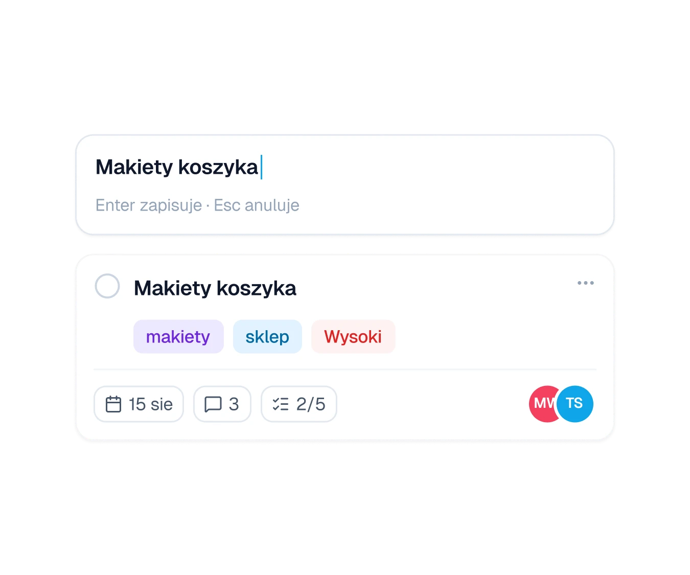
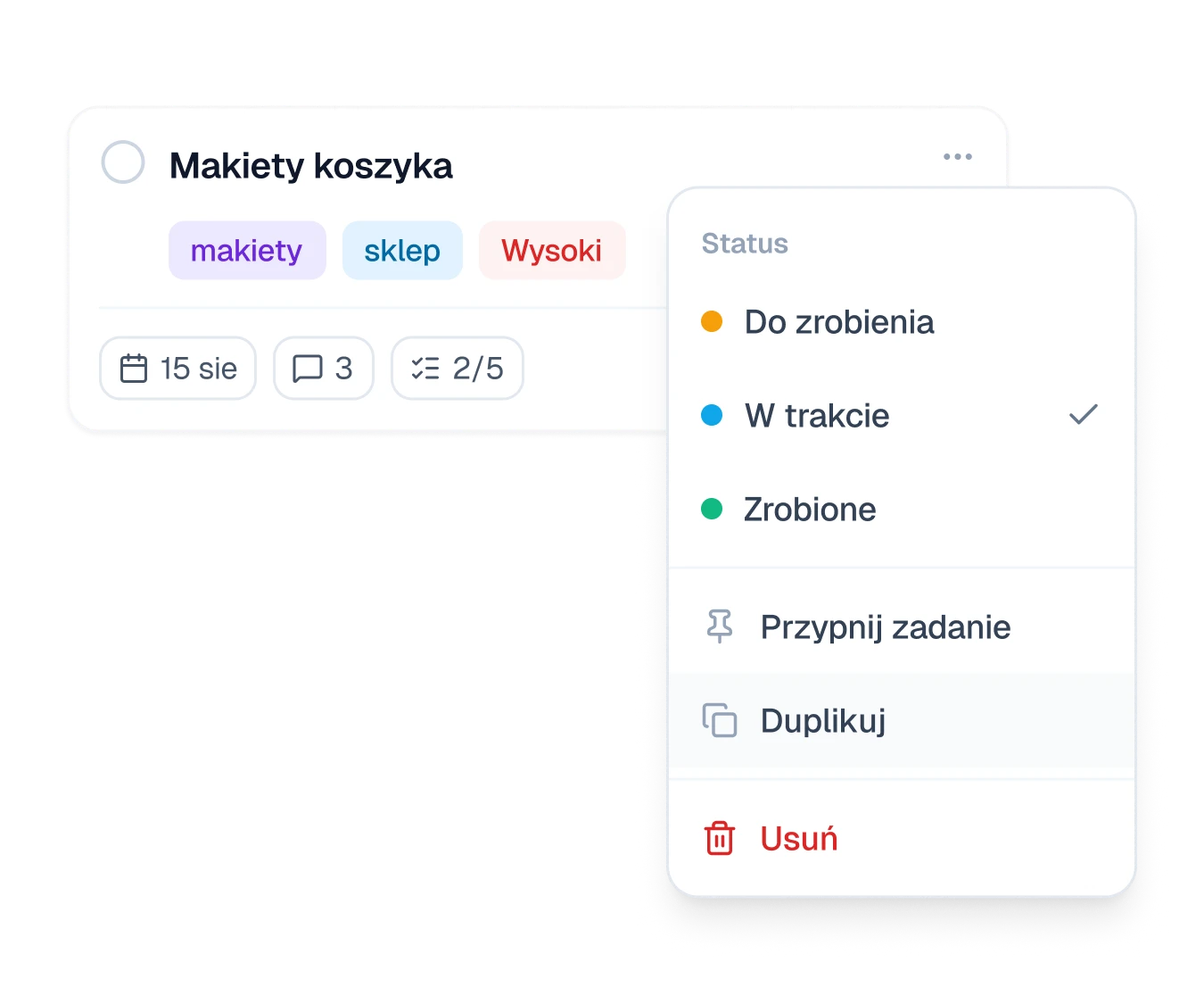
Adding takes one line: in the footer of a table group, at the top of a board column, or in the full form. The field stays open, so a list can be typed in a row. Everything else is set where it is shown. The title changes on a double click, status, people, date and priority through small pickers in the row or on the card, and fields in the task view save themselves.
Trade-off
There is no Save button, so there is nothing to cancel either. Project settings are the one place that keeps a Save bar.
A one-line field for a new task above a task card
Fig. 02A new task is one line. Enter saves it, Escape cancels.
A task card with its menu open, showing three statuses and three actions
Fig. 03Status is changed from the card's own menu.

Closing asks once and can be undone

Context
A task is closed with one click on the circle next to its title. One click is also easy to make by mistake.
Decision
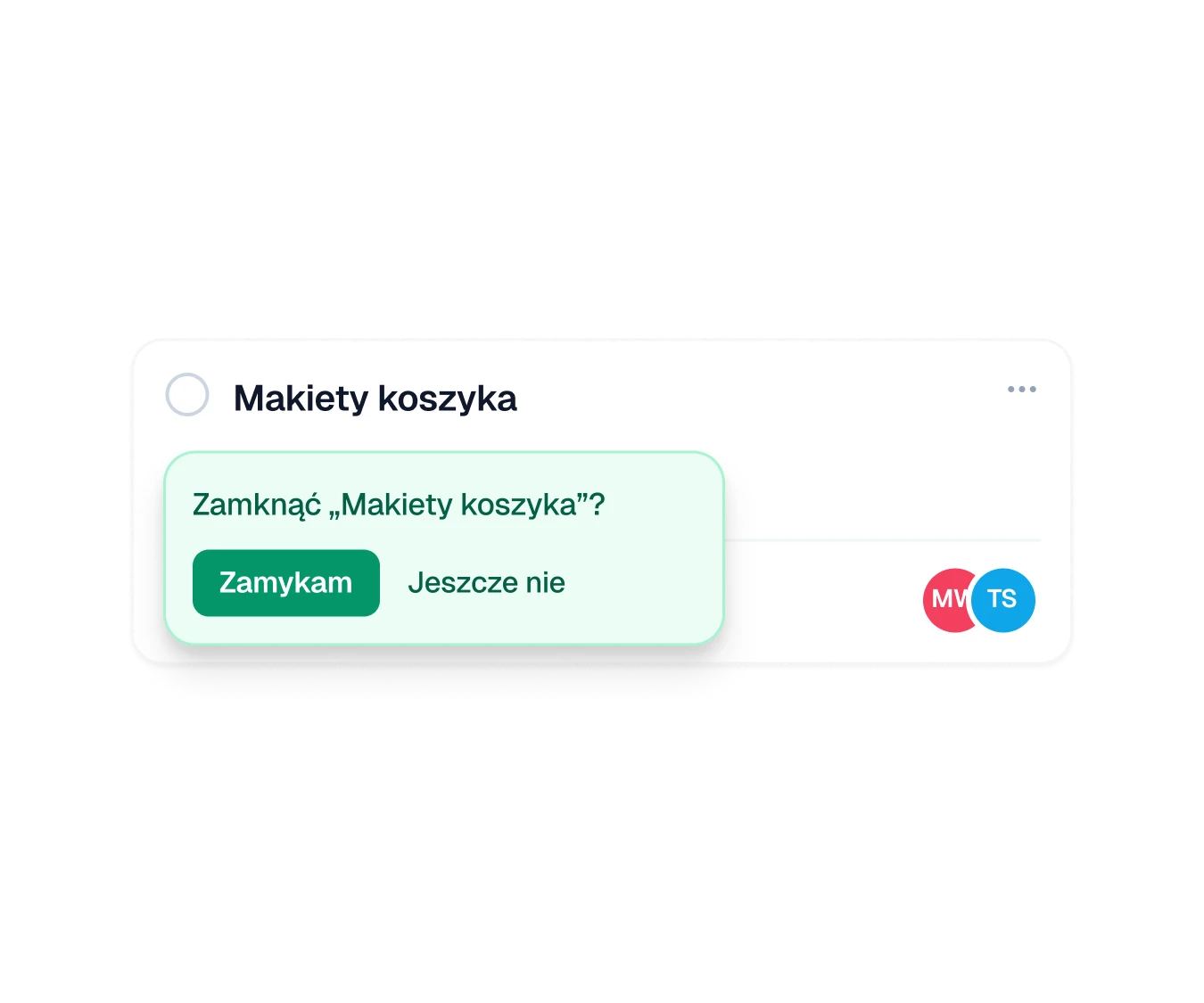
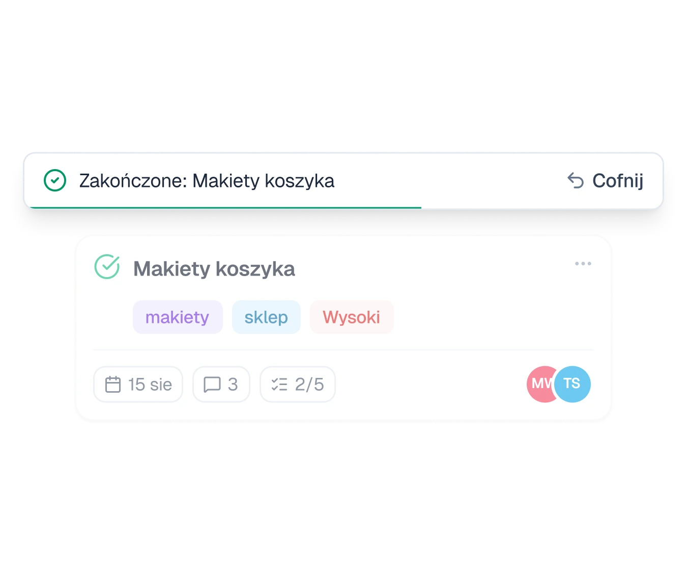
The click opens a short question right where it happened, in the green of the action. After closing, a bar with Undo stays for eight seconds. Later the task can still be reopened with one click, this time without a question.
Trade-off
One more click on every close. Deleting, which cannot be undone, gets a confirmation of its own.
A task card with a small green question asking whether to close the task
Fig. 04The question appears at the circle that was clicked.
An undo bar above a closed, greyed task card
Fig. 05Undo stays for eight seconds.

Only one task can be urgent

Context
Priority has four levels. The top one, urgent, is meant for a single task at a time.
Decision
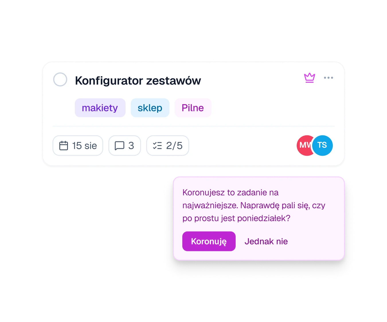
Urgent is fuchsia with a crown, never red: red stays with high priority and late dates. Crowning a task asks first, taking the crown off asks too, and a second urgent task is refused until the first one is closed.
Trade-off
When two things feel urgent, someone has to pick one. The tool does not let that choice wait.
An urgent task card with a crown and a fuchsia question asking whether to crown the task
Fig. 06Crowning a task asks first.
Status chips, priority marks, a late date, a toggle and a focused field
Fig. 07Colours that carry meaning stay the same in every workspace.

Sessions: when the work happens, not only when it is due

Context
A deadline says when something is due. It does not say when anyone will sit down to do it.
Decision
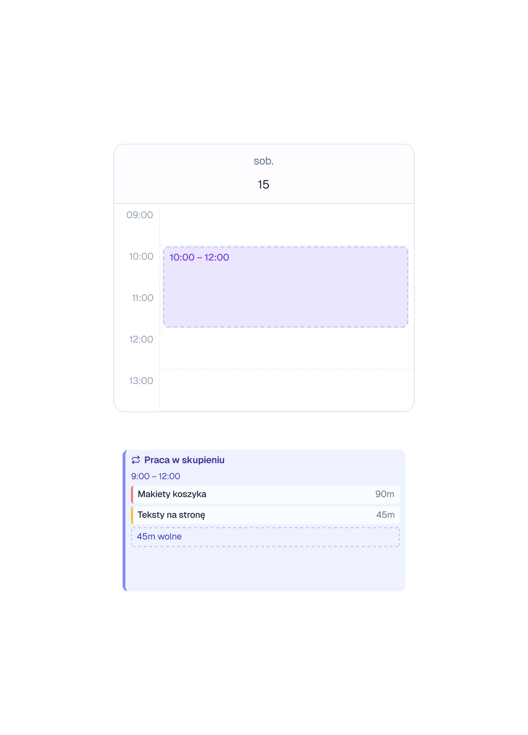
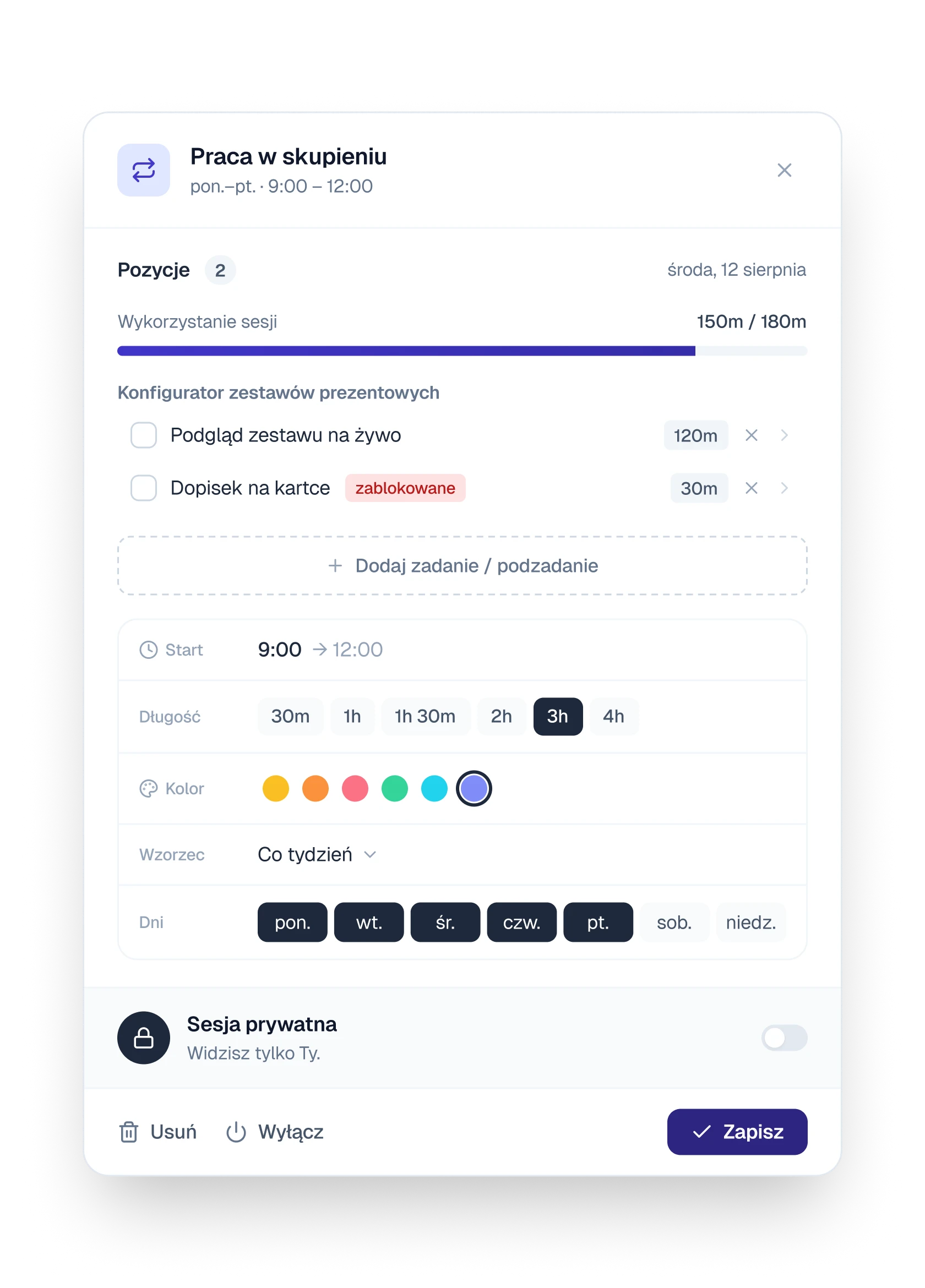
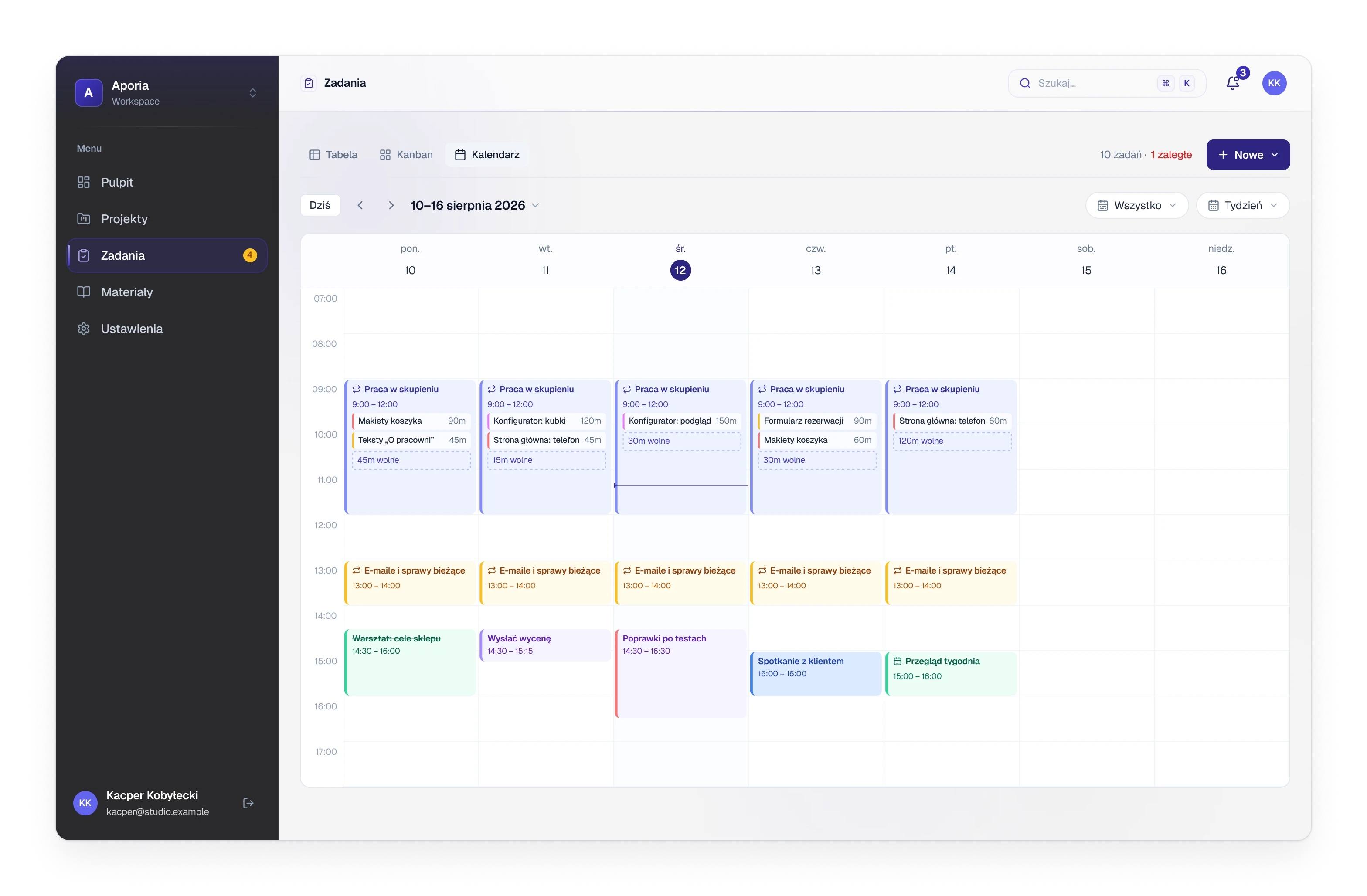
A session is a block of time in the calendar, usually repeating every week. Dragging over free time draws one, snapped to 15 minutes. Tasks and single steps are pinned into it with a time estimate, and a meter shows how much of the block is used. In the calendar the block lists what is pinned and marks the time still free with a dashed strip.
Trade-off
Overlapping sessions are allowed. The form names the conflict and the button changes its label, but nothing is blocked.
A calendar day with a block being drawn, and a session block listing two pinned tasks and 45 free minutes
Fig. 08Dragging draws a session. Pinned work sits inside the block, the dashed strip is the time still free.
A session window with pinned steps, a usage meter, length, colour and the days it repeats on
Fig. 09A session: what is pinned, how much of it is used, when it repeats.

(04)

Design

Visuals

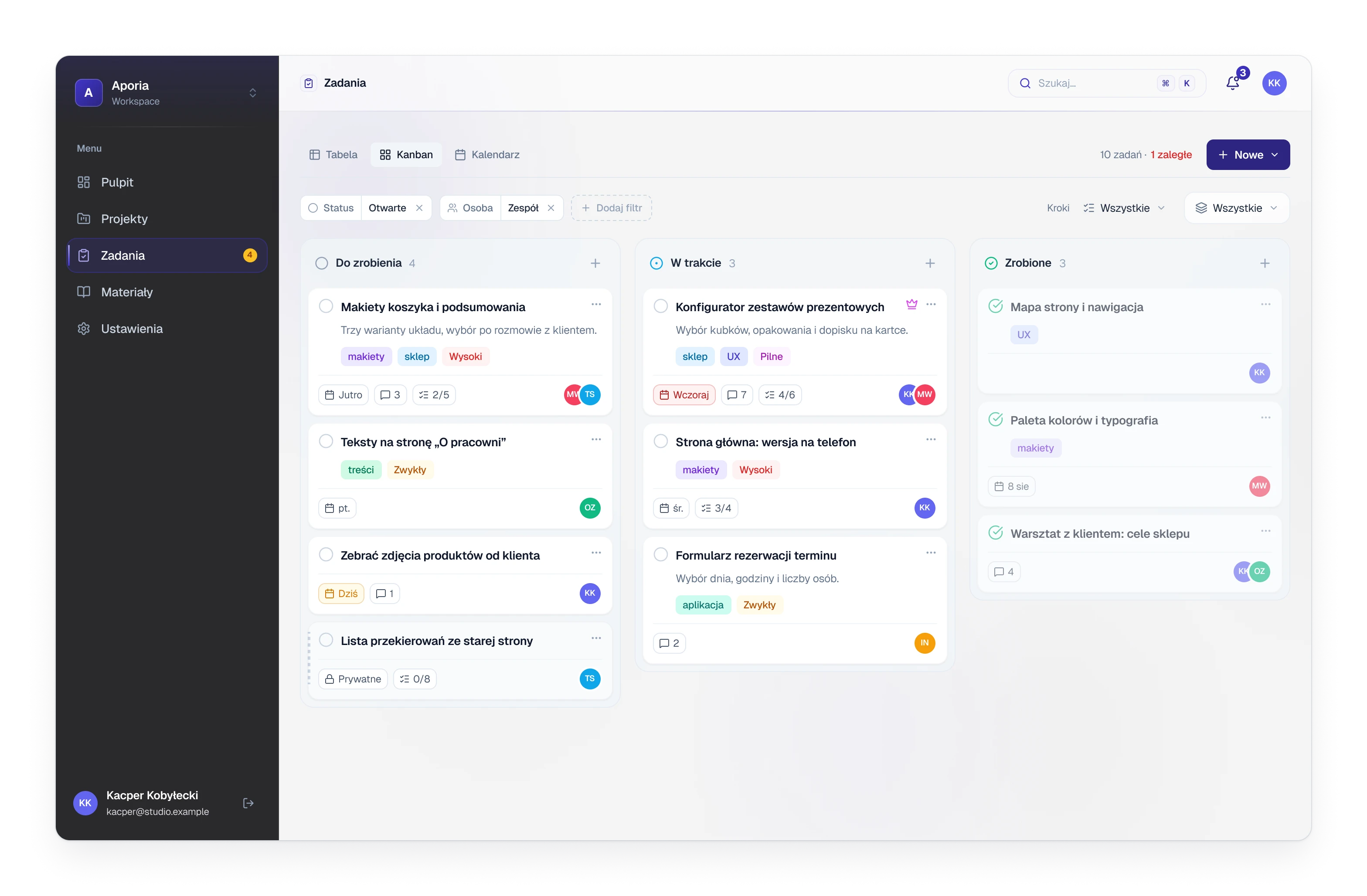
The task board with three columns, to do, in progress and done
Fig. 10Tasks as a board. A card shows only what the task has.
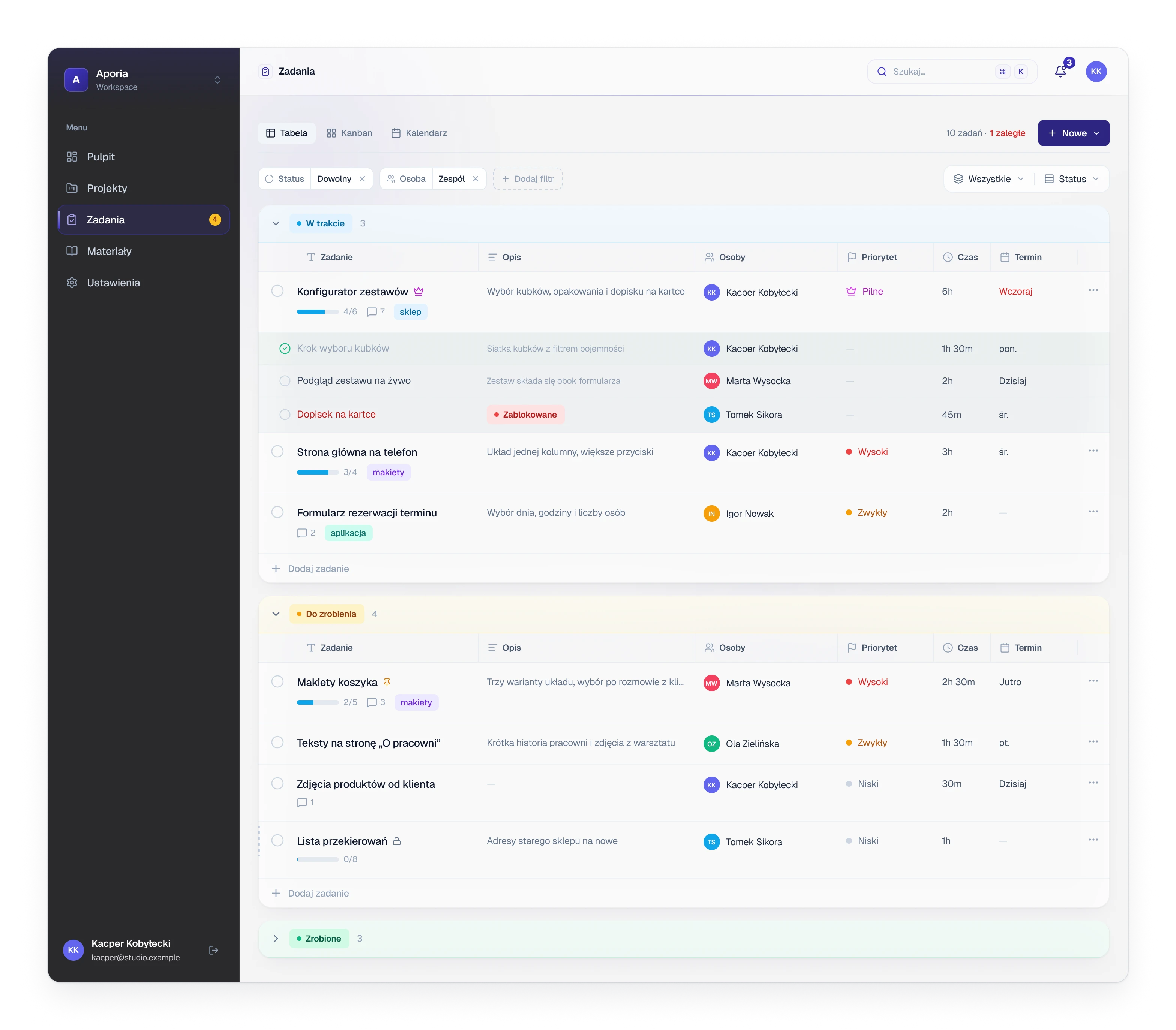
The task table with groups for in progress and to do, and steps under the first task
DetailTableThe same tasks grouped by status. Steps sit under their task, and every cell is edited in place: a double click on the title, a small picker for the rest.
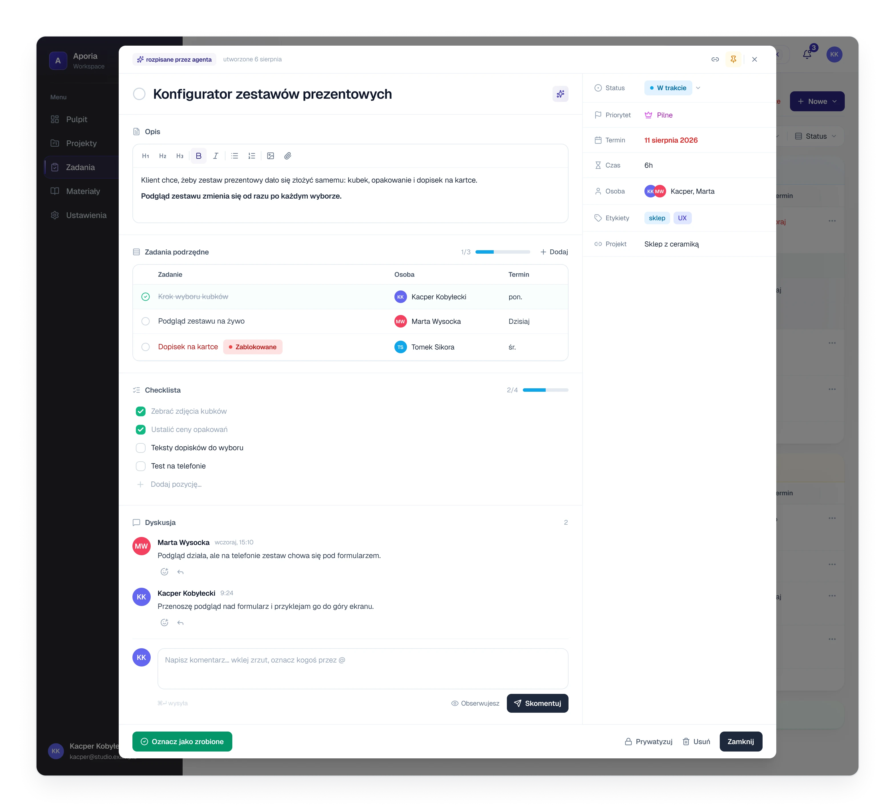
A task opened over the list, with a description, steps, a checklist, comments and a column of fields
DetailTaskDescription, steps, a checklist and the discussion on the left, the fields on the right. It opens over the list, so closing it puts you back where you were.
A week in the calendar with repeating sessions, tasks pinned into them and meetings
Fig. 11The week. Sessions repeat, and each one shows the tasks pinned into it and the time still free.
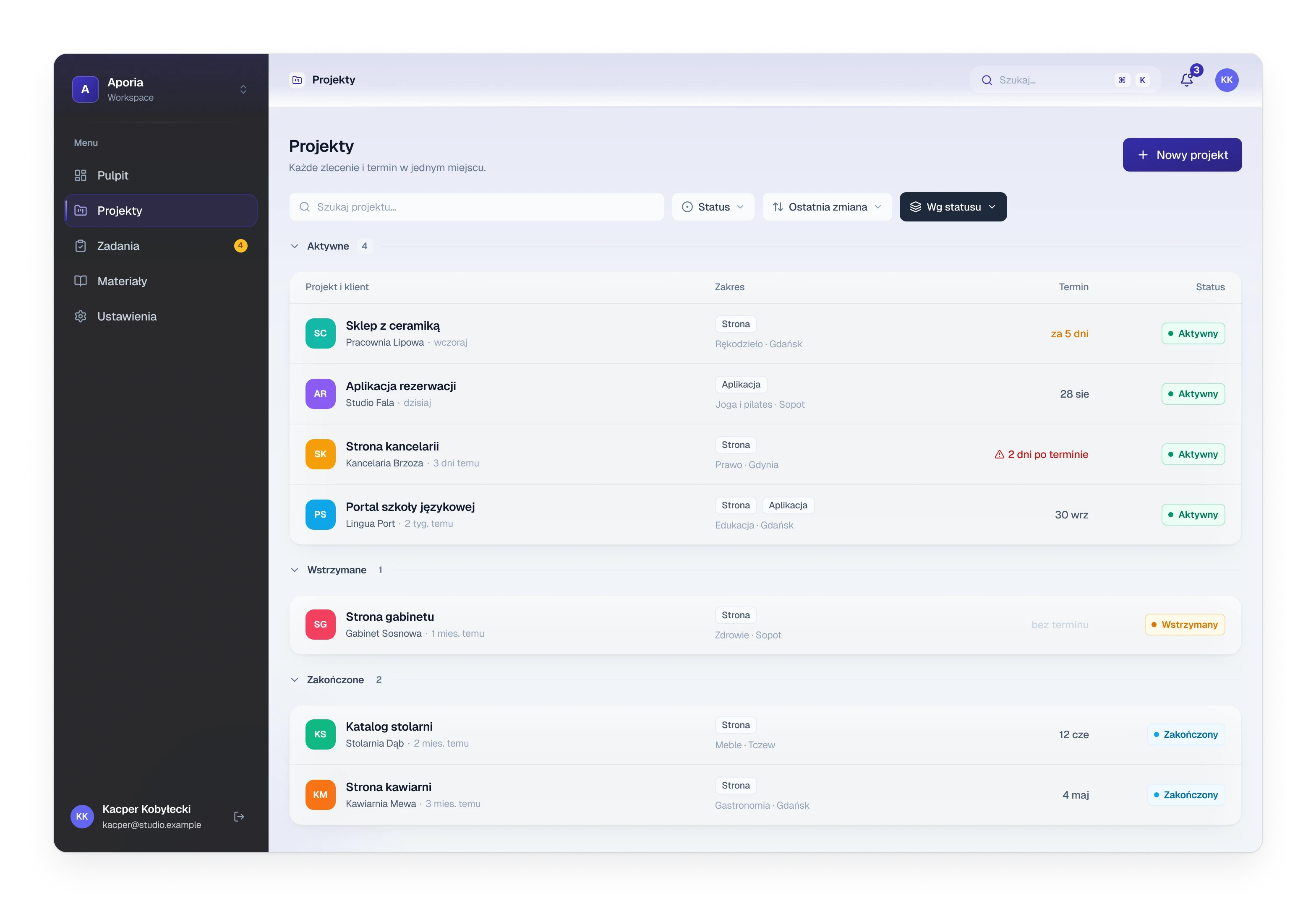
The list of client projects grouped into active, paused and finished
Fig. 12Client projects, grouped by status.
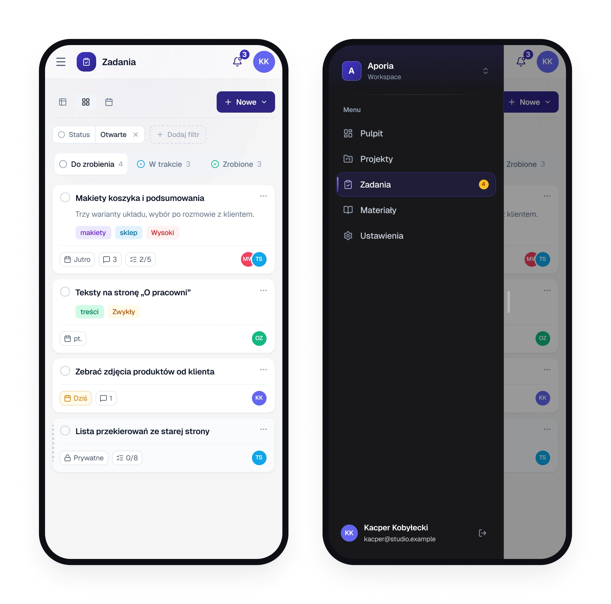
Two phone screens, the task board with one column and the menu opened as a sheet
Fig. 13On a phone: one column at a time, the menu as a sheet.
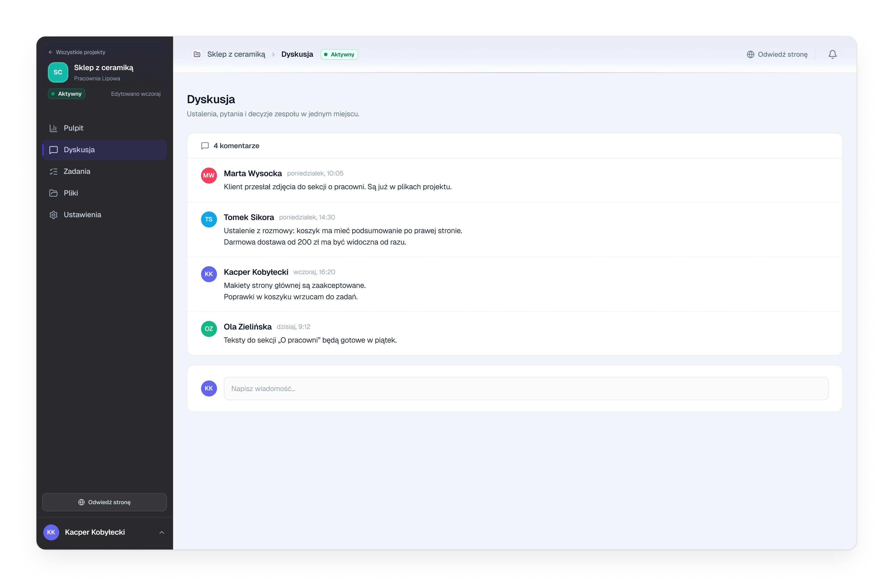
The discussion page of a client project with four comments
Fig. 14Inside a project: the discussion.
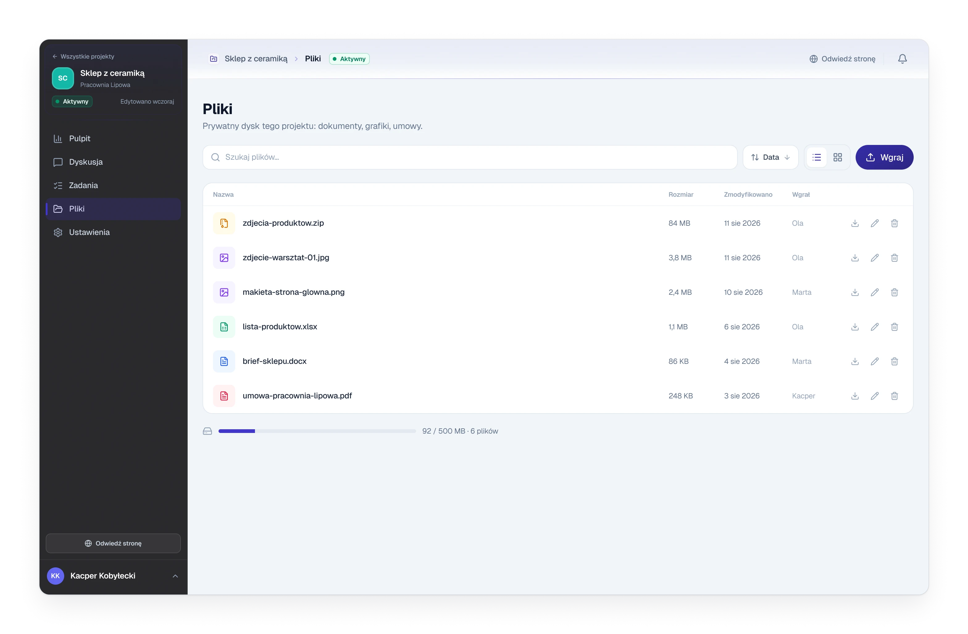
The files page of a client project with six files and a storage meter
Fig. 15Inside a project: files.

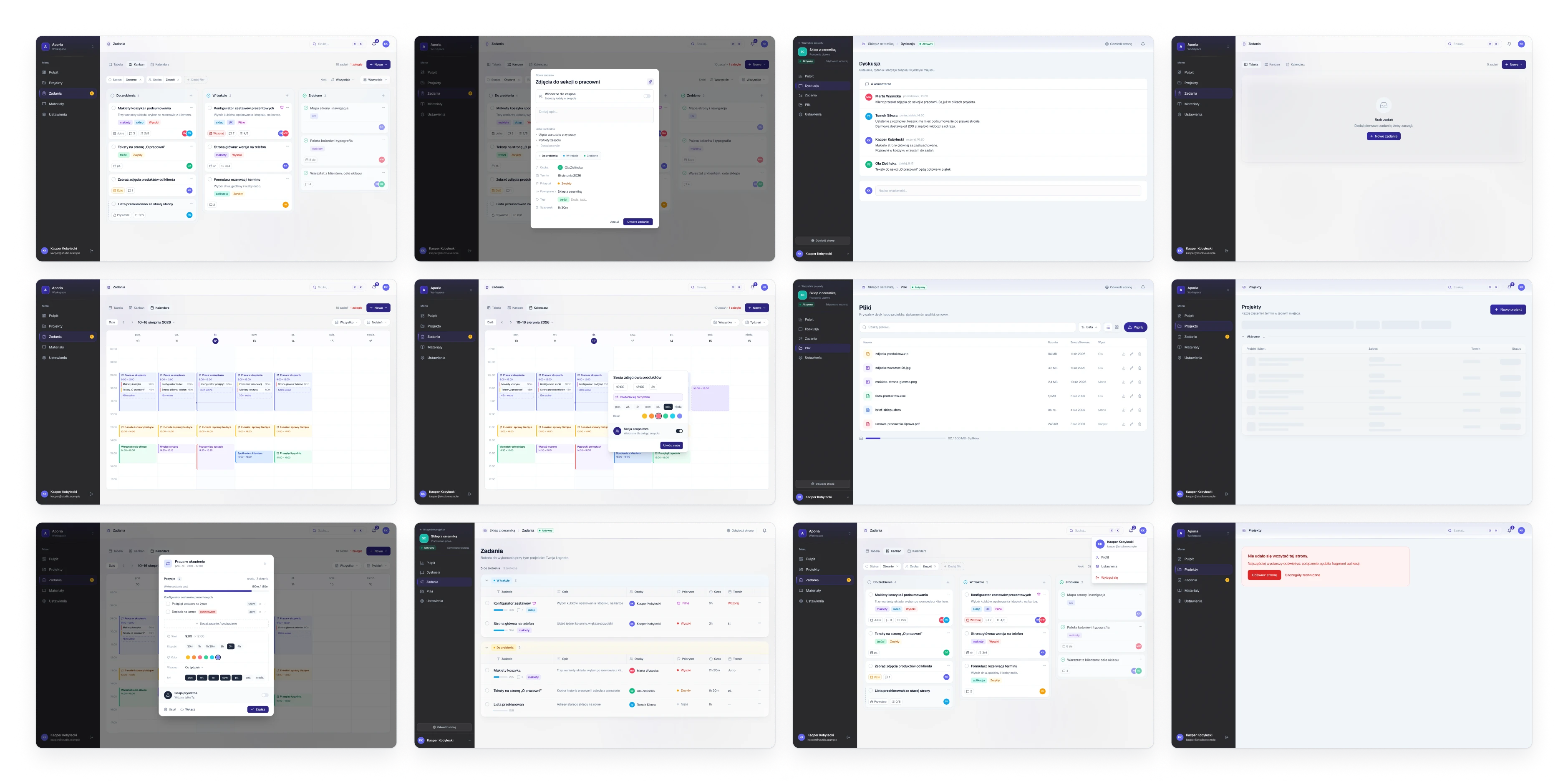
The whole file

  • 21screens
  • 80components
  • 139icons
Twelve desktop screens from the Figma file in four even columns: tasks, sessions, a client project and the empty, loading and error states
Twelve of the 21 screens in the Figma file, all with invented data. The private parts of the tool are not documented.

(05)

System

Design system


274 variables in six collections. Thirty of them are the brand colour: change one hex and the whole tool follows.

Variable collections
CollectionVariablesModes
Primitives149One value
Brand30Five characters, three example colours
Color57Light / Dark
Spacing14One value
Radius5One value
Typography19One value
What changes between the modes
IndigoEmerald
Shade 50#F5F5FA#F3FBF9
Shade 500#4136C9#08F7AD
Shade 700#2D2682#099F71
Shade 900#191736#0D3F30
Status and priorityFixedFixed
Focus ringFixedFixed

Typography

Geist
Regular / Medium / SemiBold / Bold

Components

  • Buttons, badges and form fields
  • Tabs, menus and overlays
  • Search and notifications
  • App shell
  • Task and project patterns

In the file

  • 80 components
  • 139 icons
  • 45 text styles
  • 18 effect styles
A colour field, the ten shades made from it with their lightness and saturation, and the same scale in five characters next to sample controls
Fig. 16One colour in, ten shades out, in five characters. Lightness and saturation of every step come from a curve.

(06)

Result

Outcome

One tool, designed and built by one person: tasks in three views, client projects, a planned week, and an interface that takes its colour from a single field.

Delivered

  • Tasks as a table, a board and a calendar, with steps, checklists and discussion
  • Client projects with their own discussion, tasks, files and settings
  • Work sessions: the week planned in blocks of time
  • A colour generator: one hex, ten shades, five characters
  • Design system in Figma: 274 variables, 45 text styles, 80 components
  • Documentation in Figma: 21 screens and 3 flows
Next project →03 / 03

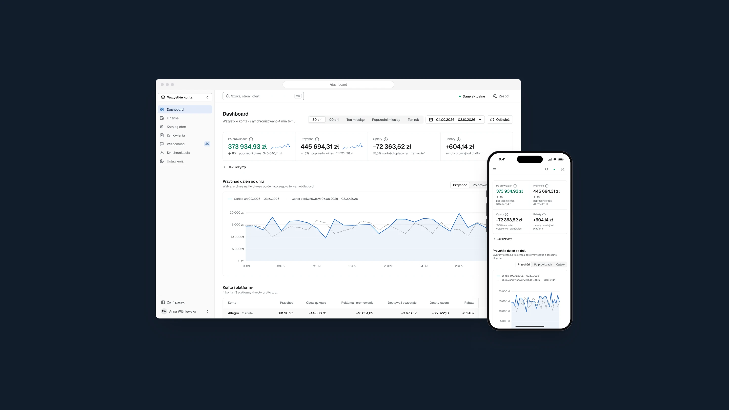
Marketplace Panel

The panel's first screen in a browser window, with the result after fees, revenue day by day against the previous period and the accounts table, and the same screen on a phone, on a dark navy background