Every colour has one job
- Context
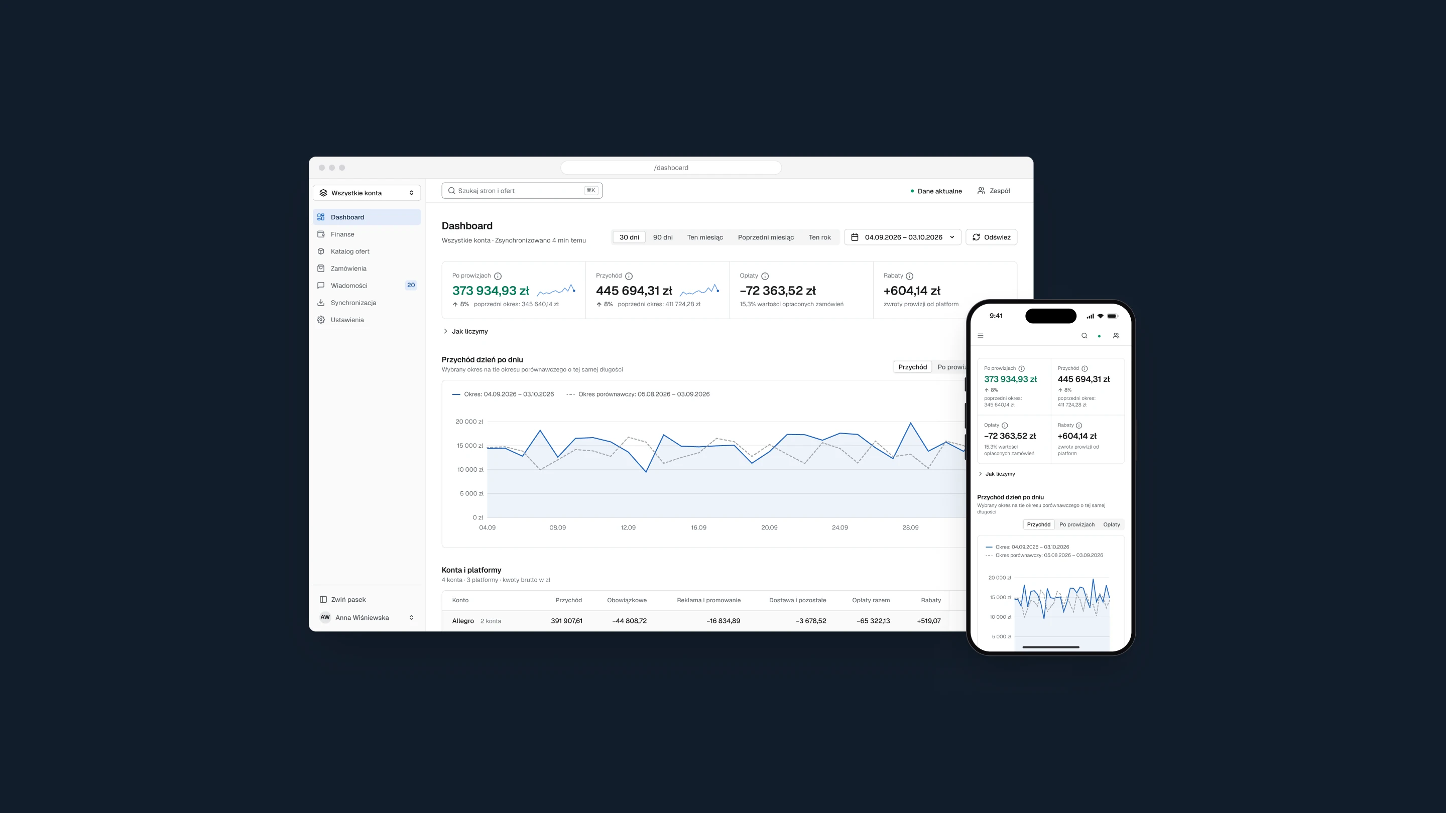
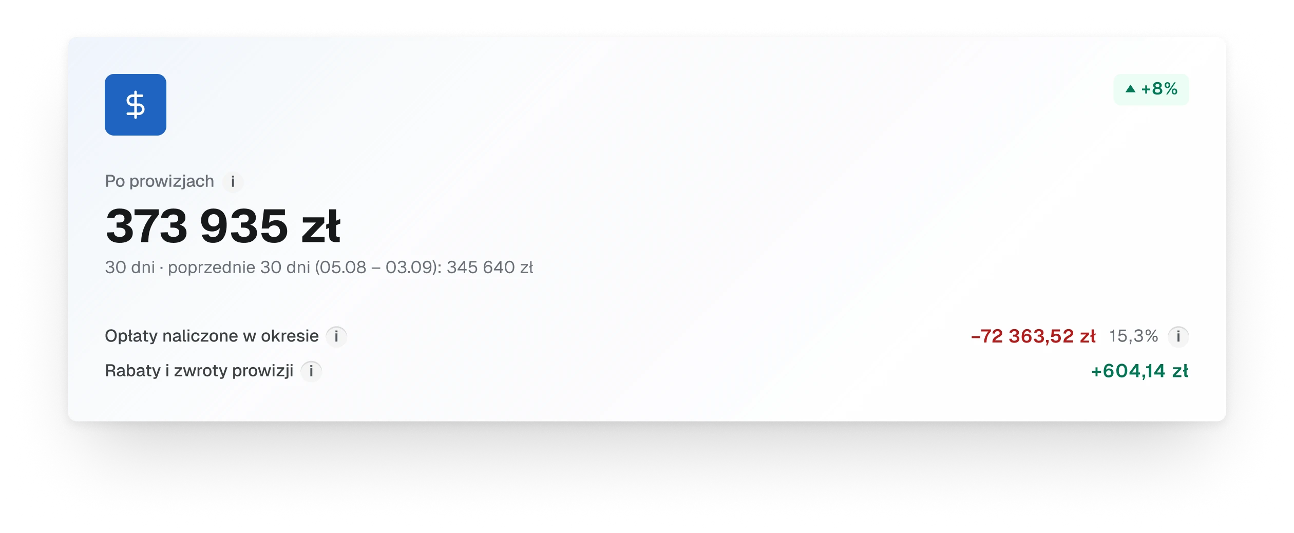
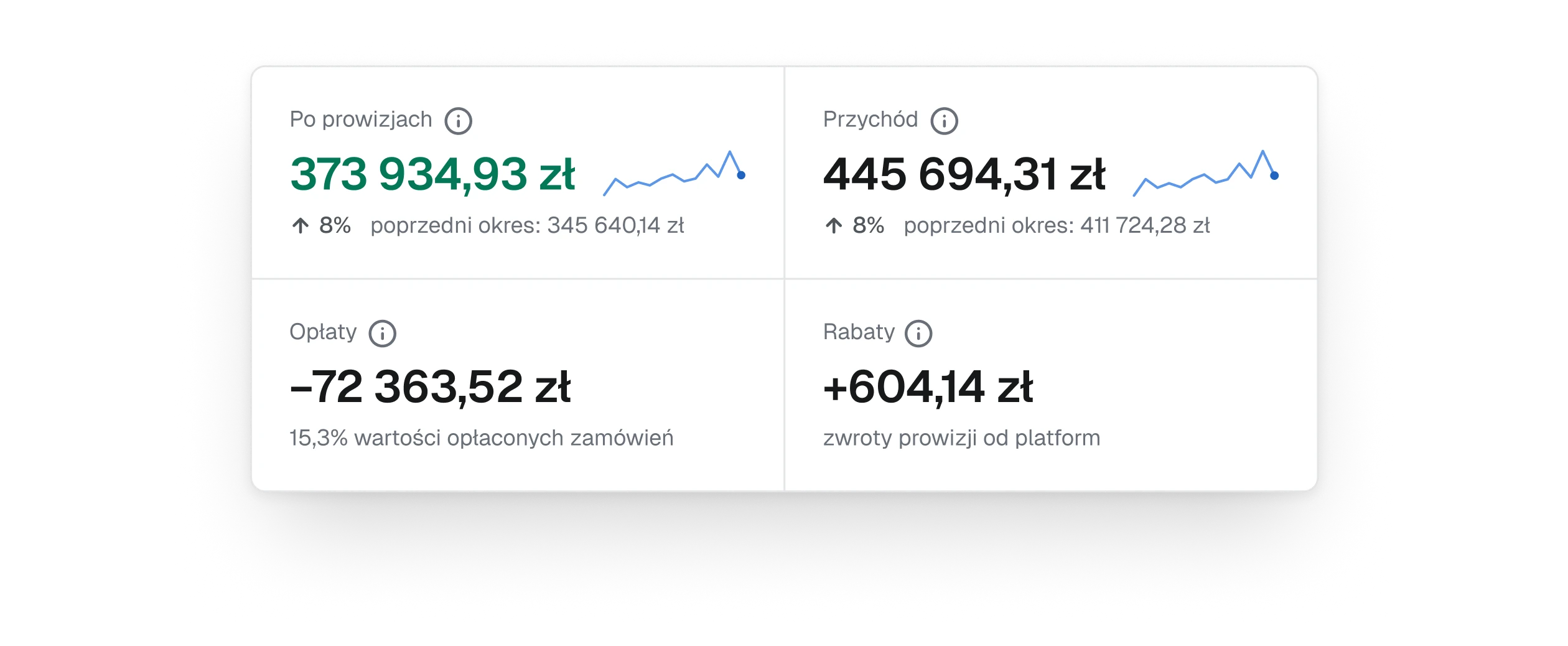
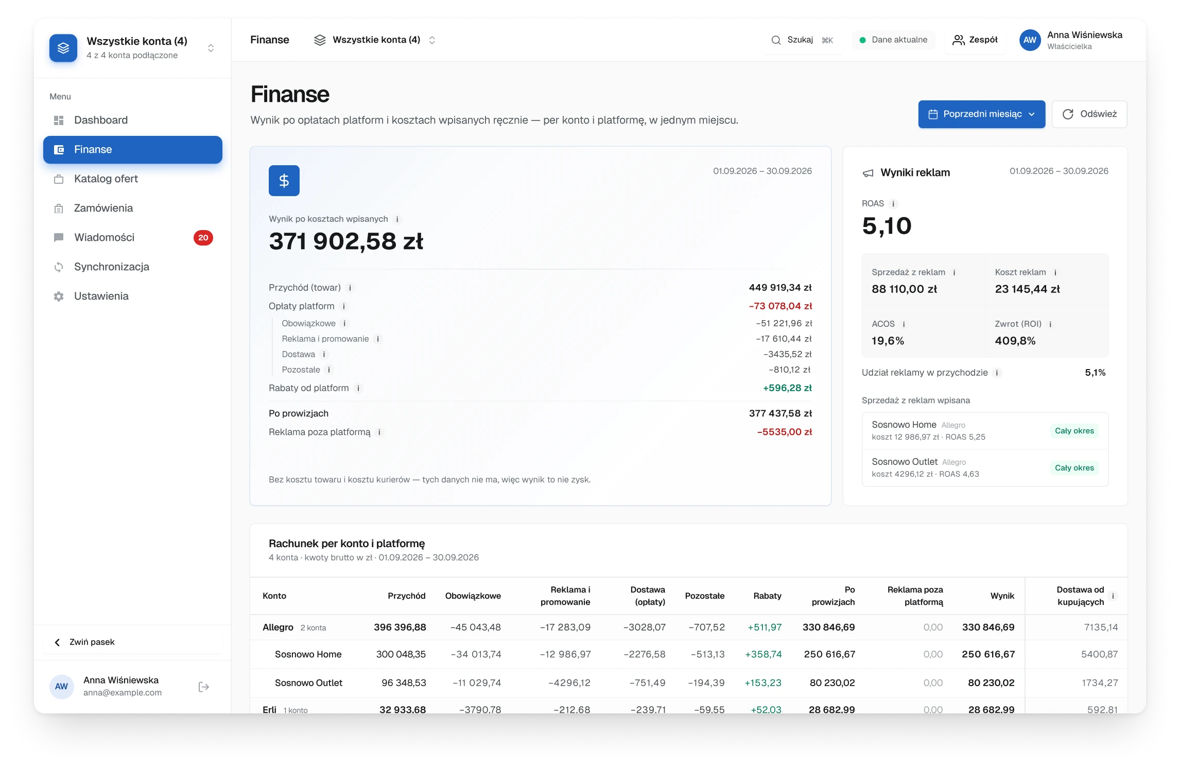
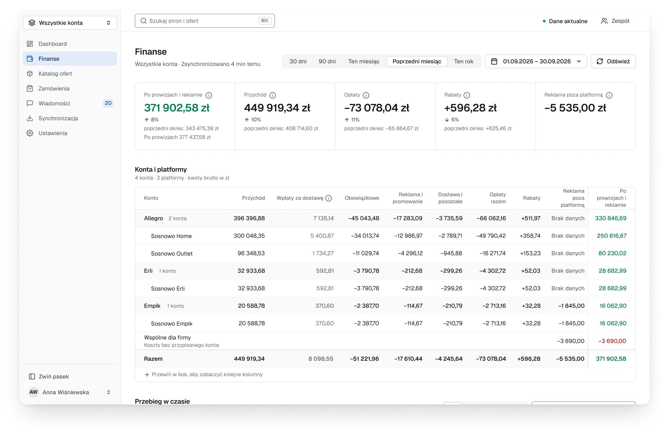
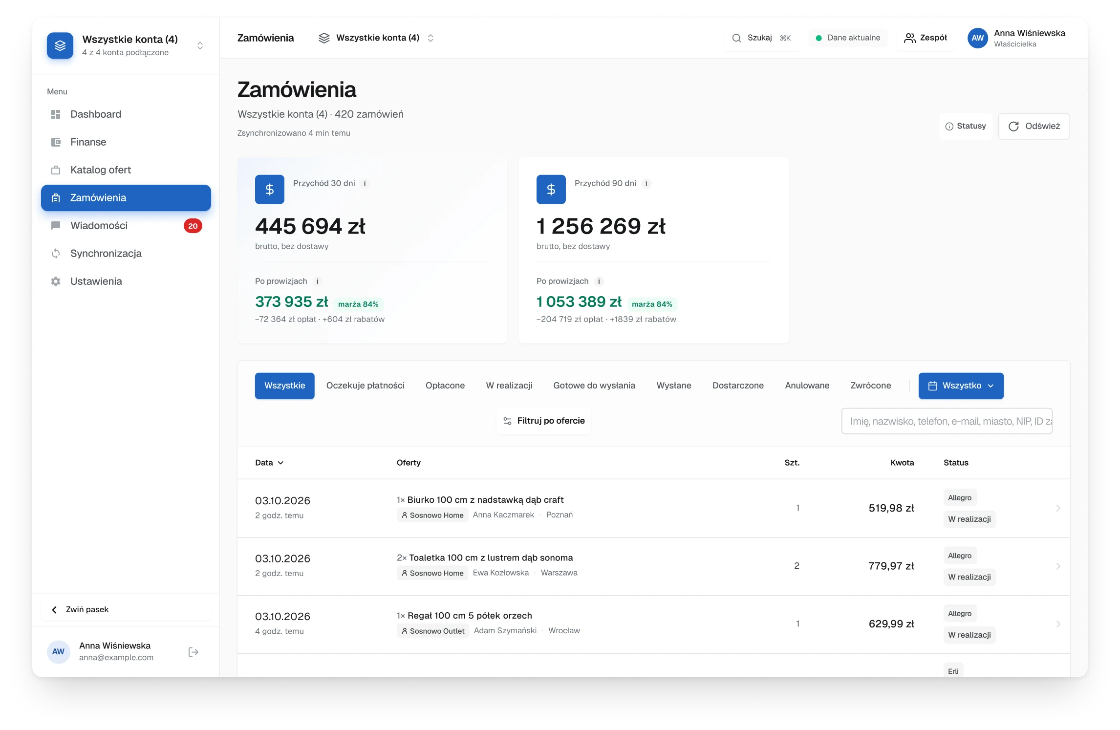
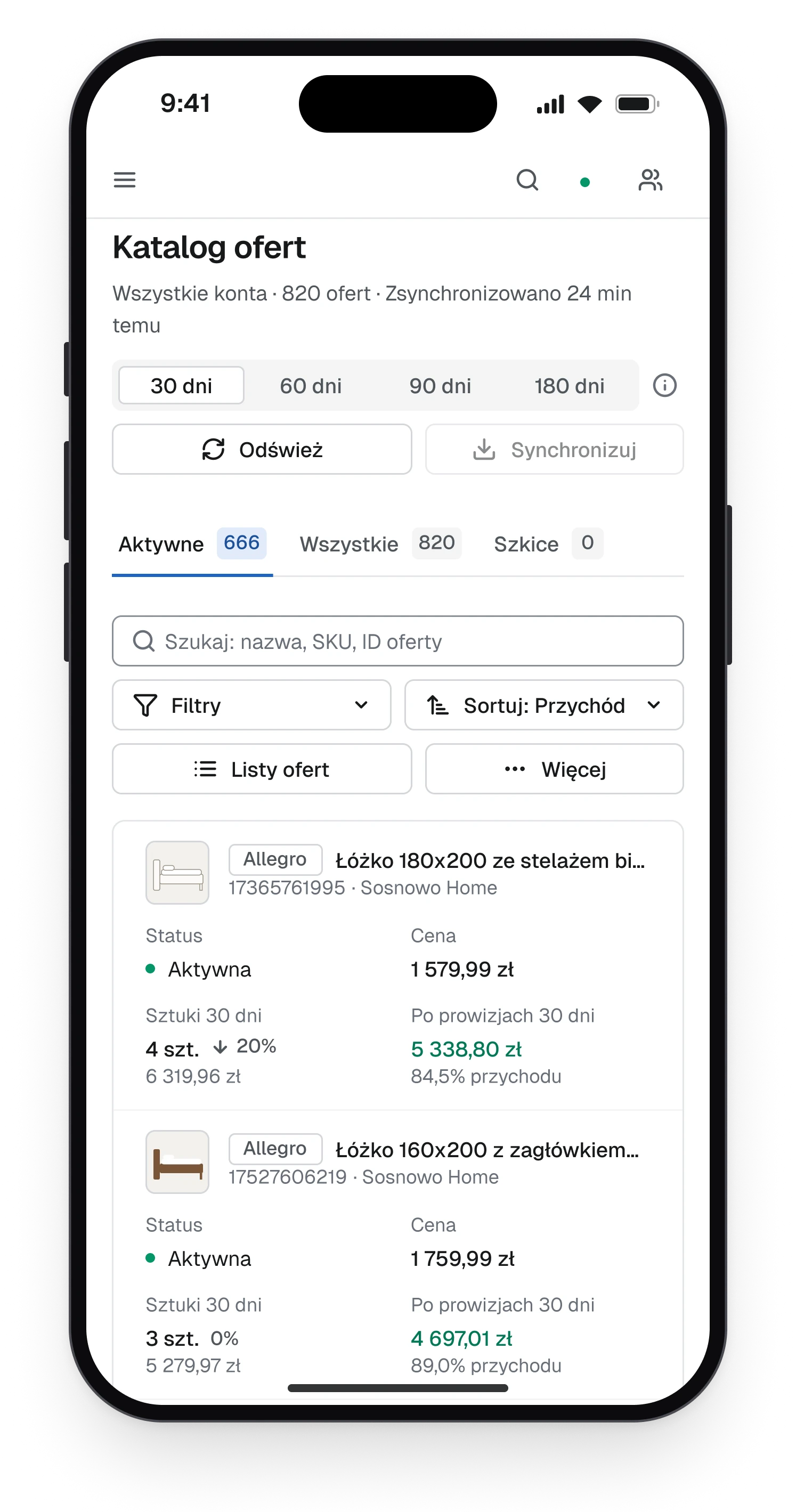
- The old first screen coloured almost everything: fees in red, changes in red and green badges, a blue tile behind every icon. The commission, a cost nobody can avoid, was the reddest thing on the screen, so the eye learned to skip red.
- Decision
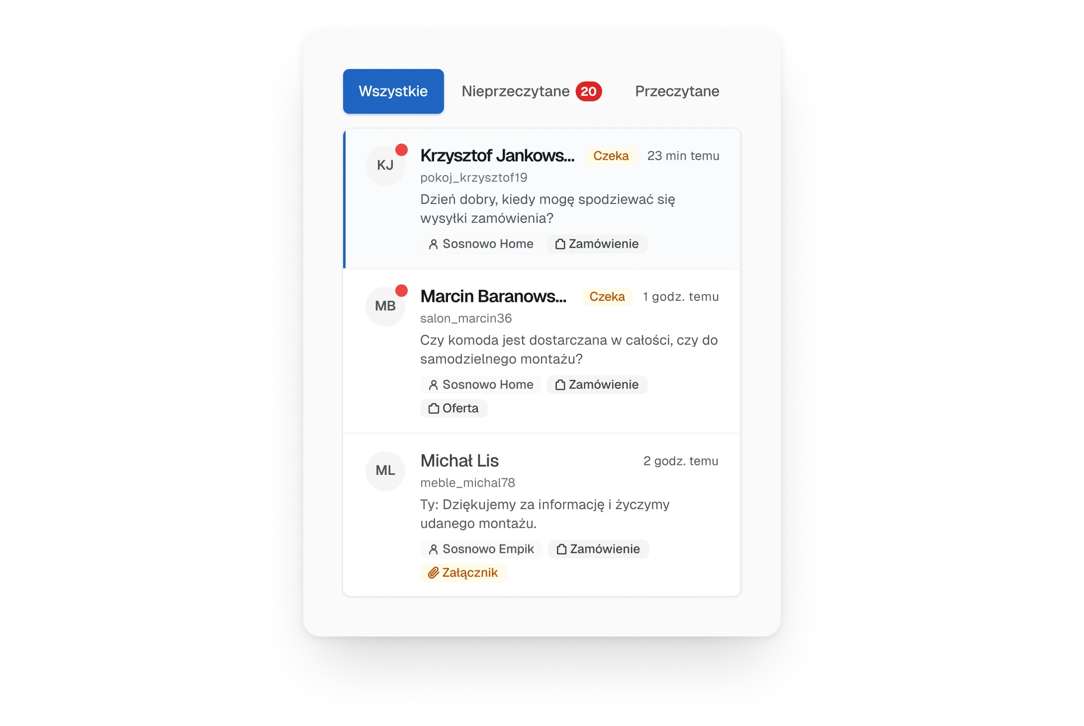
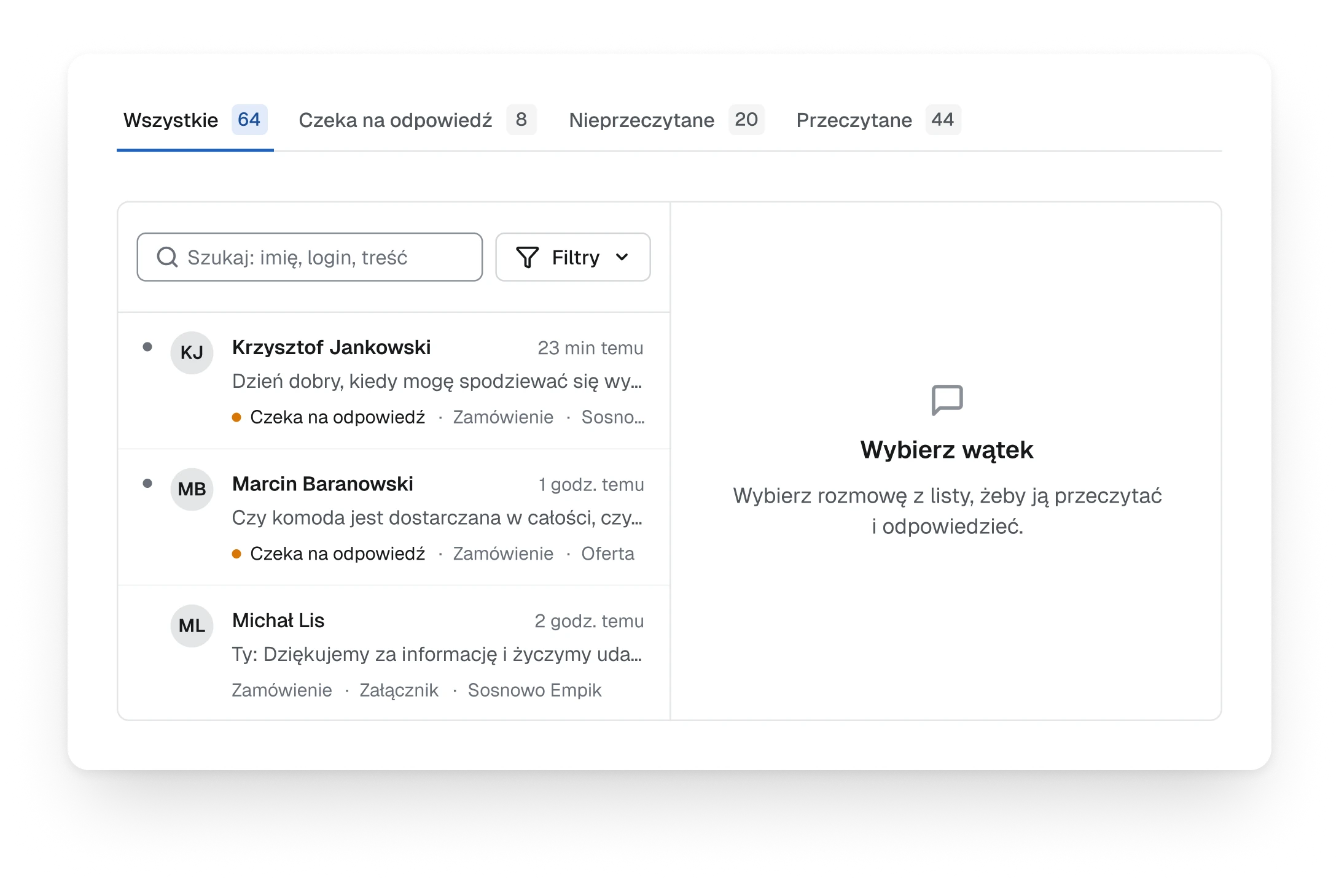
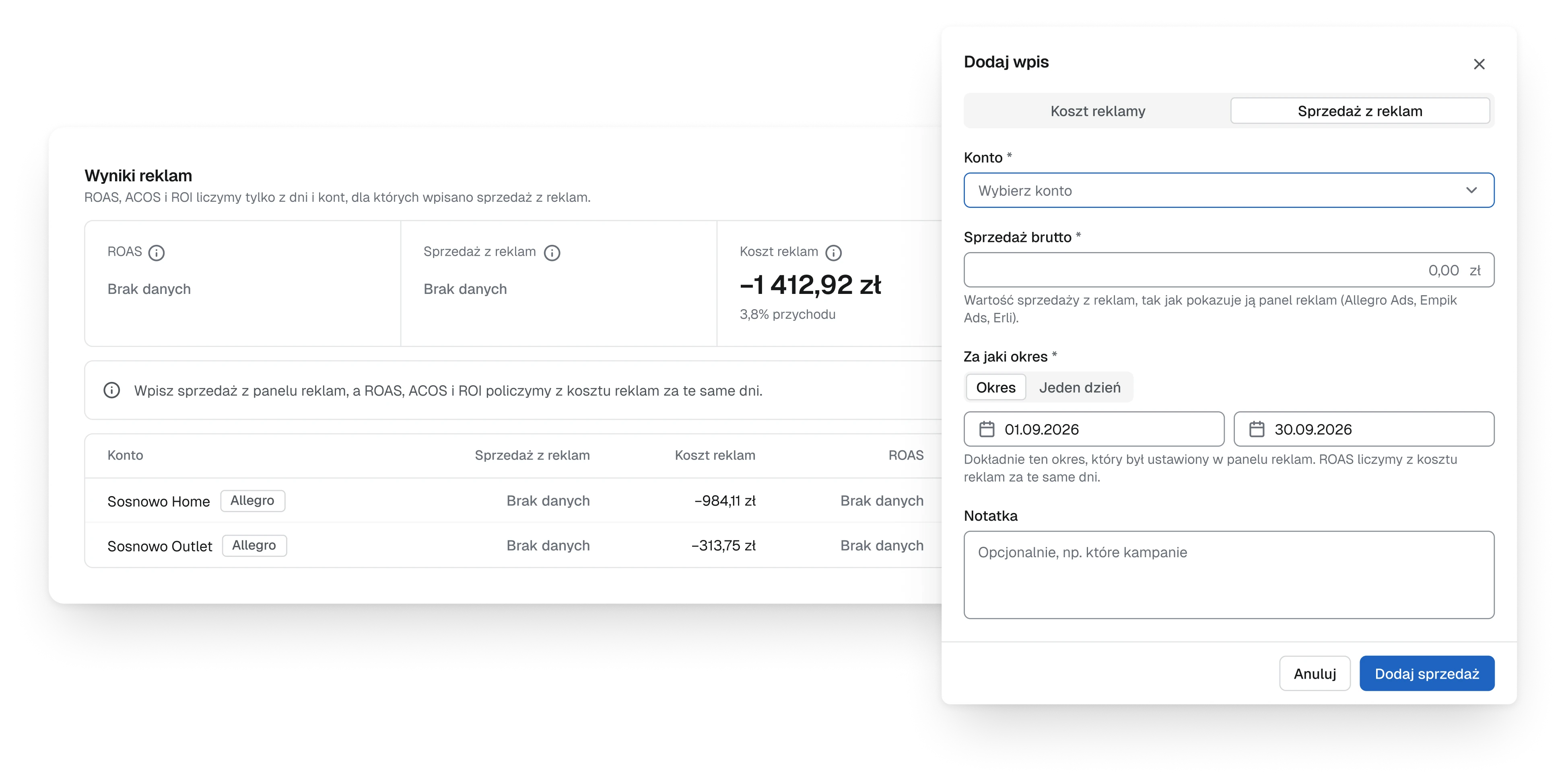
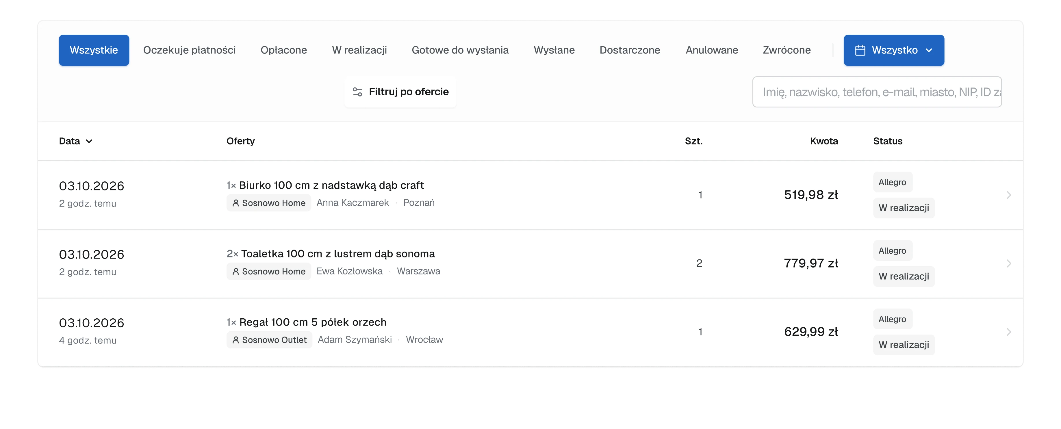
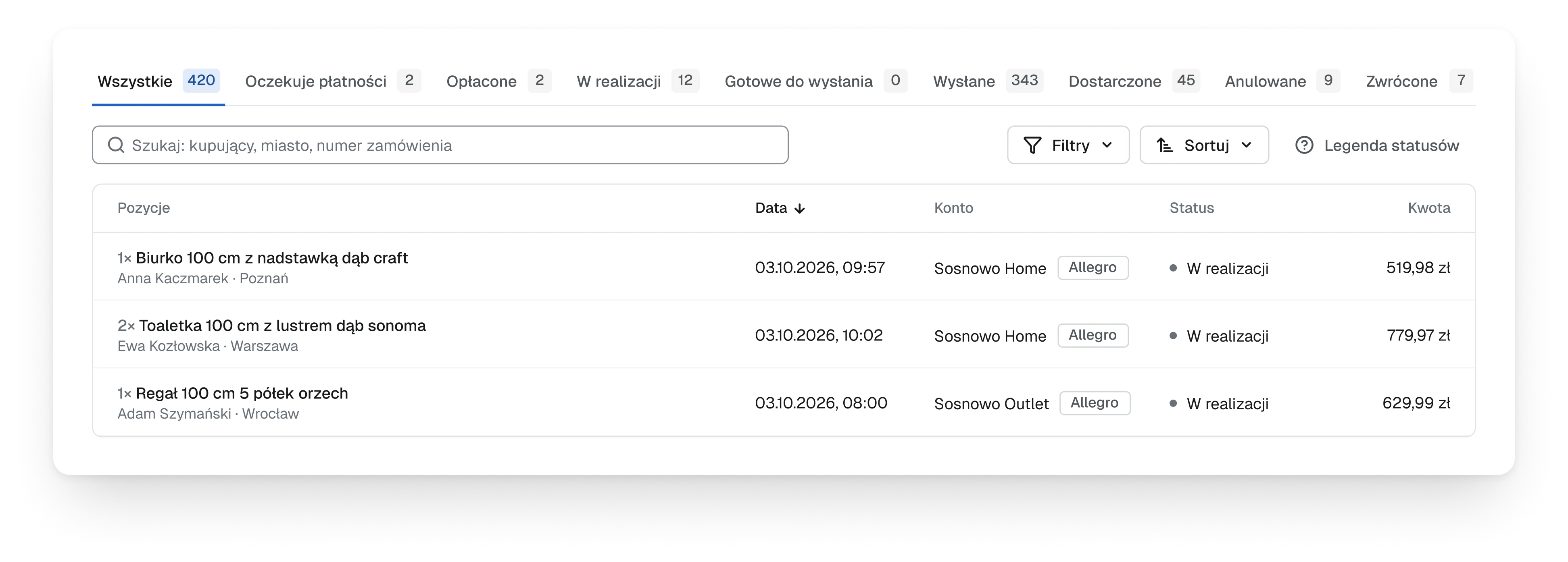
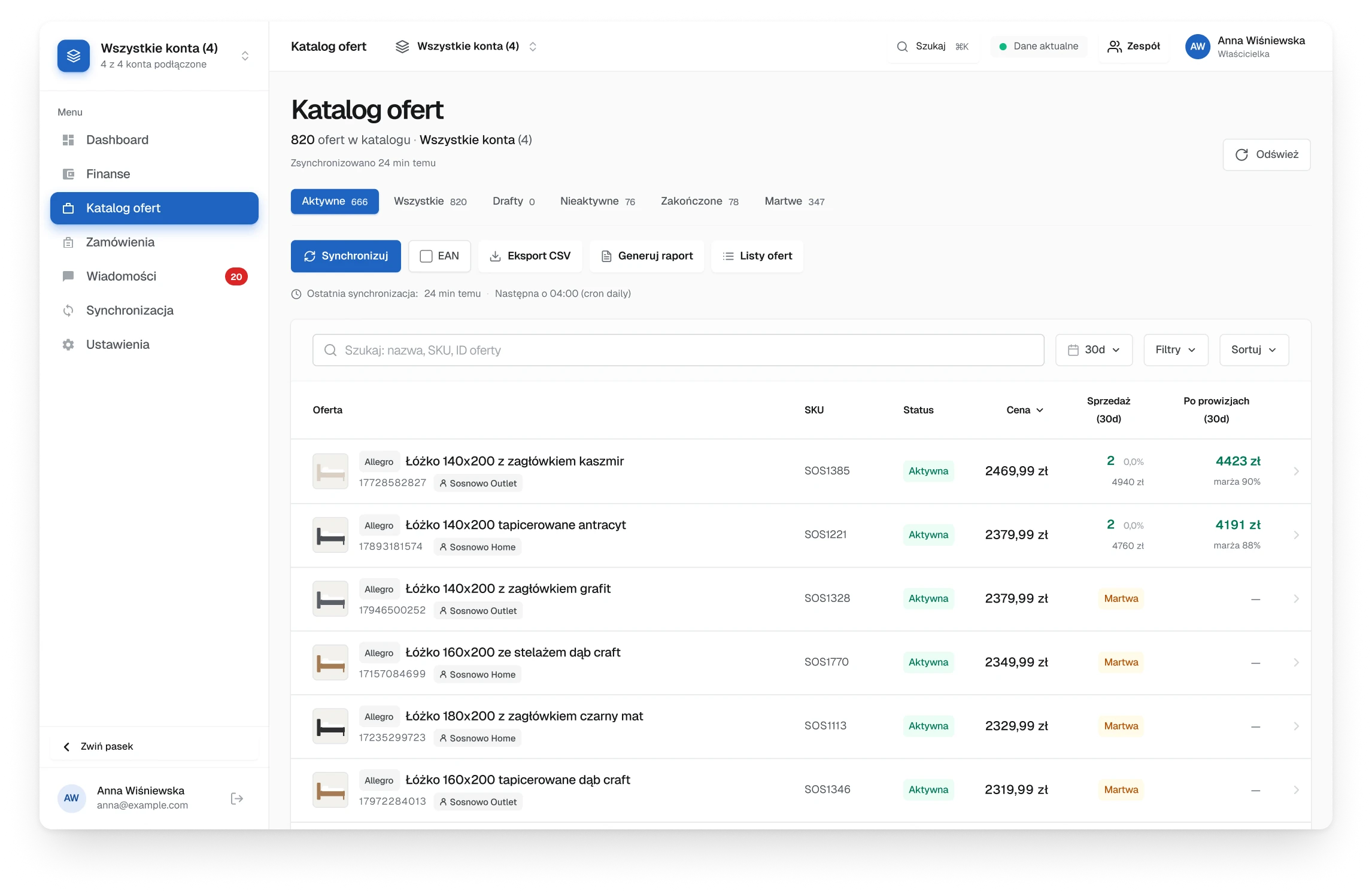
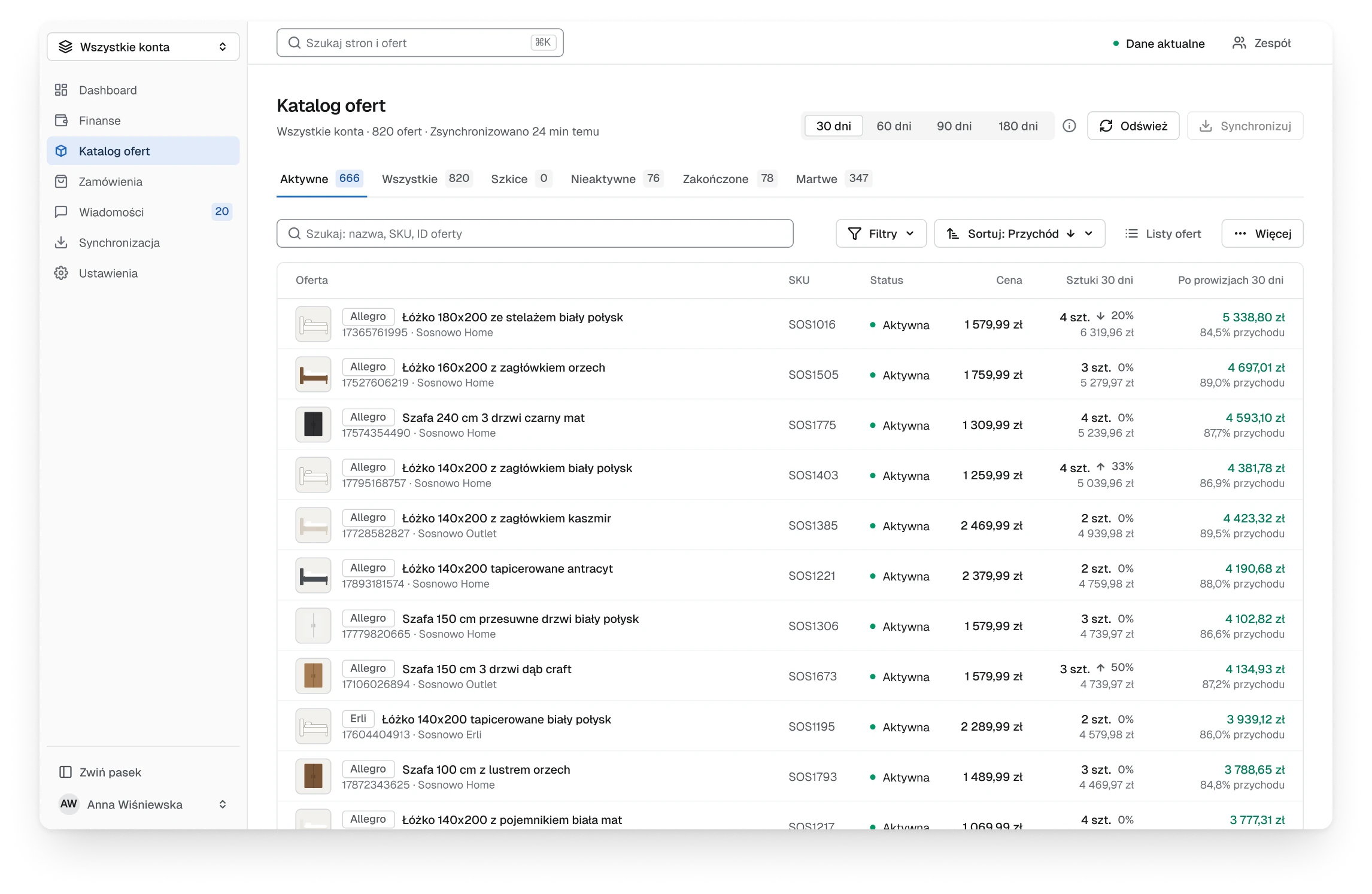
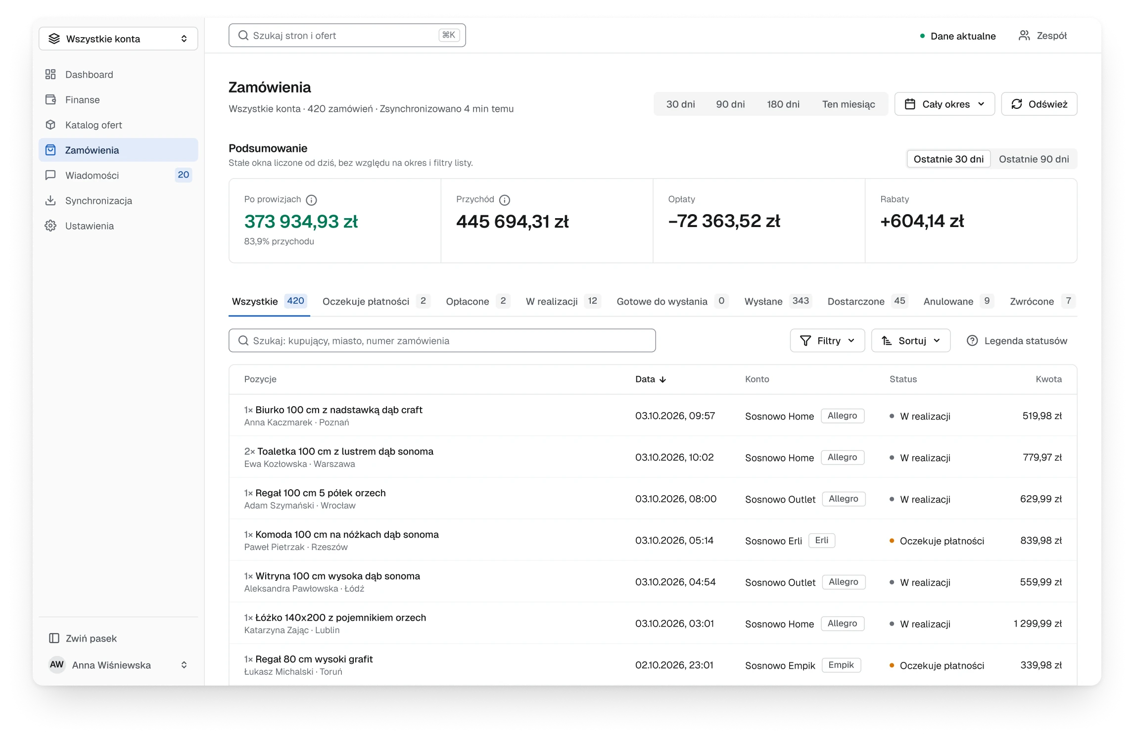
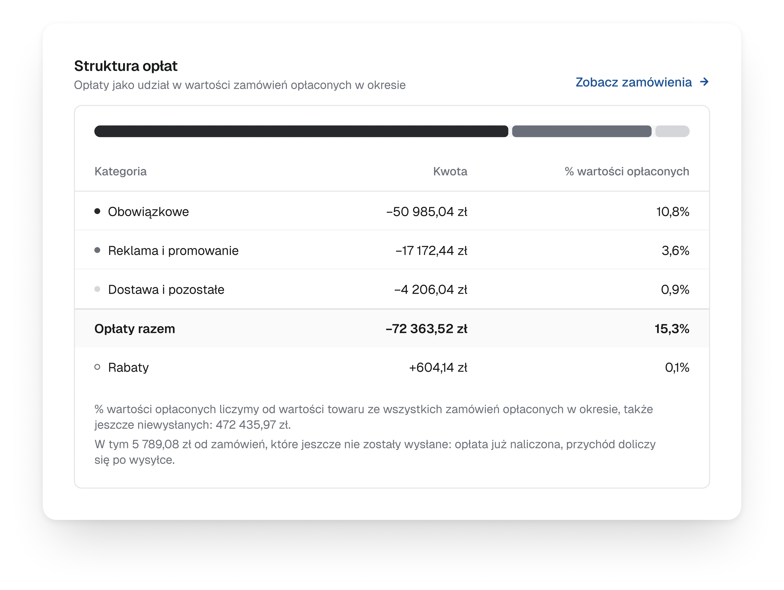
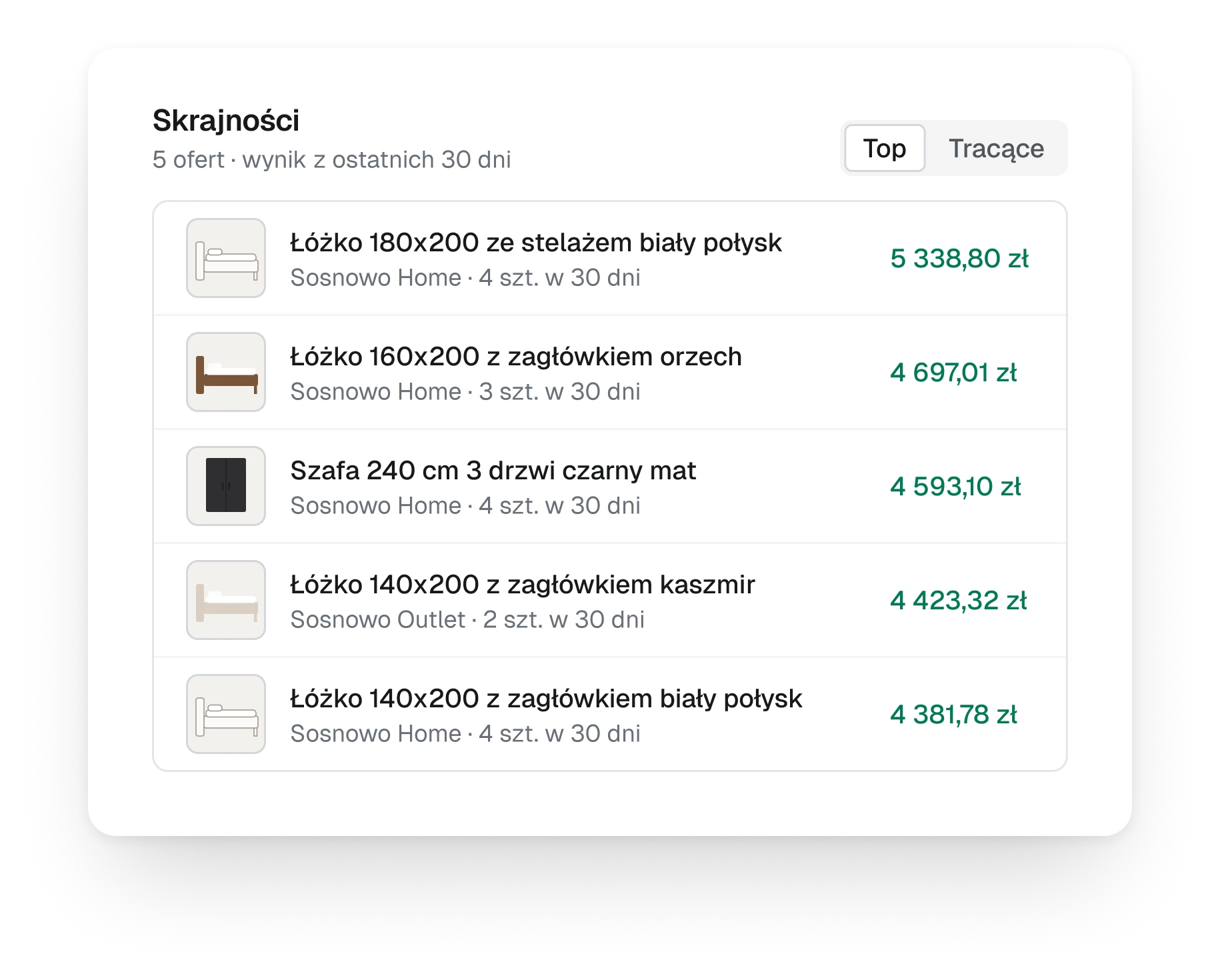
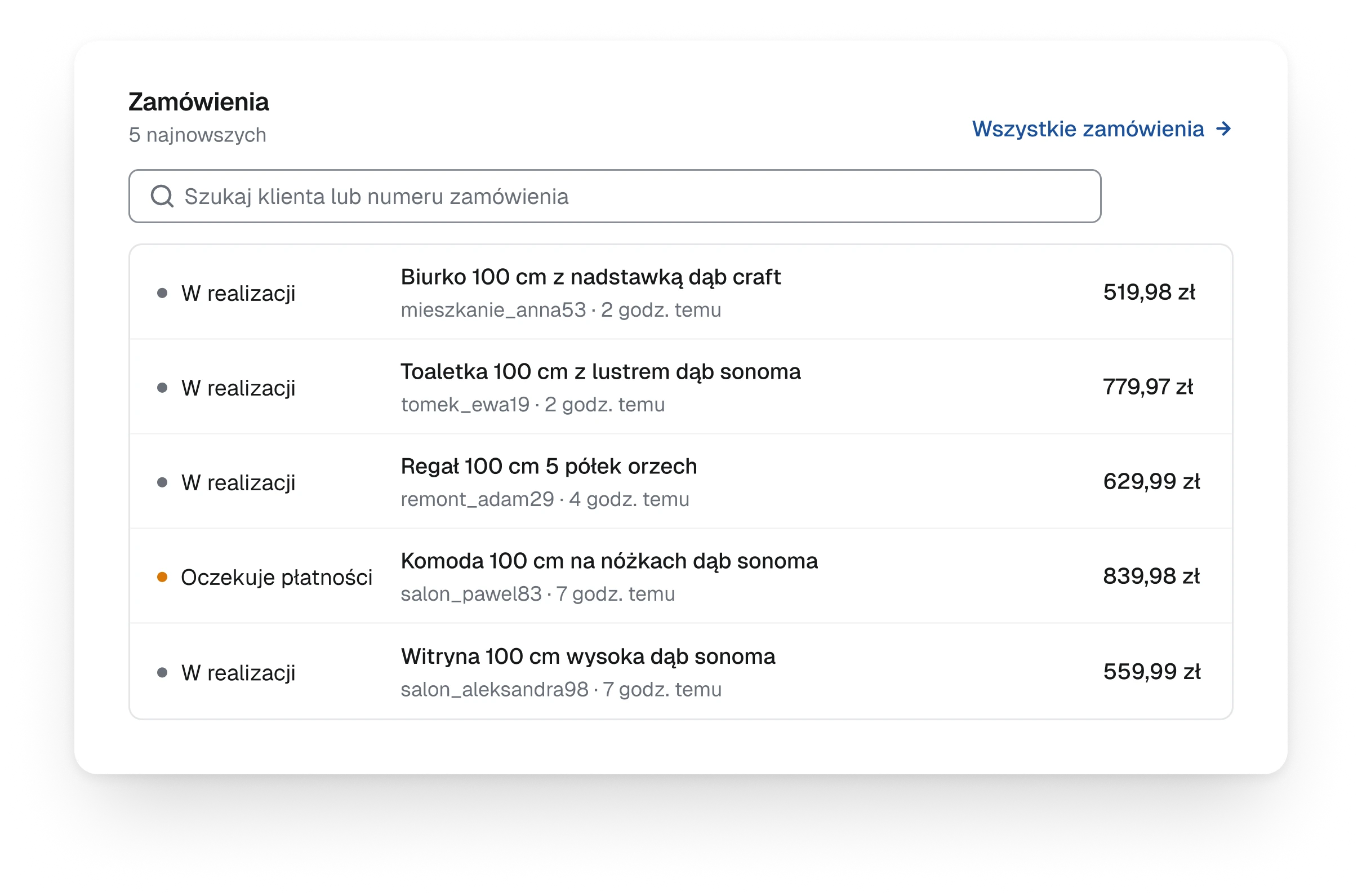
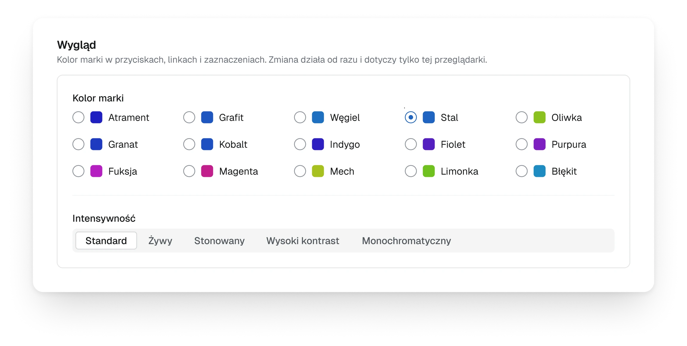
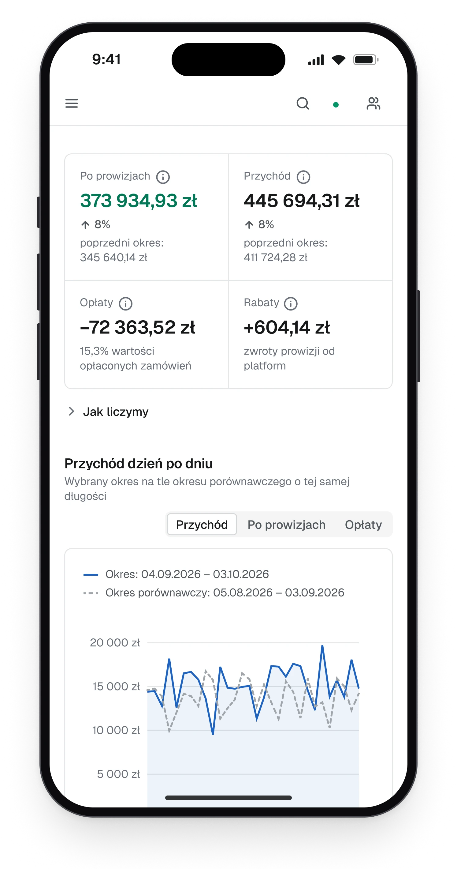
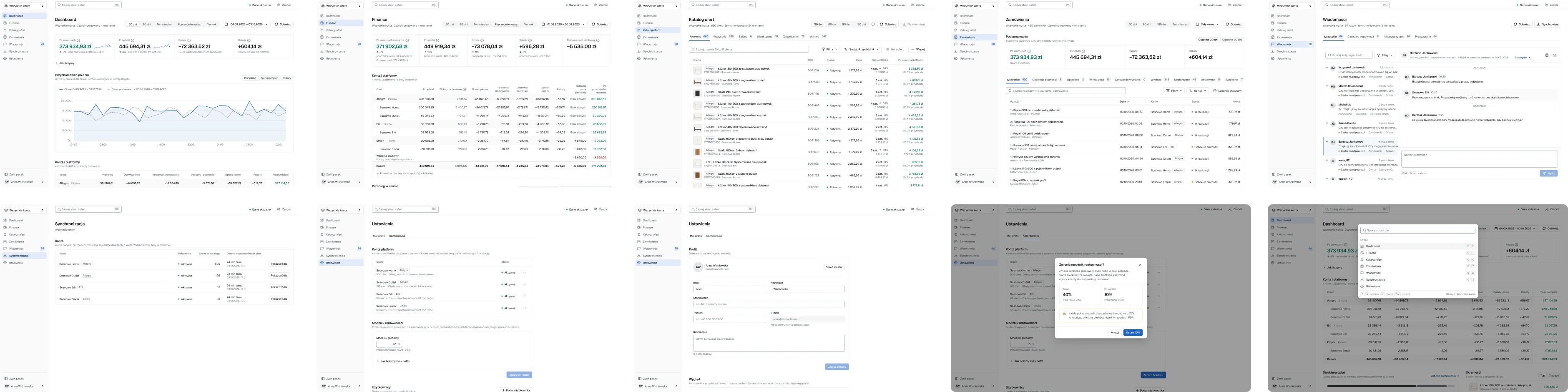
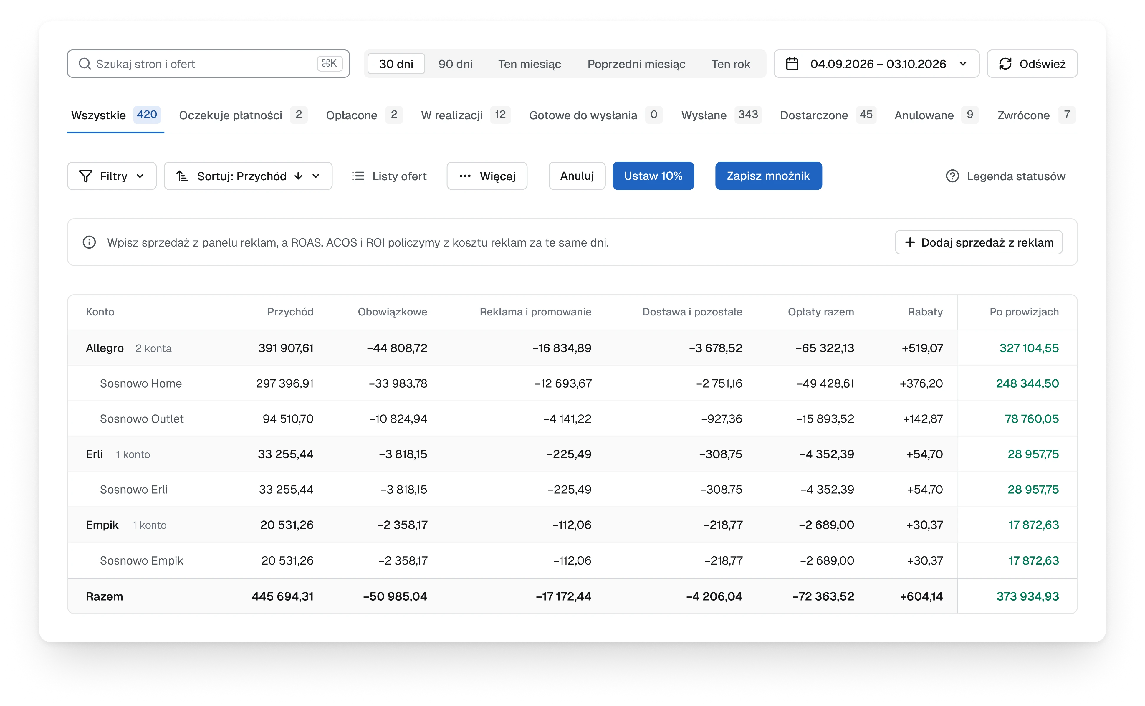
- Each colour now means one thing. Green and red belong to a single number, the result after fees, and only when it comes from the marketplaces' own billing. Amber marks what is waiting for someone. The brand blue says where you are and what is selected: the current section, the active tab, the chosen thread, the trend line. Fees carry a minus sign instead of a colour, and changes in the period are grey.
- Trade-off
- An estimated result stays grey even when it looks good. The panel would rather say less than say something it cannot back.