Case study 01 / 03UX · UI · Design system

DrukKsiążek24

E-commerce2026

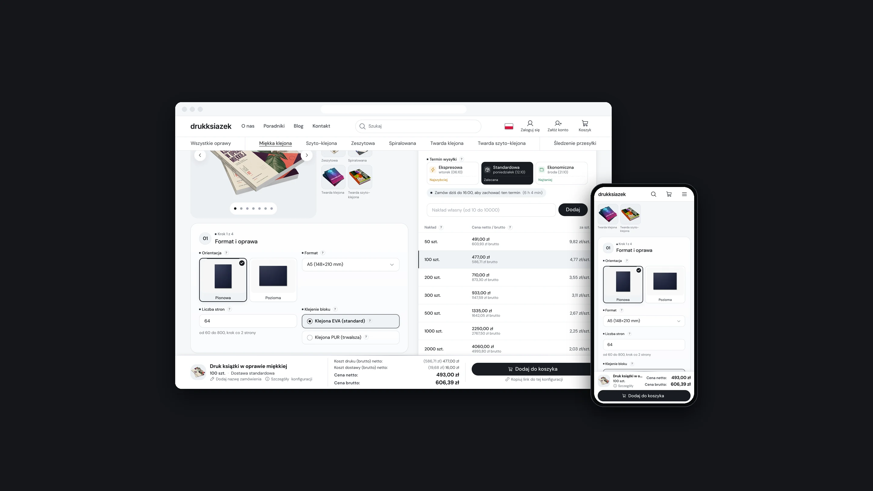
An online print shop for books, designed as one system: a configurator a first-time author can get through, an order flow that explains itself, and a panel the print house works in all day. I designed it in Figma, from the store to the admin panel.

The DrukKsiążek24 book configurator in a browser window and on a phone, on a dark background

Client
Mazowieckie Centrum Poligrafii
My role
UX/UI design
Timeline
2 to 3 months, 2026
Scope
Store and configurator / Checkout, files and tracking / Admin panel / Design system / Polish, German, French

(01)

The project

Context

Mazowieckie Centrum Poligrafii is a digital print house in Marki, near Warsaw. DrukKsiążek24 is where it sells book printing online: from 10 copies, in six bindings, with the price on screen before anyone talks to a salesperson.

The old store ran on a ready-made template. The client wanted one that could stand next to the largest print shops in Poland and carry the business into other countries.

So the job was not a new look for a shop. It was the whole path of an order: choosing a book, paying, sending files, production and delivery, and the panel where the print house handles all of it. In numbers: 31 store screens, 48 panel screens, 12 e-mails and three languages.


(02)

The problem

Problem

A book has dozens of print parameters. The customer meets them once, the print house works with them all day.

Paper, print, binding and lamination limit each other, and each of them moves the price. Files arrive after the order and can be sent back. The deadline depends on the day the files are accepted. The old calculator put all of this into one long form and left the customer to work it out.

Constraints

  • Six bindings, each with its own page range and options
  • Price depends on every parameter, the print run and the shipping date
  • Files come after payment and may need a correction
  • Three markets with their own language, currency and tax rules
  • The same components have to serve the customer and the staff

(03)

Approach

Process

  1. 01

    Structure

    Sitemap of the store, the customer account, the admin panel and the content pages.

  2. 02

    Flow

    The sales process end to end, and every status an order can have.

  3. 03

    System

    Colours, type, spacing and components as Figma variables and styles.

  4. 04

    Screens

    Store, configurator, checkout, account and admin panel.

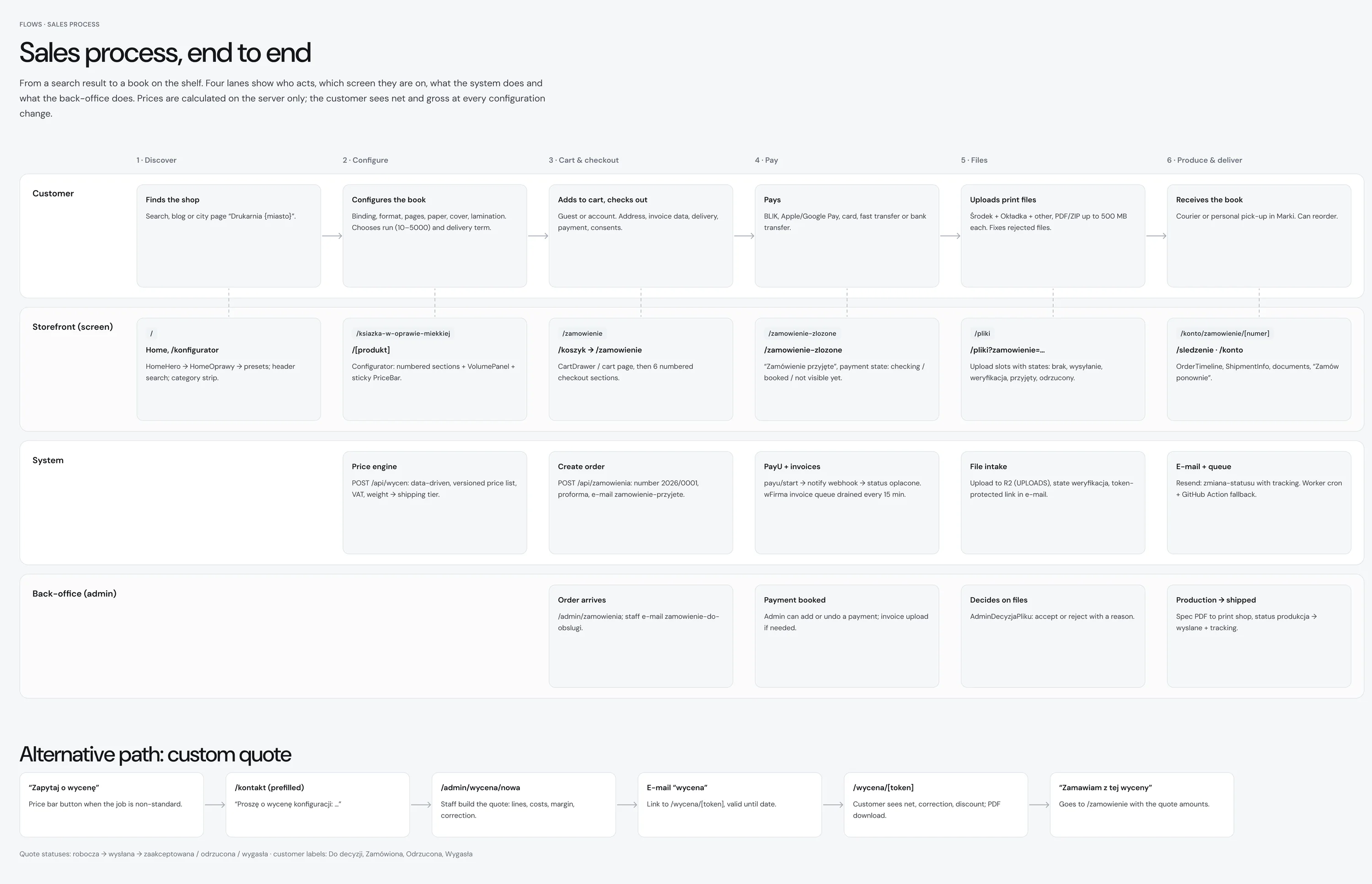
Diagram of the sales process in four lanes, from finding the shop to receiving the book
Fig. 01Sales process: what the customer does, which screen they are on, what the system and the print house do.
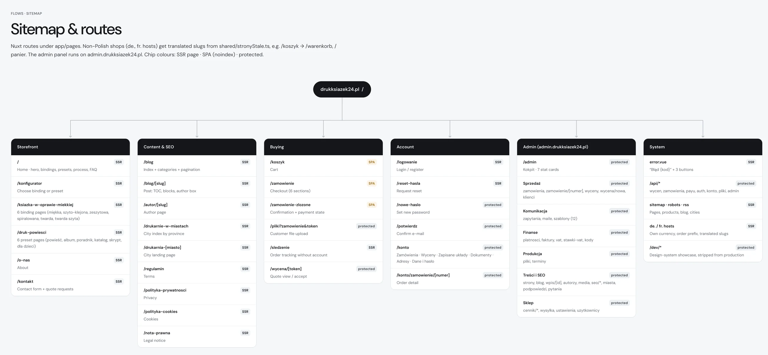
Sitemap of the store with six groups of pages
Fig. 02Sitemap and routes.
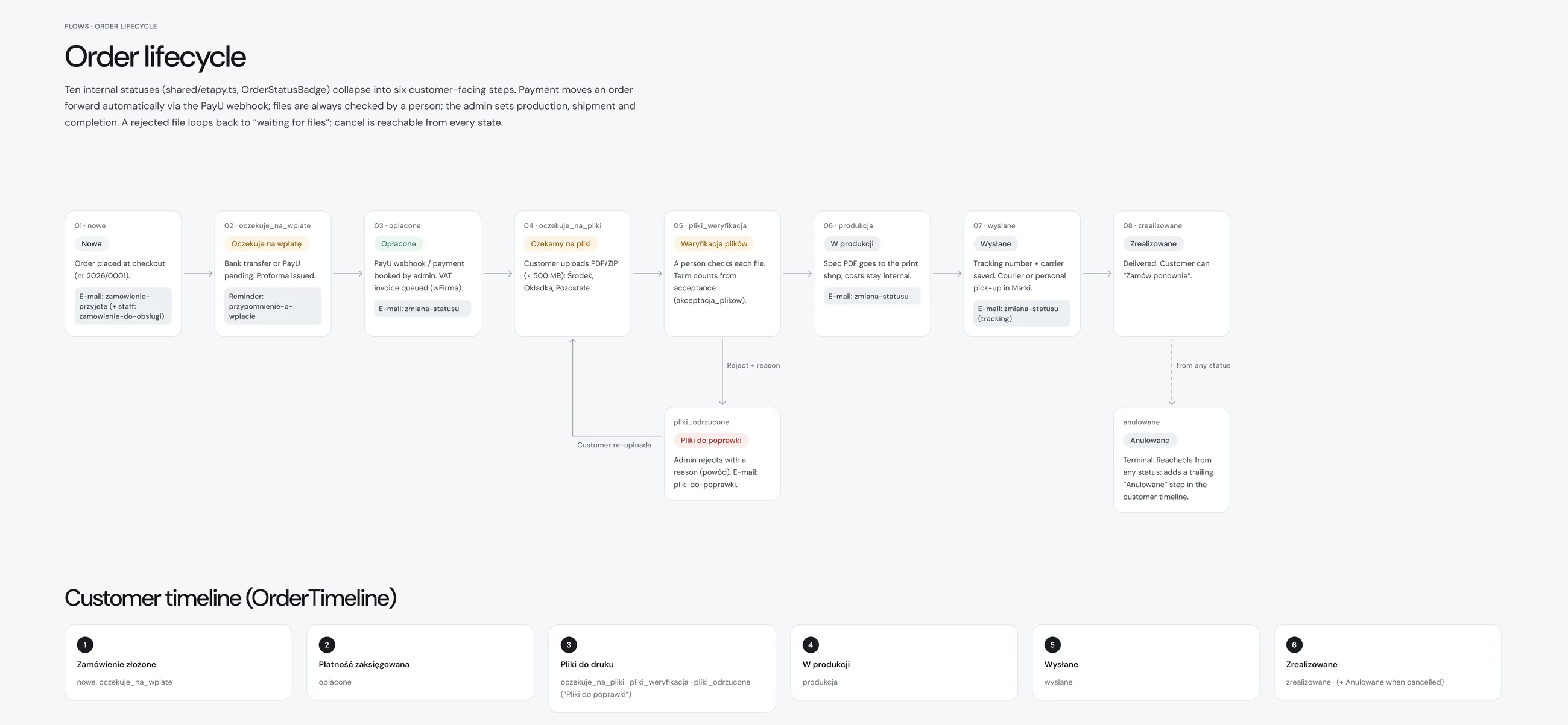
Diagram of order statuses and the timeline the customer sees
Fig. 03Order statuses, from payment to delivery.

(04)

Key decisions

Decisions

The price never leaves the screen

Context
In print the price per copy falls sharply with the print run, and almost every choice moves it. The old calculator showed the total in a third column, at the end of a long form.
Decision
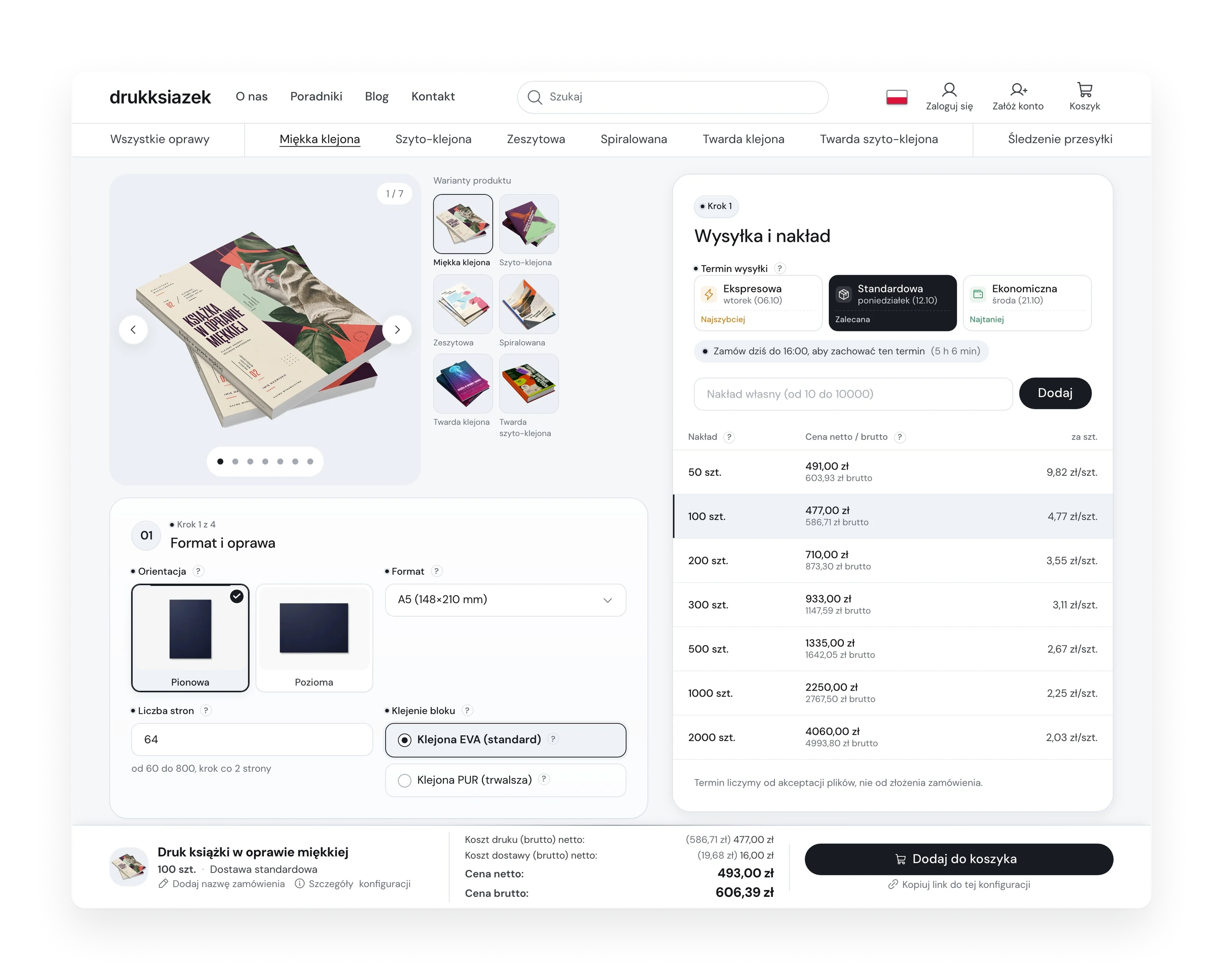
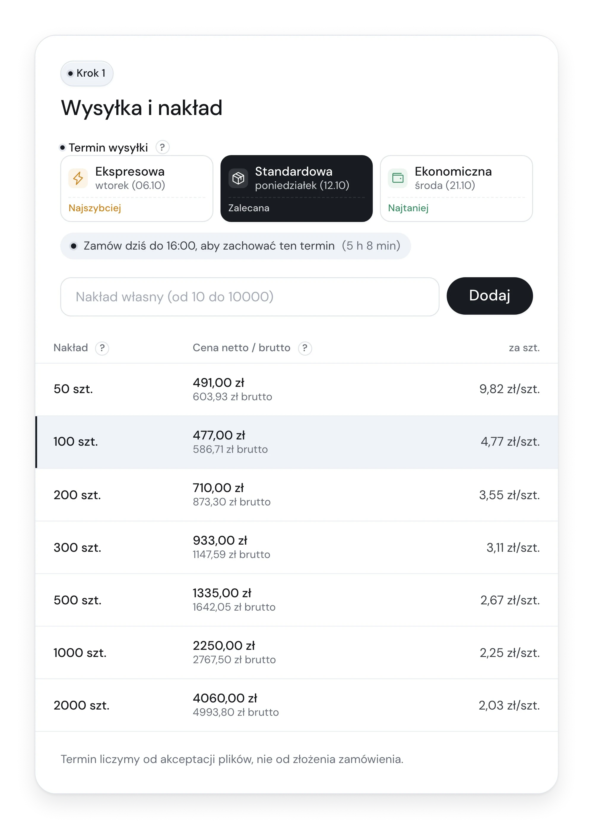
Print run and shipping date became step one, in a panel that stays next to the form. It lists seven print runs with the net, gross and per-copy price, and three shipping dates as real dates. A bar at the bottom keeps the total and the cart button in view. When a book cannot be priced, the reason stands where the price would be, with a way to ask for a quote.
Trade-off
On a phone the bar has room for the totals and one button. The cost breakdown moves into a details sheet.
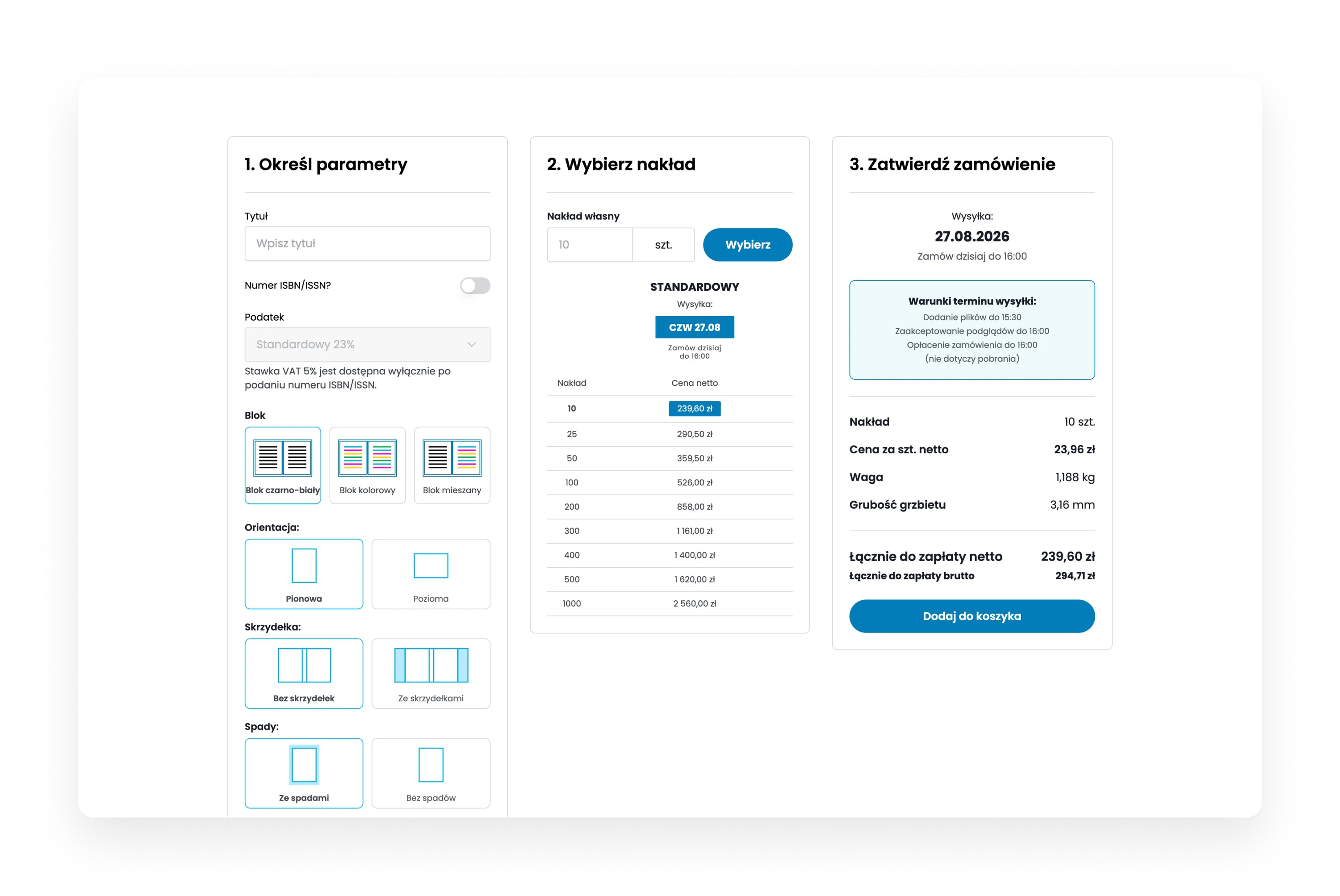
The old calculator with three columns, parameters, print run and order summary
Fig. 04Before: parameters, print run and summary in three columns.
The new configurator with the form on the left, the price table on the right and a price bar at the bottom
Fig. 05After: the form on the left, prices on the right, the total in a bar.

Print terms explained where the choice is made

Context
A first-time author does not know what 4+0, PUR or a bleed is. The old form offered them as bare dropdowns.
Decision
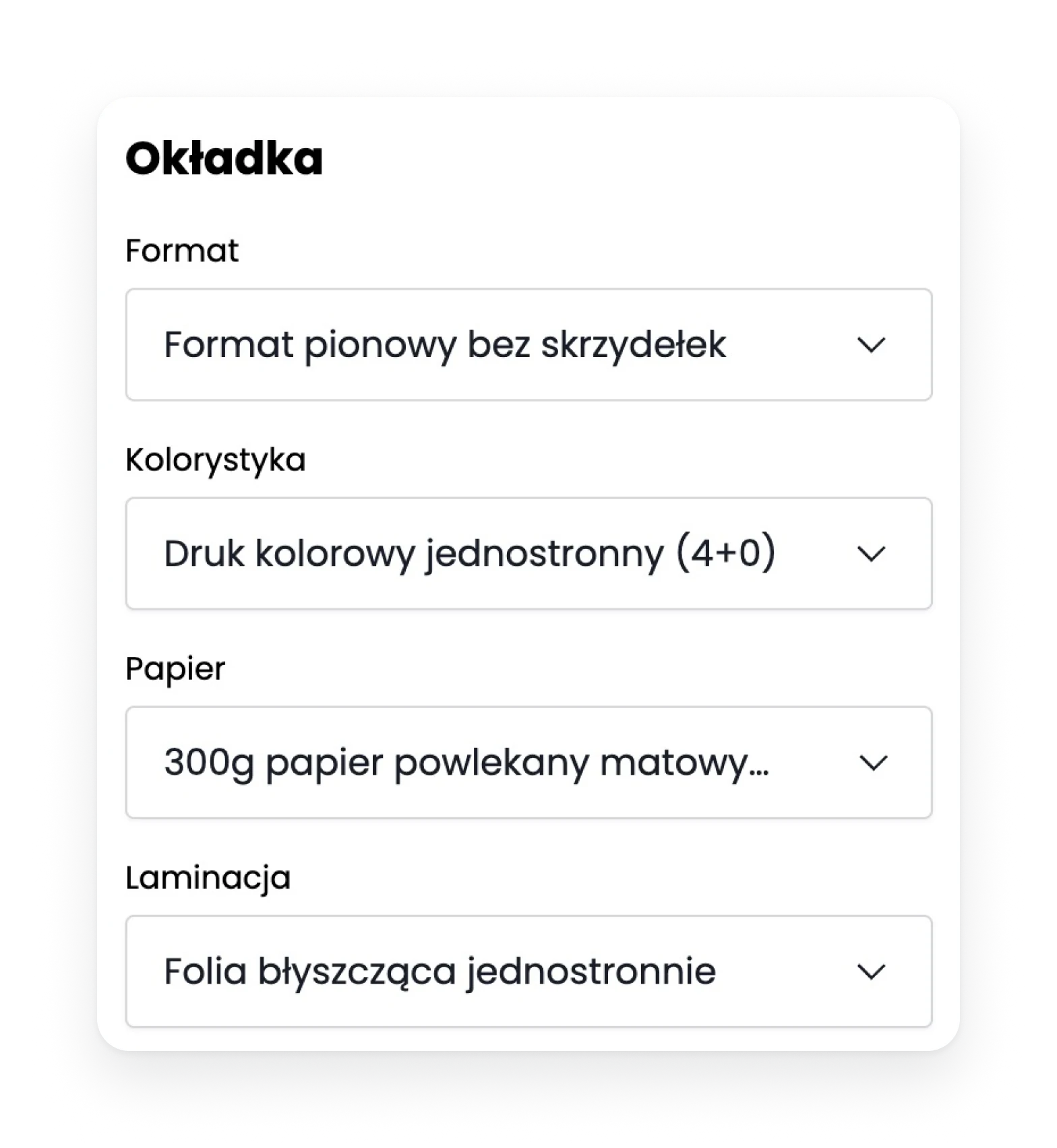
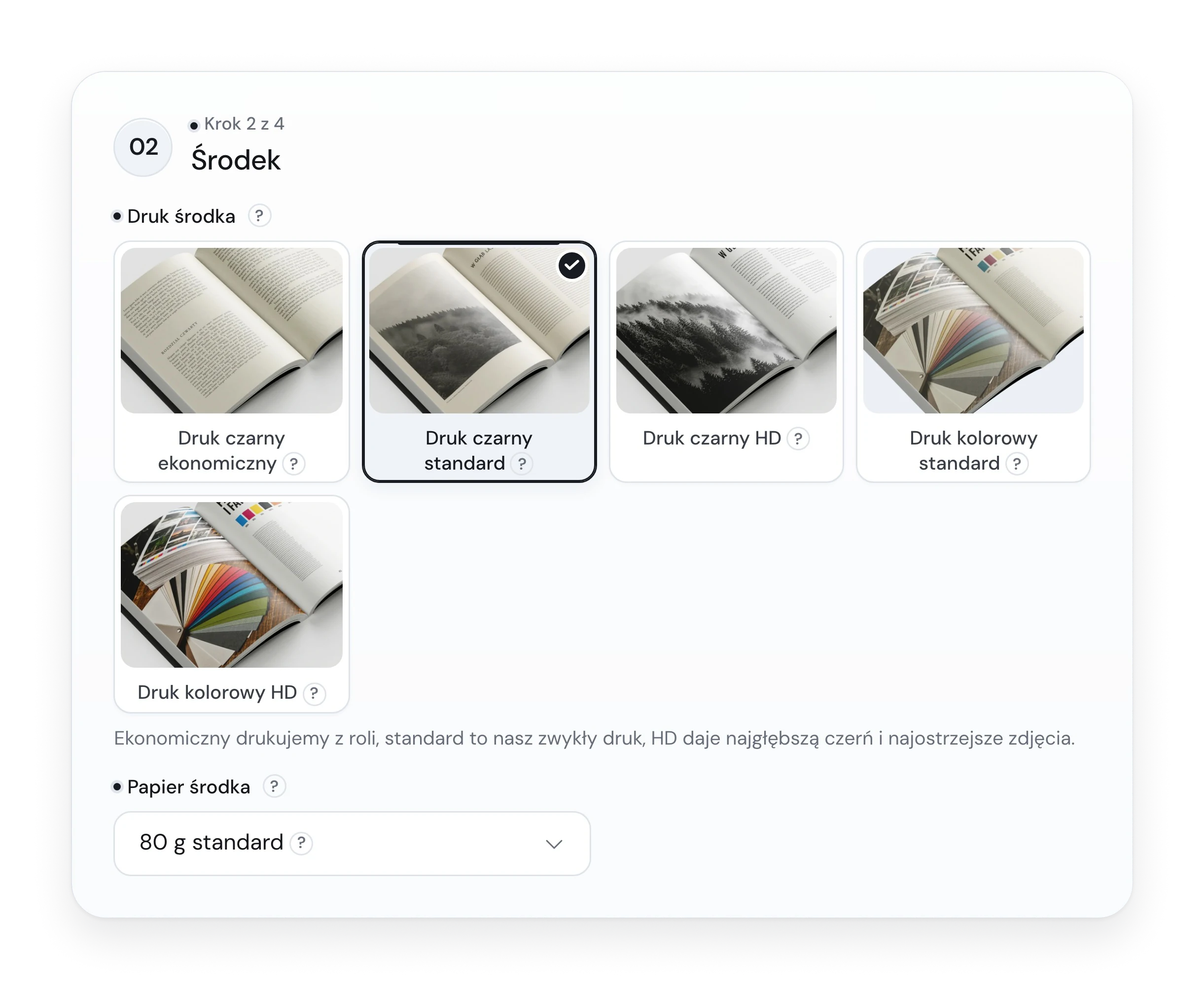
Options you can see are shown as photos. Fields and options have a hint: a short text, sometimes a drawing, and a link to the right chapter of a guide. An option that does not fit the current book stays visible but switched off, with the reason under it. A wrong page count comes with a one-click fix. What follows from other choices, like spine width, is calculated and not asked.
Trade-off
105 hints per language have to be written and kept current, so the print house edits them in the panel.
A column of dropdowns from the old form, labelled with print terms
Fig. 06Before: dropdowns with print terms.
Step two of the new configurator, with print options shown as photo tiles
Fig. 07After: step 2 of 4, print options as photos with a plain explanation.

Order first, files later, and say when the clock starts

Context
A print order is not finished at payment. The files have to arrive and pass a check, and the deadline runs from that day.
Decision
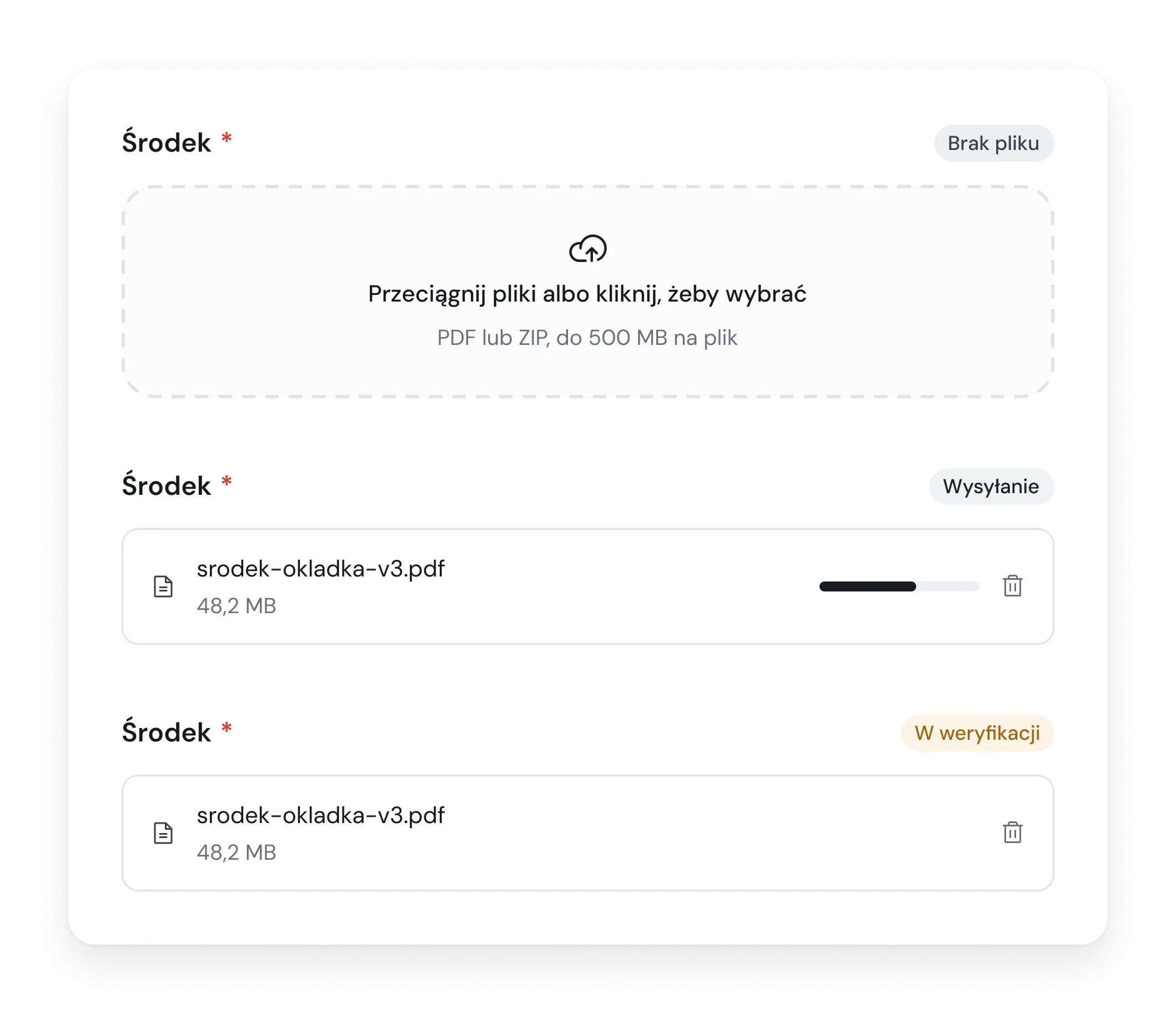
Checkout works without an account. After payment the customer uploads files into named slots: interior, cover, other. Each slot shows its state: missing, uploading, being checked, accepted, rejected. A rejected file comes back with the reason written by the person who checked it. One sentence, that the deadline counts from file acceptance, appears at every step, from the configurator to tracking. Any order can be tracked with its number and e-mail.
Trade-off
Paying before the files are checked asks for trust. So until the files are accepted the customer can cancel and get the money back, and the checkout says so.
Three states of a file slot, empty, uploading and being checked
Fig. 08File slot: missing, uploading, being checked.
Order timeline with six steps, from order placed to delivered
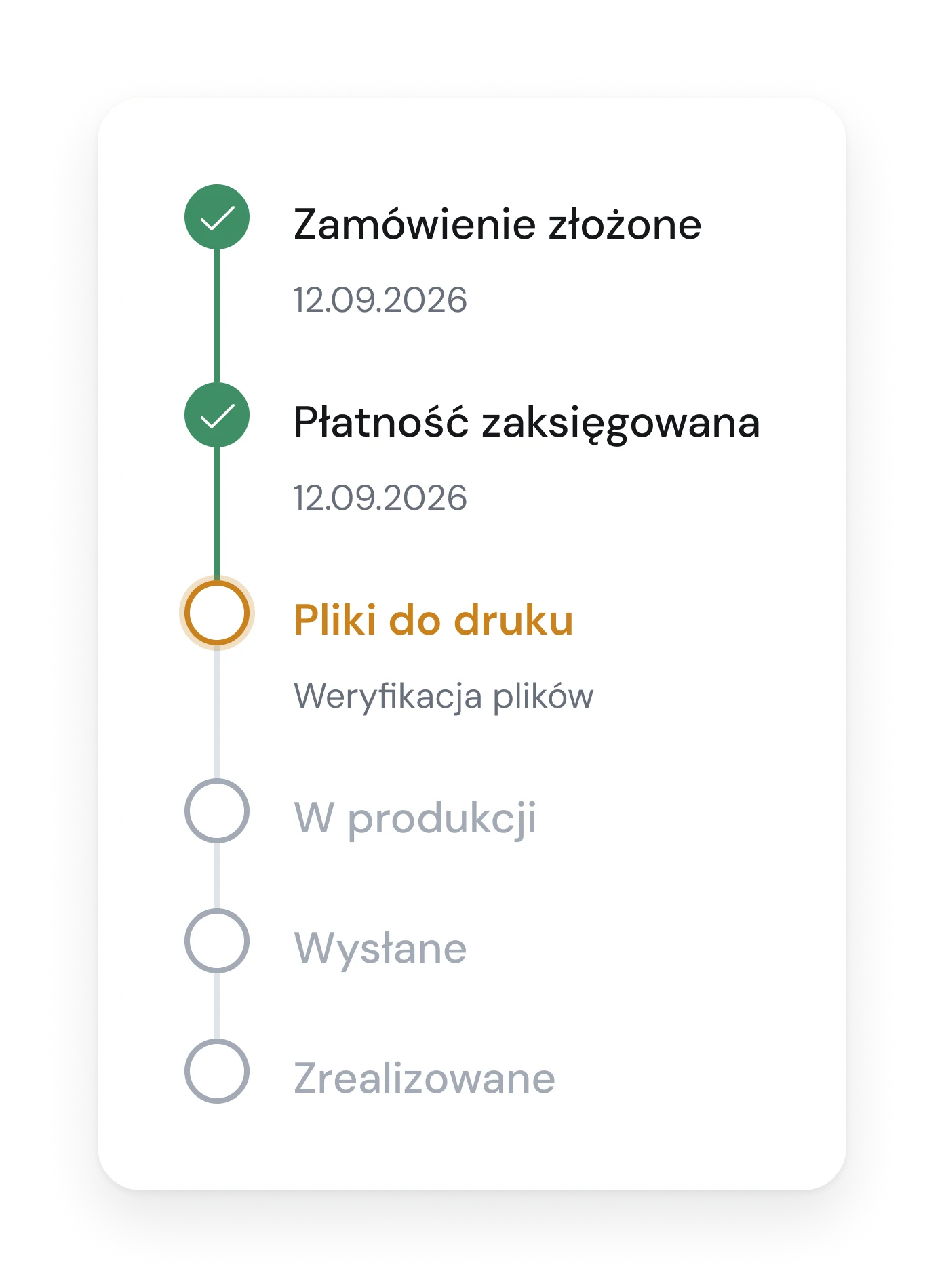
Fig. 09Order timeline as the customer sees it.

One system, two skins: shop and panel

Context
The customer sees one field at a time and comes once. The staff look at rows of orders, a search box and three buttons, all day.
Decision
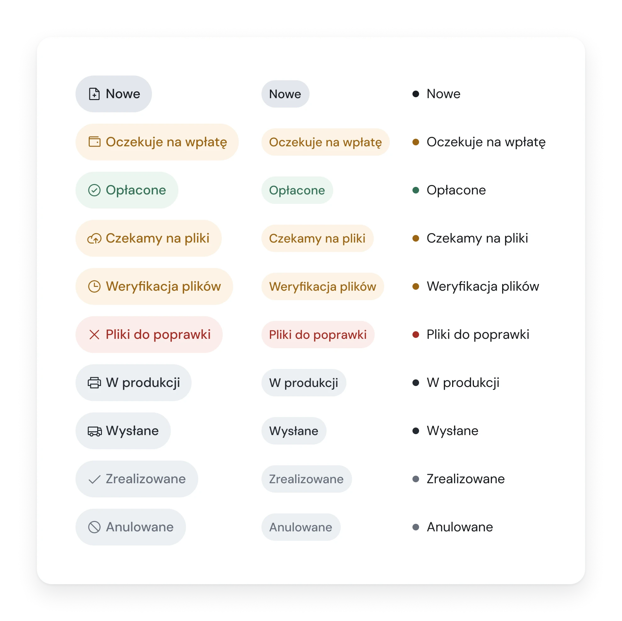
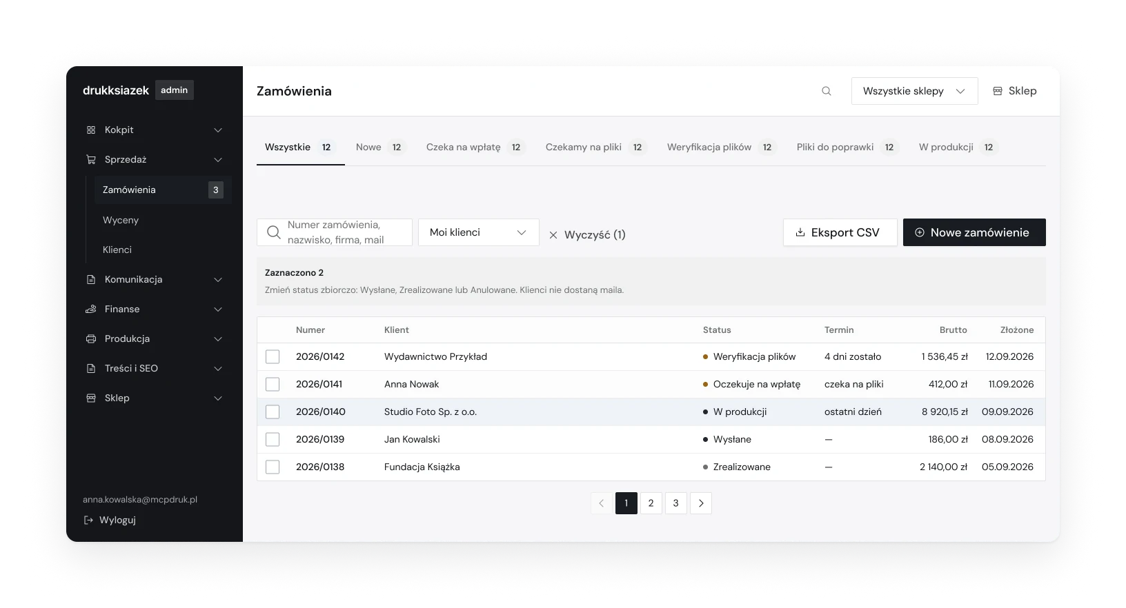
The panel uses the same components as the shop in a second mode: smaller controls, square corners, outlines instead of shadows, neutral greys, no hover animation. In tables a status is a dot and a word, because a column of filled badges turned into a wall of colour. Orders move by themselves when a payment or a file arrives. The staff have two manual steps, and the manual override and the cancel button are quiet on purpose.
Trade-off
Every component has to hold up in both modes, so each one is checked in both before it reaches a screen.
Order status badges in three forms, filled with an icon, quiet, and a dot with a word
Fig. 10One status, three forms: with an icon, quiet, and a dot with a word for tables.
Orders list in the admin panel with a dot and a word for every status
Fig. 11Orders in the panel: square corners, outlines, a dot and a word for the status.

Three markets, one store

Context
The client wanted to sell in Germany and France. Each market has its own language, currency, tax rates and rules for showing prices.
Decision
One store, recognised by its address. Polish text is the default and each shop replaces only what differs. In the German and French shops the gross price leads, the tax number field is named as it is in the buyer's country, and page addresses are translated. The price list is converted from the Polish one by an exchange rate, and the panel shows which shop is up to date.
Trade-off
A missing translation shows as a Polish sentence. That is deliberate: a gap you can see gets fixed, a silent fallback does not.
Print run table in the Polish shop with net prices in złoty
Fig. 12Poland: net price leads, in złoty.
The same table in the German shop with gross prices in euro
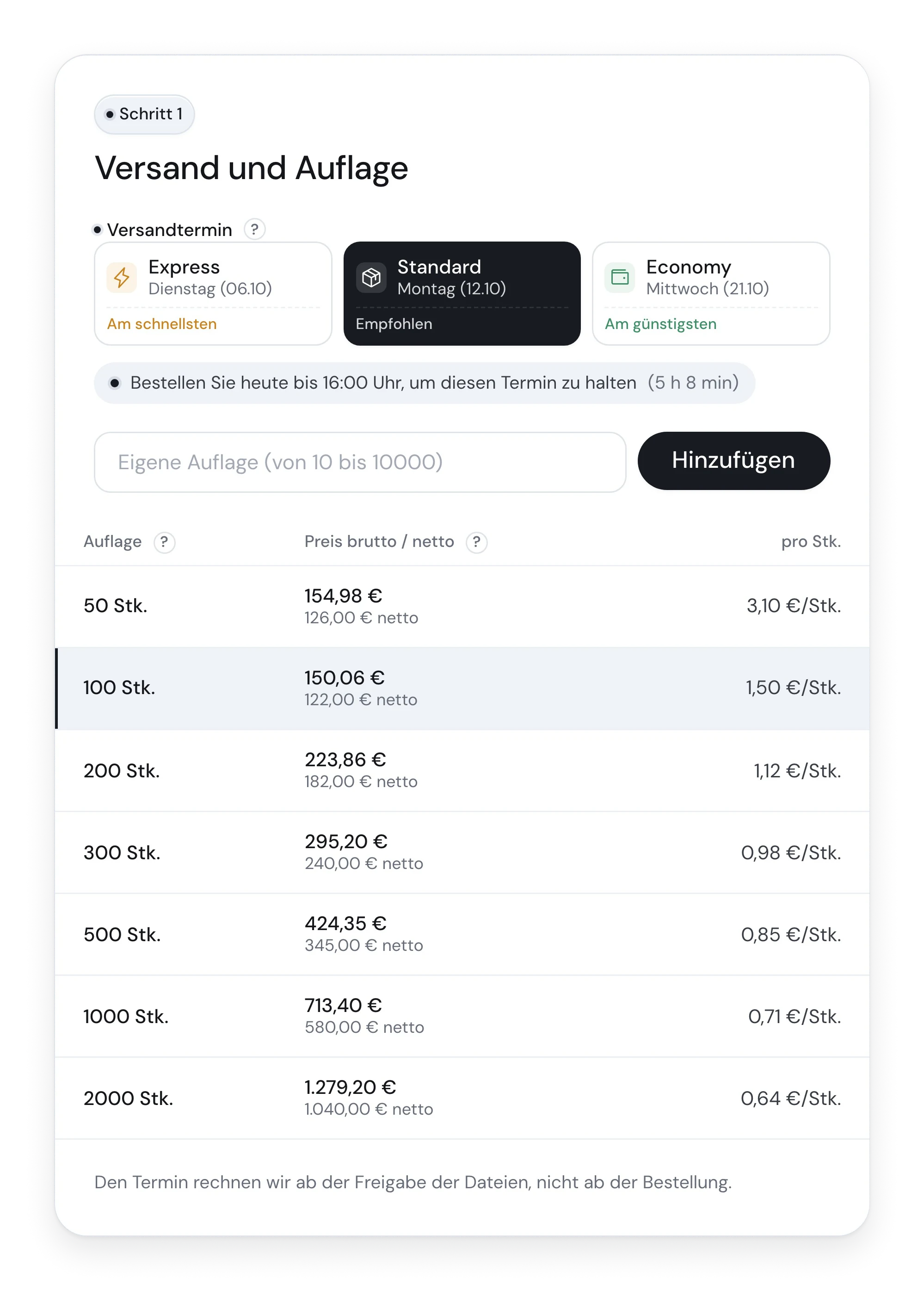
Fig. 13Germany: gross price leads, in euro.
The same table in the French shop
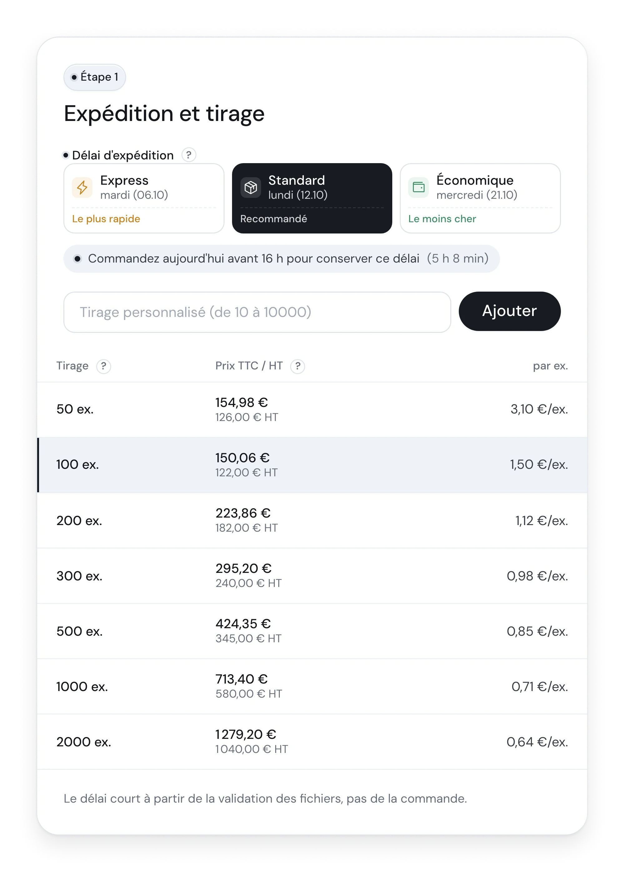
Fig. 14France: the same panel in French.

(05)

Design

Visuals

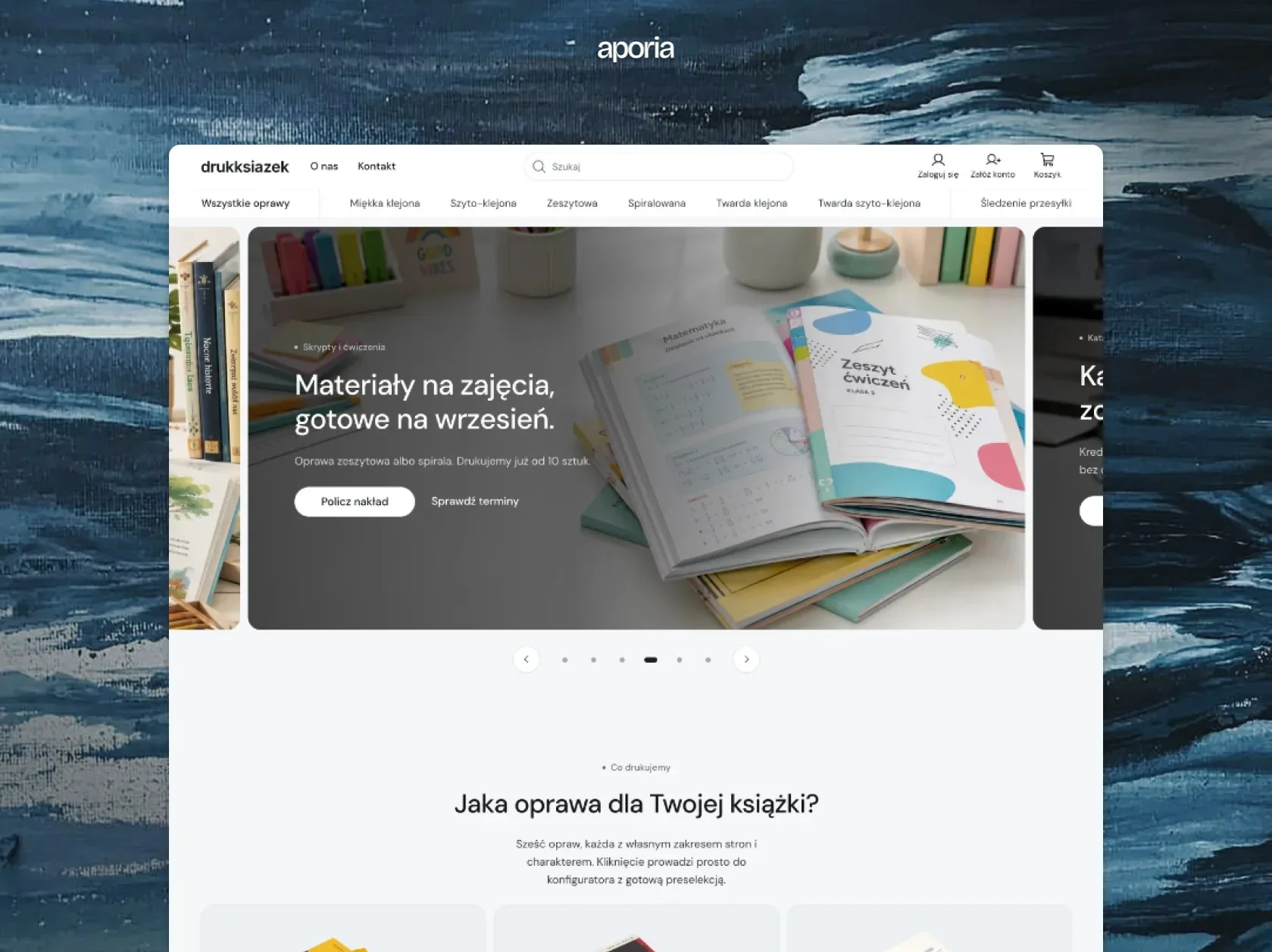
Home page of the store with a hero slider and the start of the bindings section
Fig. 15Home page.
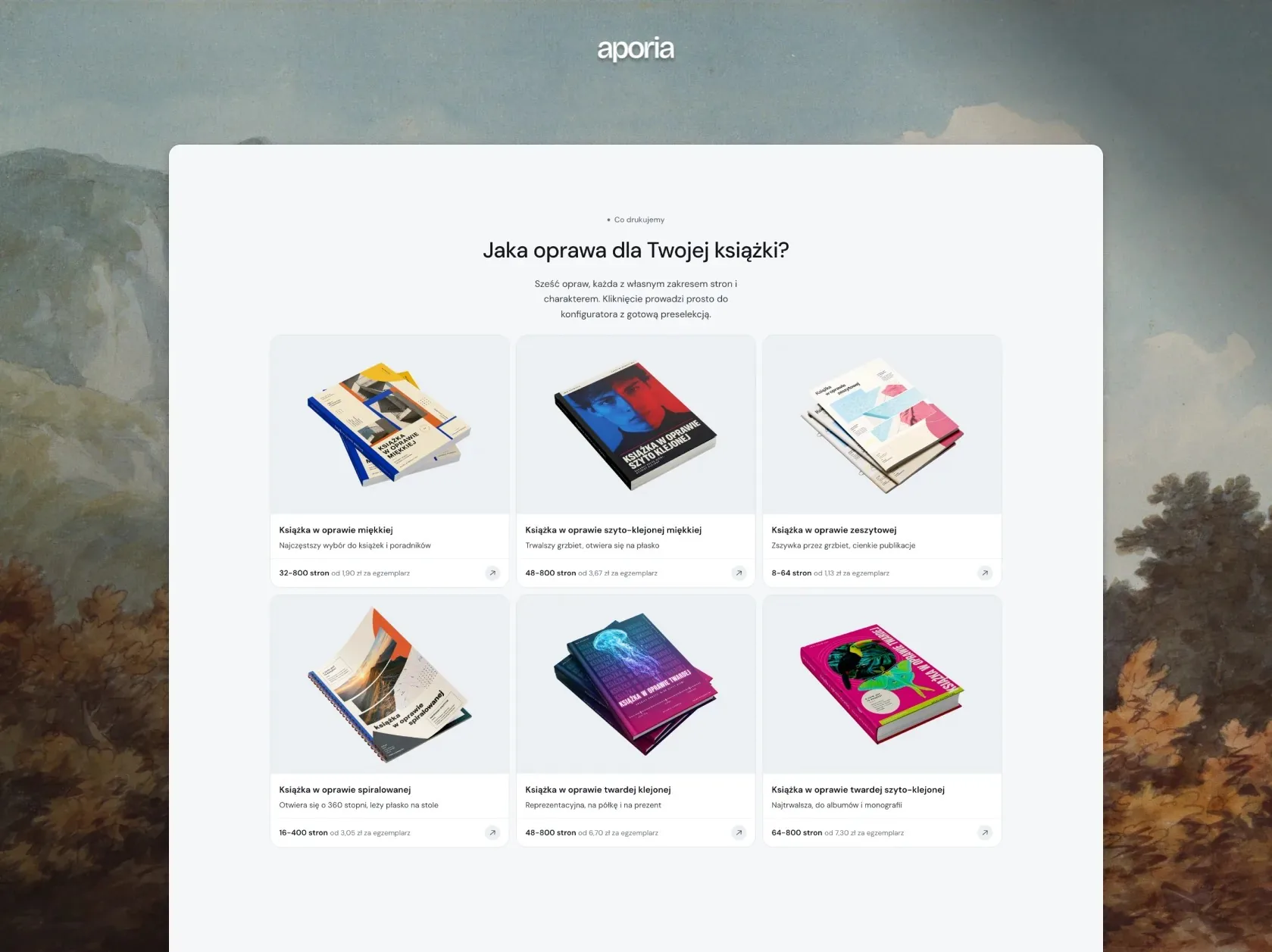
Six binding cards, each with a photo, a page range and a starting price
Fig. 16Six bindings, each with a page range and a starting price.
A carousel of book presets, with the novel card in front
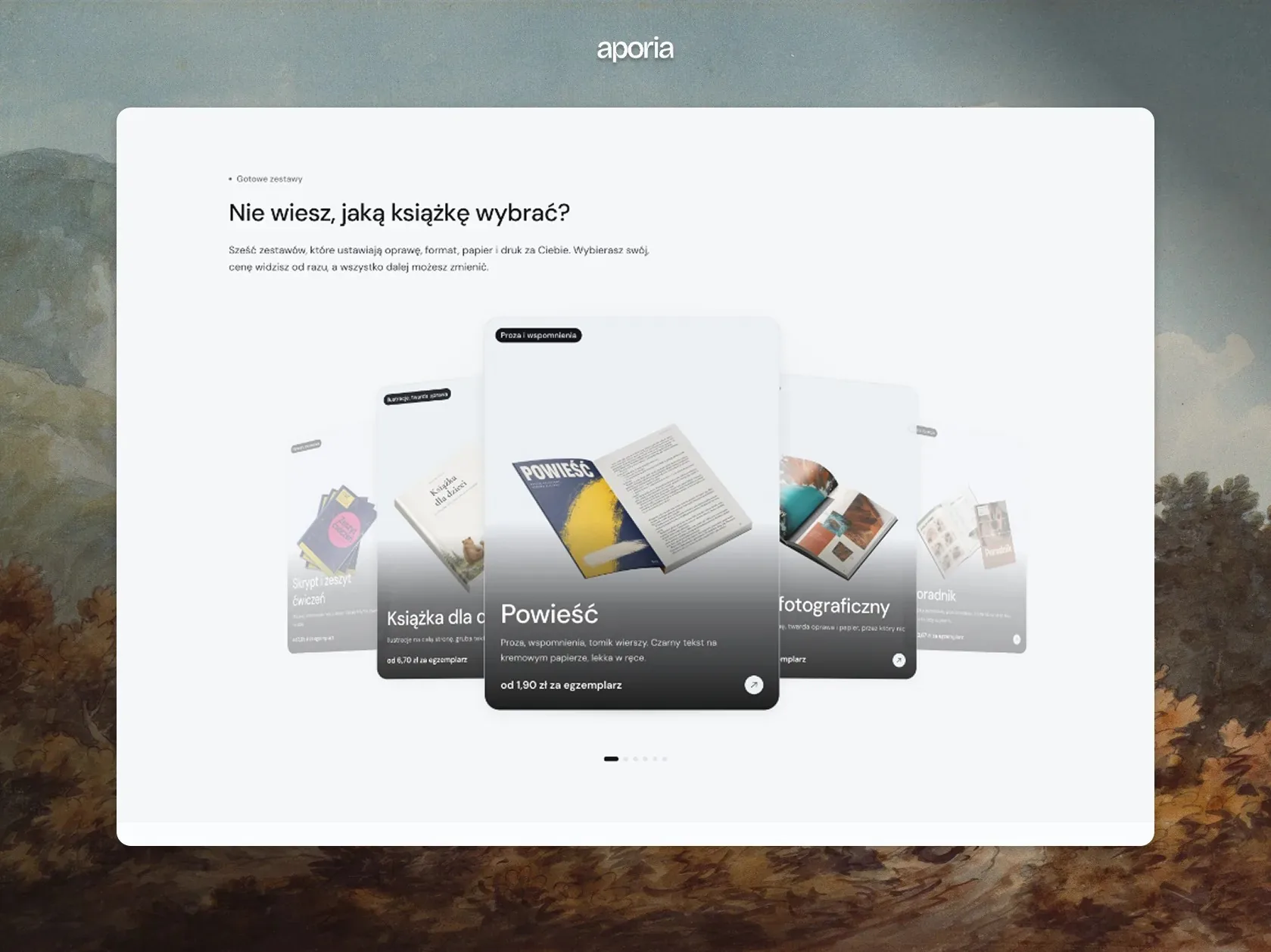
Fig. 17A second way in: start from the kind of book.
The shipping and print run panel with three shipping dates and a table of seven print runs
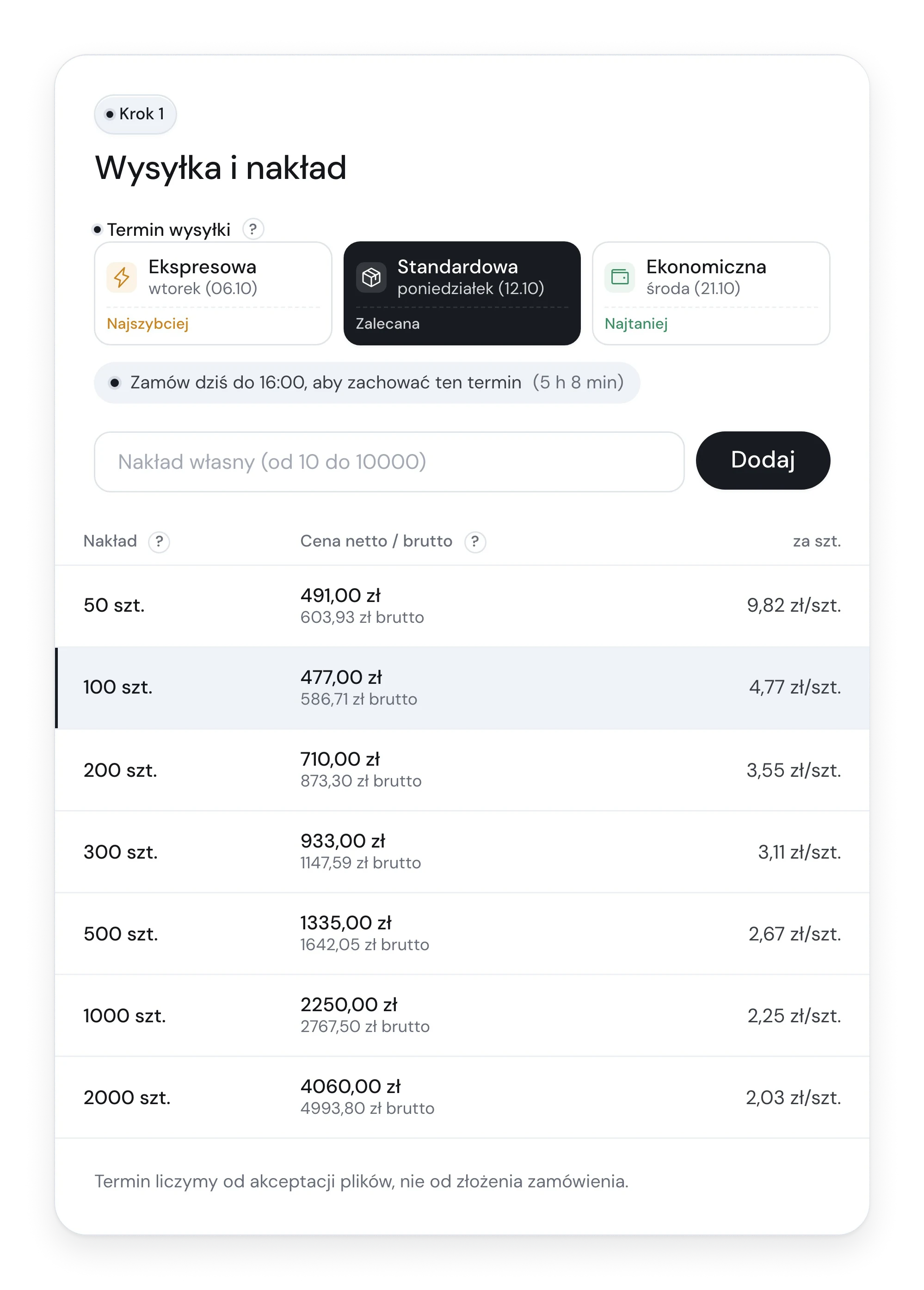
DetailPrint run tableSeven print runs with the net and gross price and the price per copy, so the customer sees how the unit price drops. Three shipping dates sit above it, with the fastest, the recommended and the cheapest marked.
A hint bubble explaining the format of a finished book with a drawing and a list of sizes
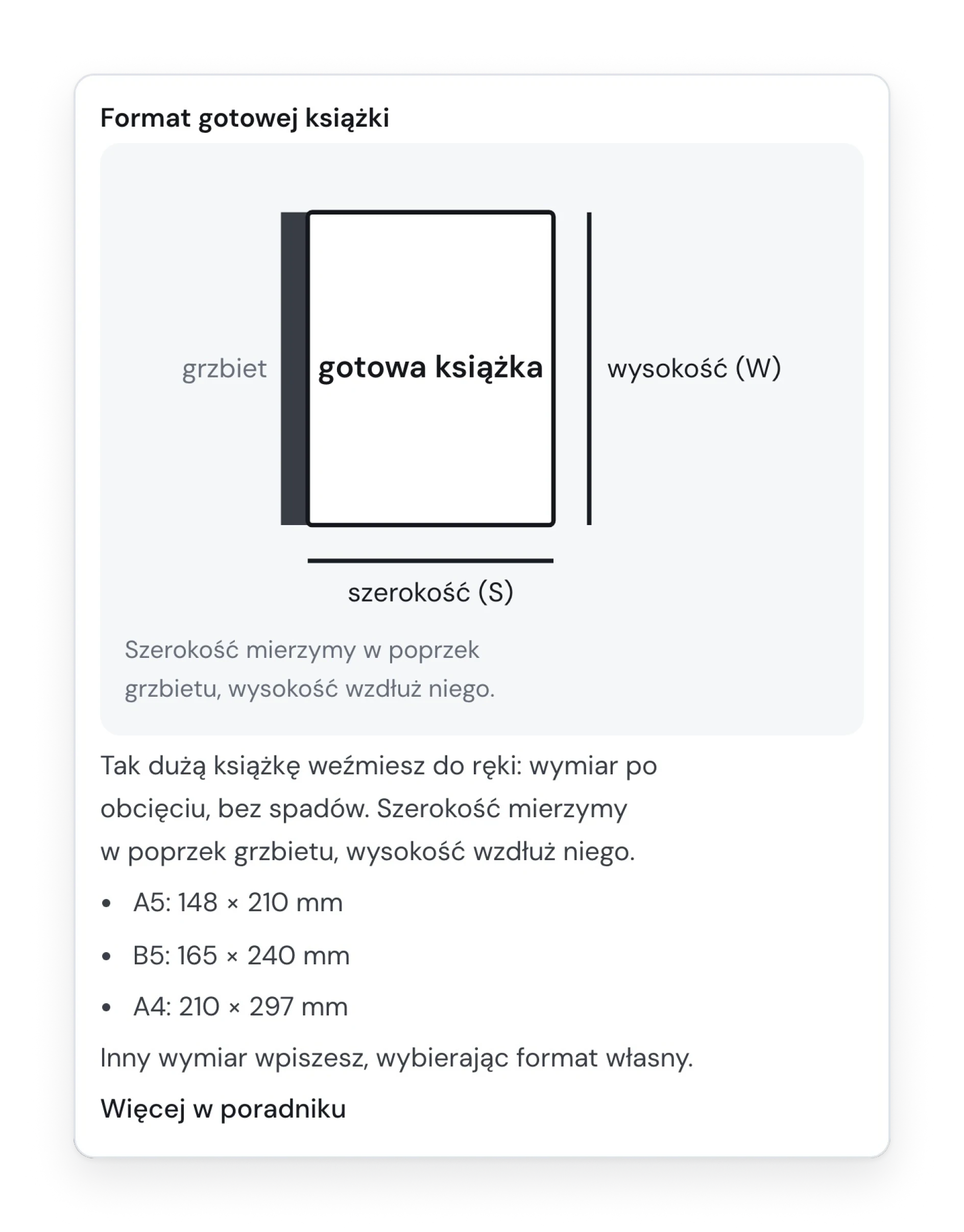
DetailHintA question mark next to a field opens a short explanation, a drawing and a link to the guide. On a phone it opens as a sheet from the bottom, because a bubble with a link does not hold under a finger.
A phone on a wooden table showing the store's home page
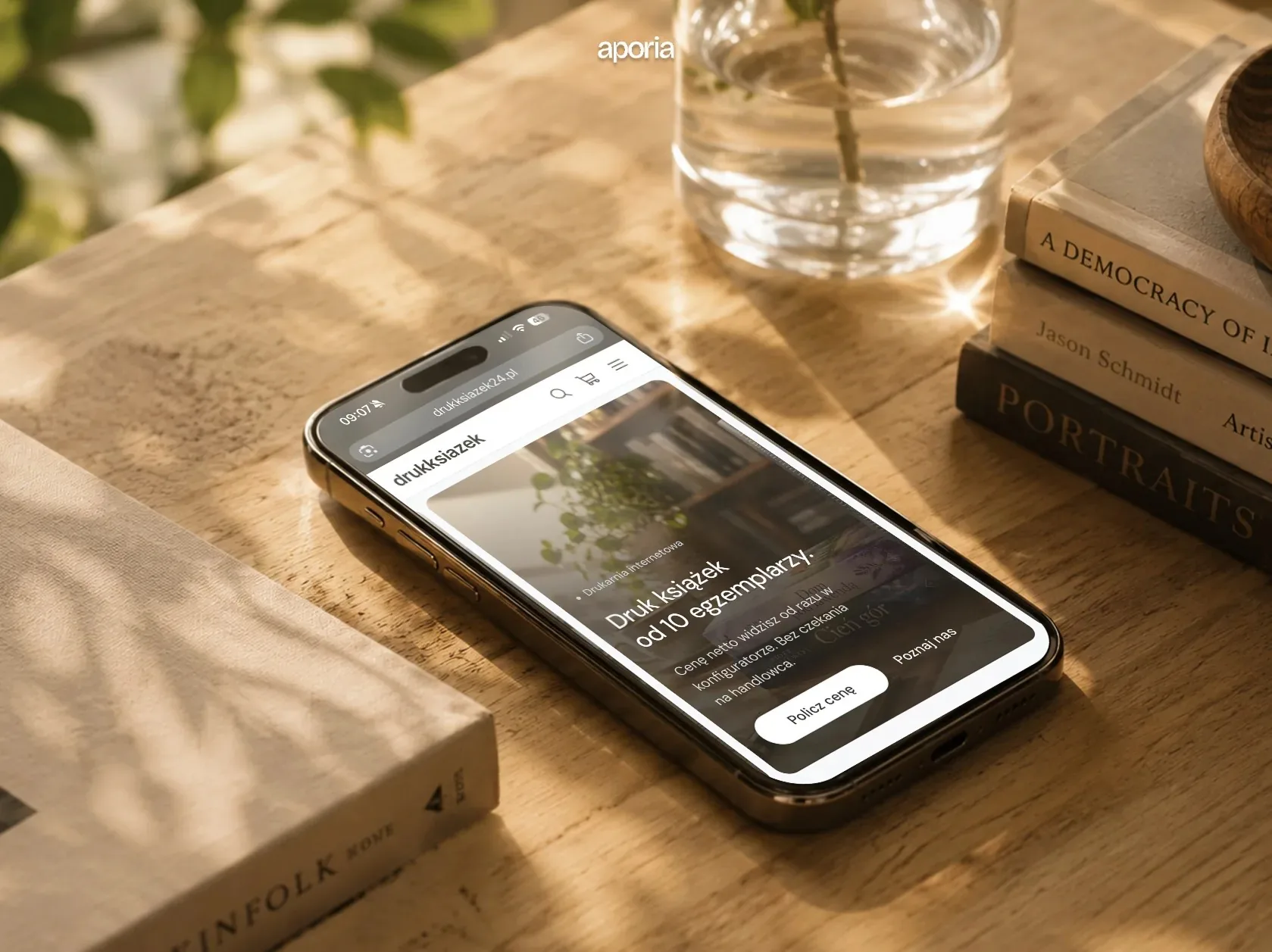
Fig. 18The store on a phone.
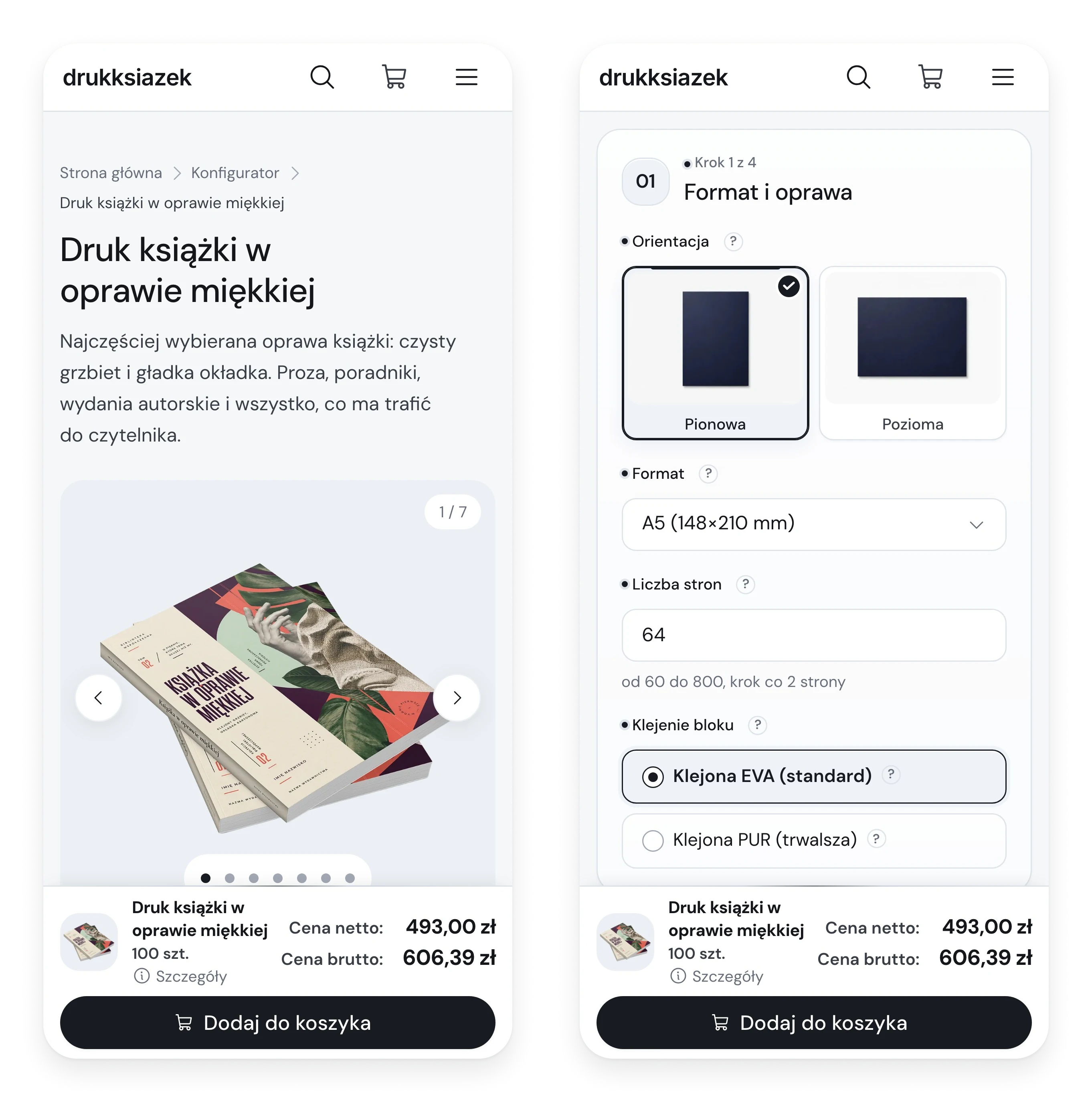
Two phone screens of the configurator, the product page and step one with the price bar
Fig. 19Configurator at 390 px: the price bar stays at the bottom.
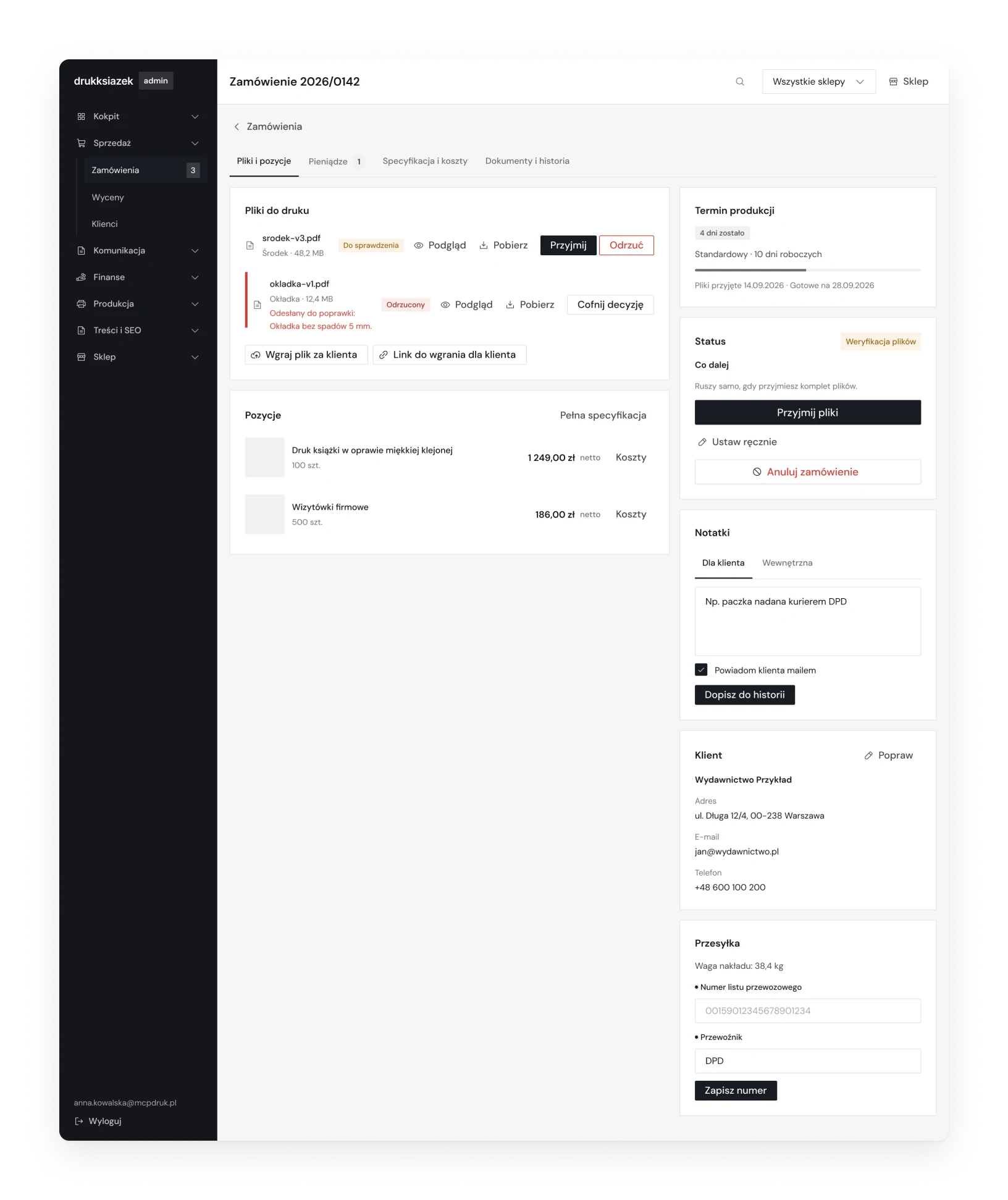
An order in the admin panel with files to check, the production deadline, the status and notes
Fig. 20An order: files to accept or send back, the deadline and the next step.
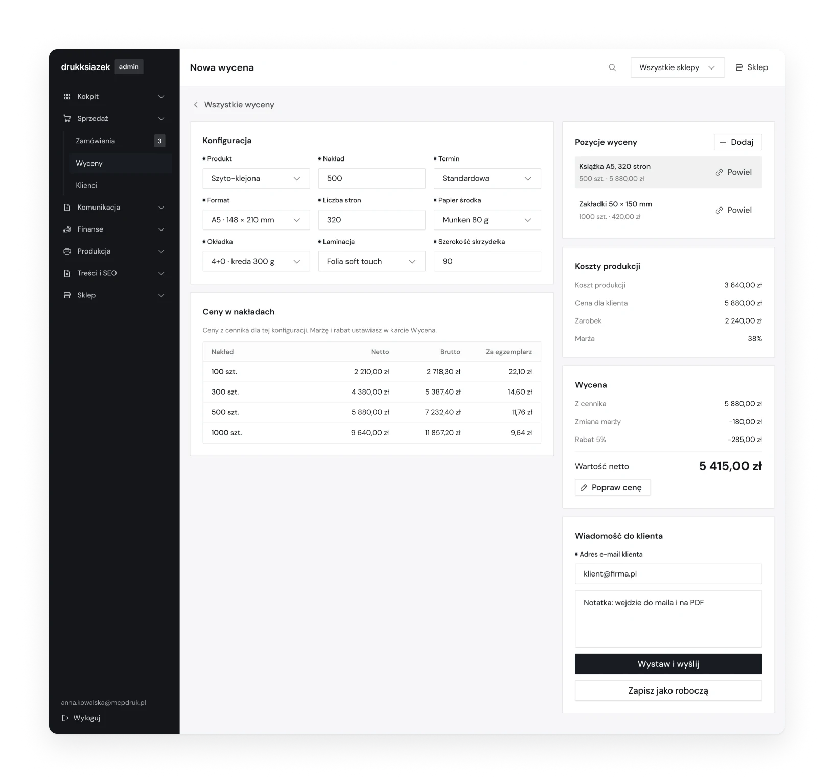
A new quote in the admin panel with the configuration, prices by print run, production cost and margin
Fig. 21A quote: production cost, margin and the price for the client.
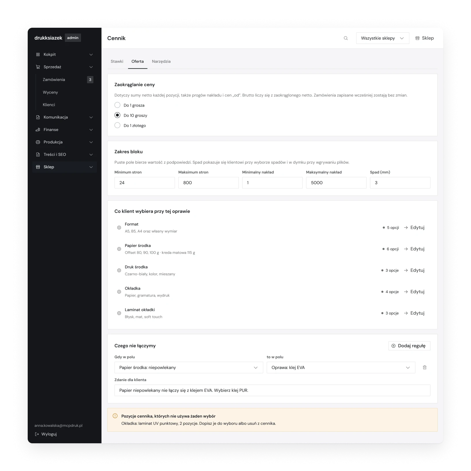
The price list in the admin panel with rounding, limits, what the customer can choose and what cannot be combined
Fig. 22The price list: what the customer can choose and what cannot be combined.

The whole file

  • 79screens
  • 159components
  • 12e-mails
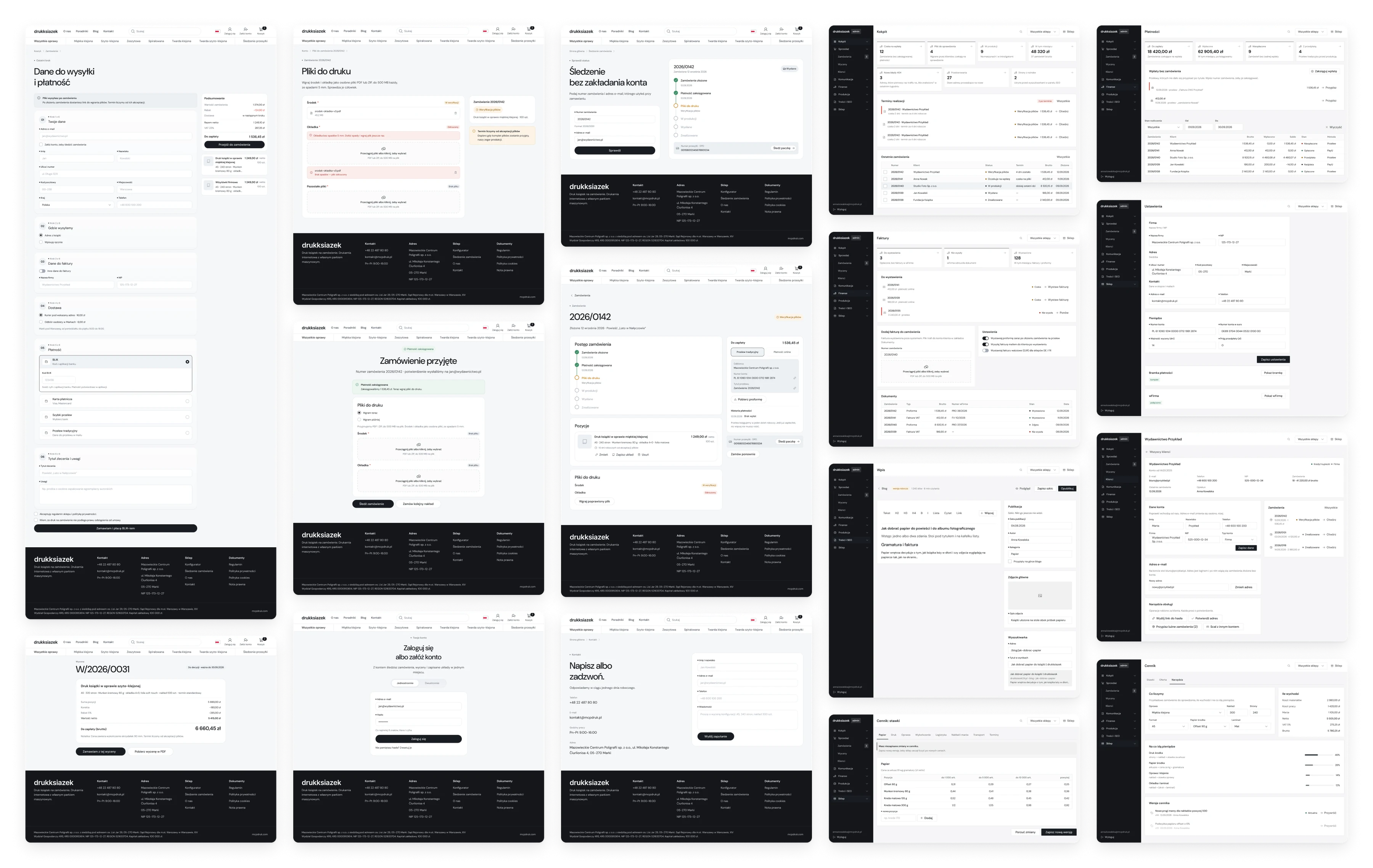
Sixteen desktop screens from the Figma file in five even columns, store screens on the left and admin panel screens on the right
Sixteen of the screens in Figma: the store on the left, the print house panel on the right.

(06)

System

Design system


243 variables in seven collections. Changing 21 of them turns the shop into the panel: the same components, a different tool.

Variable collections
CollectionVariablesModes
Primitives58One value
Color66Shop / Panel
Spacing37Desktop / Mobile
Radius9Shop / Panel
Size24Shop / Panel
Typography32Desktop / Mobile
Motion17One value
What changes between the modes
ShopPanel
Button radiusPill2 px
Card radius20 px2 px
Field radius12 px2 px
Field height44 px40 px
Button height42 px40 px
GreysSlate, a little blueNeutral

Typography

DM Sans
Regular / Medium / SemiBold

Components

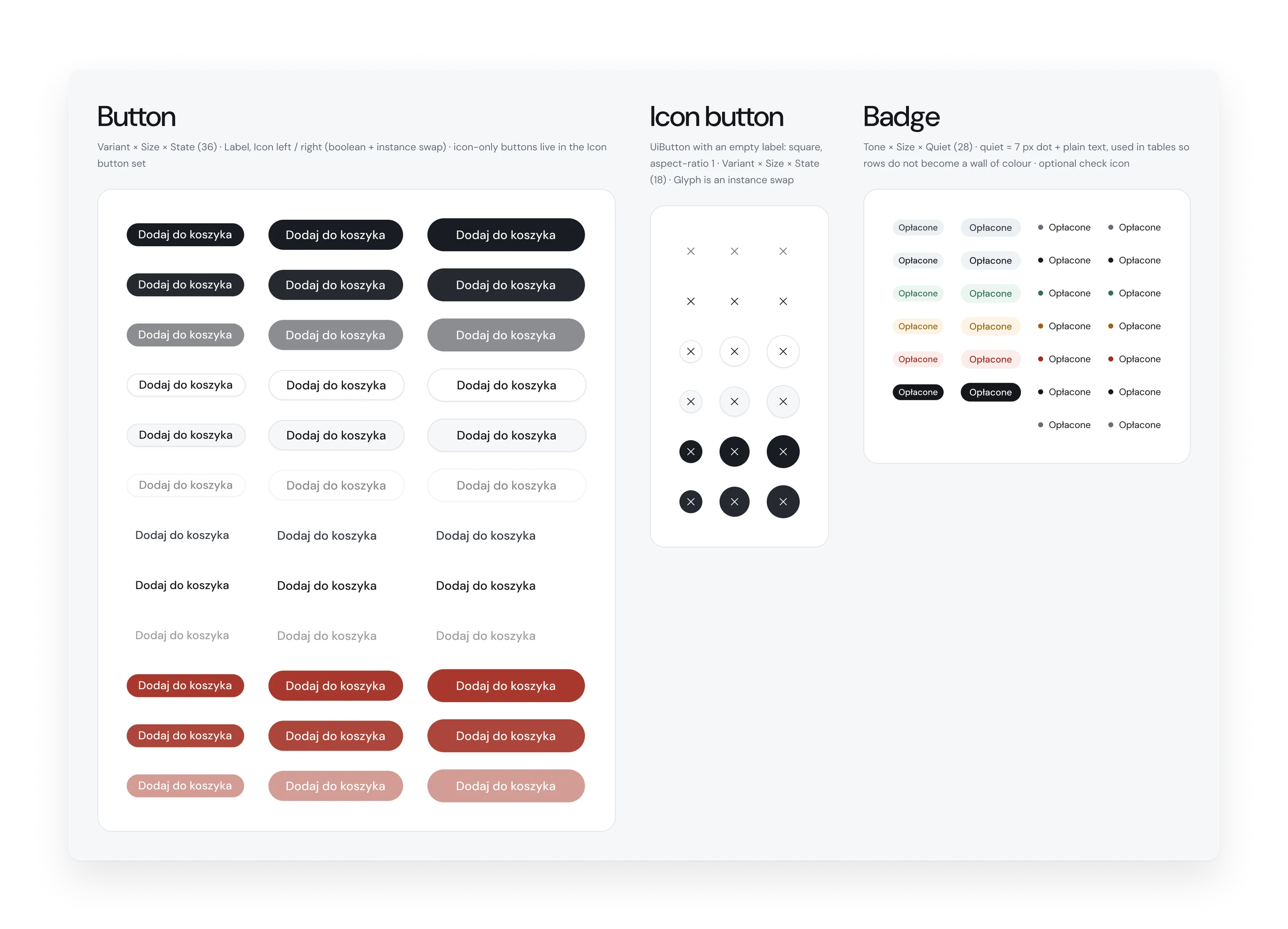
  • Buttons and badges
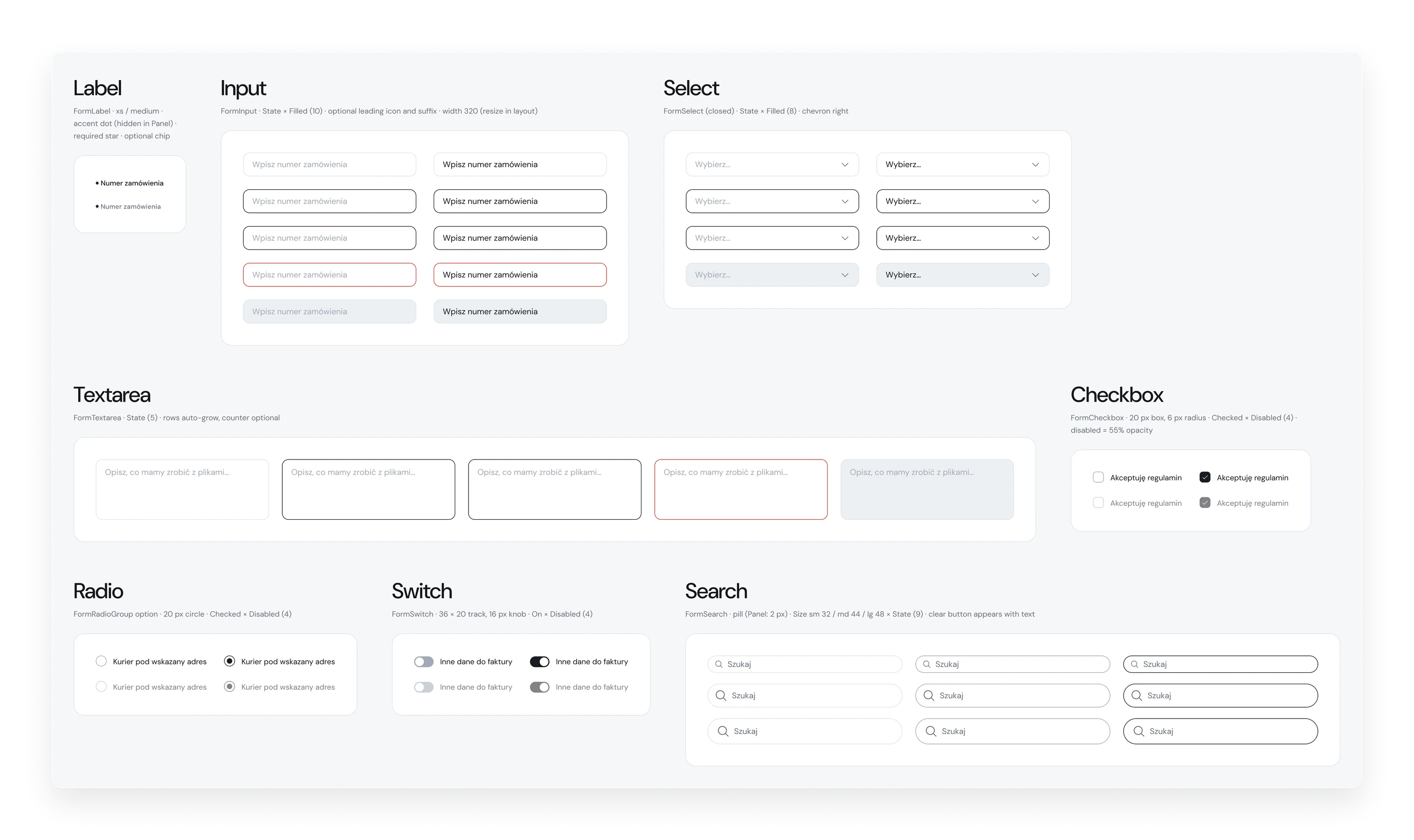
  • Forms
  • Navigation
  • Overlays and content
  • Shop: cart, orders, account

In the file

  • 159 components
  • 84 icons
  • 30 text styles
  • 16 effect styles
Component board with buttons, icon buttons and badges in all variants
Fig. 23Buttons and badges: variants, sizes and states.
Component board with form controls and their states
Fig. 24Form controls and their states.

(07)

Result

Outcome

One system that takes a book from a price to a parcel: store, configurator, checkout, file check, tracking and the panel behind it, in three languages.

Delivered

  • Store and configurator for six bindings and six book presets
  • Checkout, file upload, tracking without an account, customer account
  • Panel: orders, files, payments, quotes and a versioned price list
  • Content tools: blog editor, media library, SEO, city pages, editable hints
  • Design system in Figma: 243 variables, 30 text styles, two modes
  • Three live shops: Polish, German and French
Next project →02 / 03

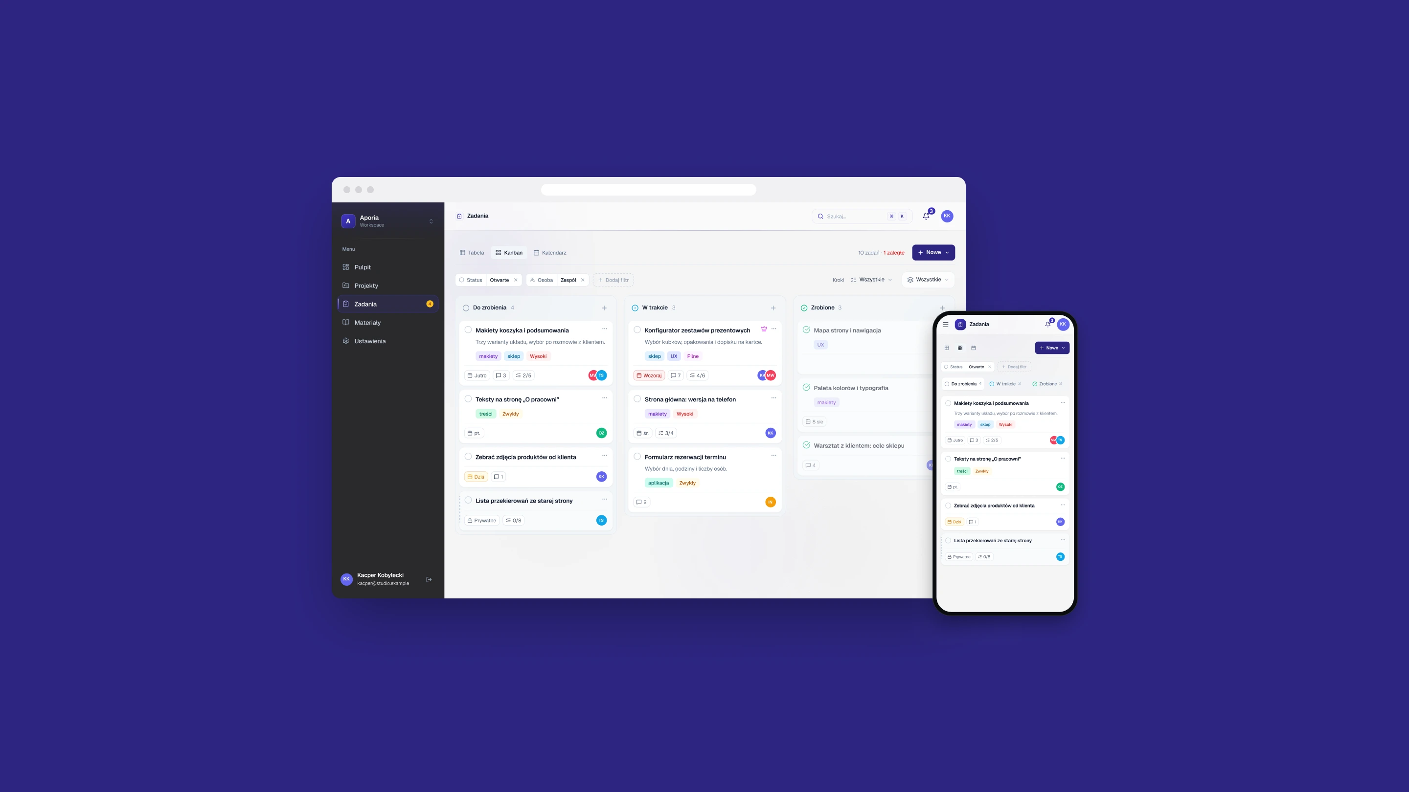
Aporia Pro

The Aporia Pro task board in a browser window and on a phone, on an indigo background