Biuro Podróży Orchowscy has been taking school and company groups around Poland and Europe since 1996. Its website had fallen behind the agency, so I redesigned it from the ground up, to the client's direction: a new layout and a calmer look for the catalogue, the tour page and the path to an enquiry.
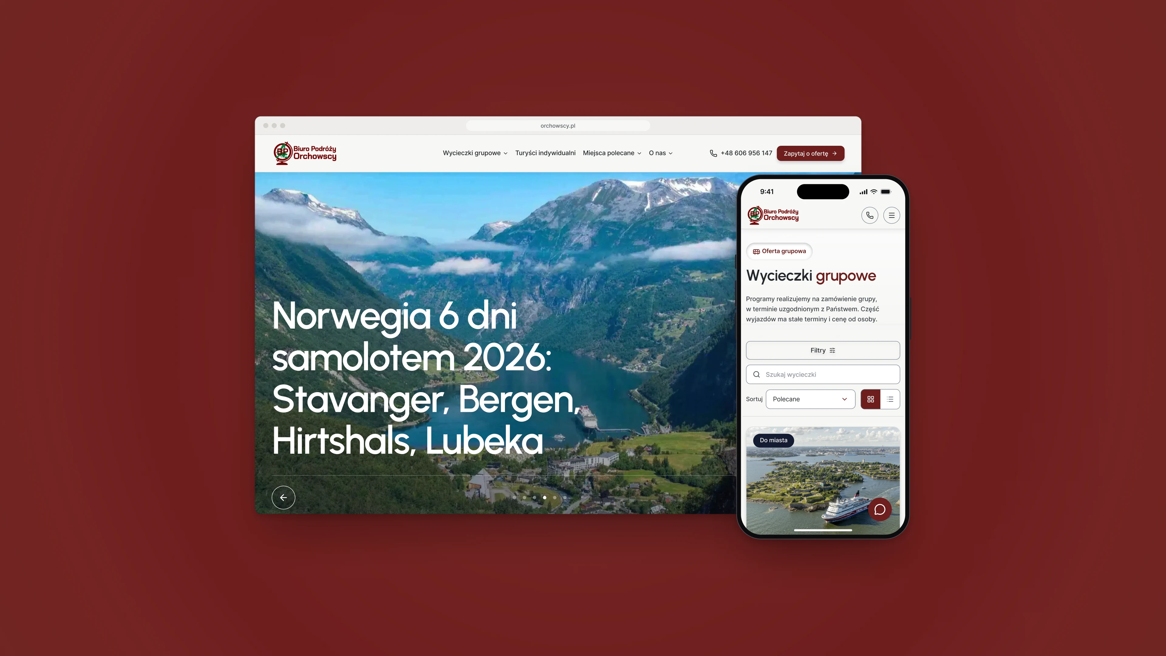
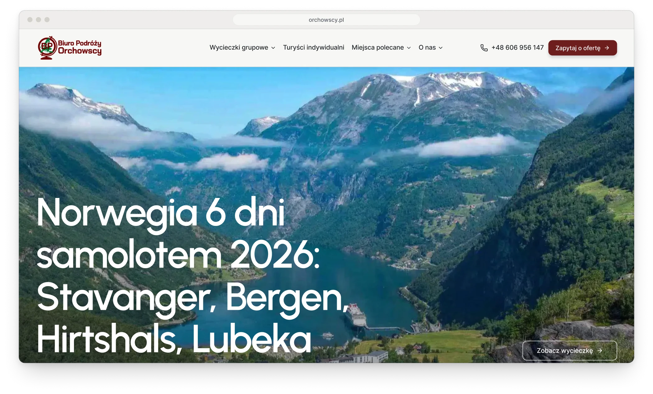
Fig. 01The home page, and the tour catalogue on a phone.
Notes
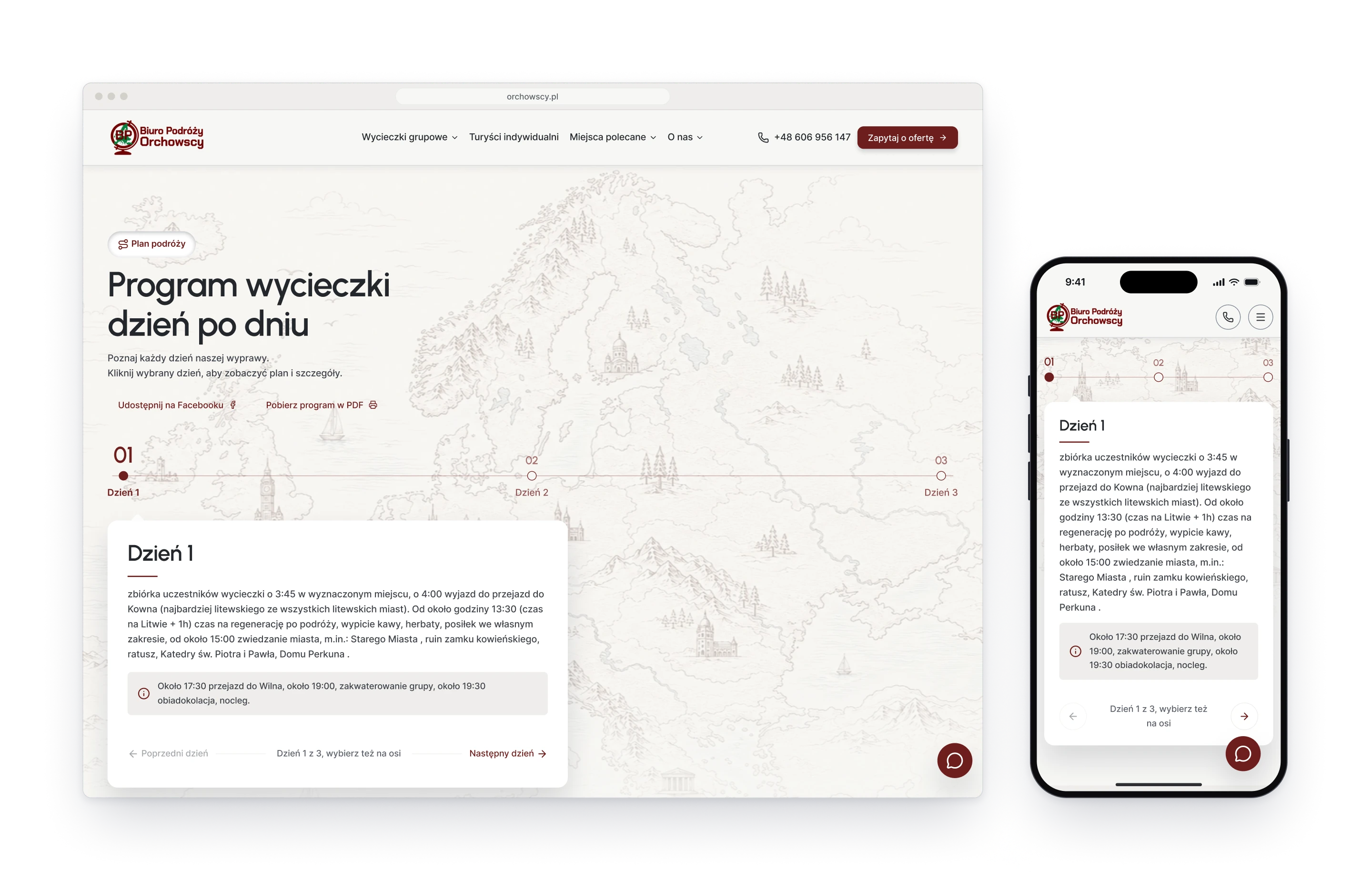
The redesign started from what the agency already had. Every one of its eighty-odd programmes, with its text and the client's own photographs, was carried over from the old WordPress site, so the new look had to fit content that already existed. The job was to design templates that make this material look its best: a tile, a tour page and a programme laid out day by day.
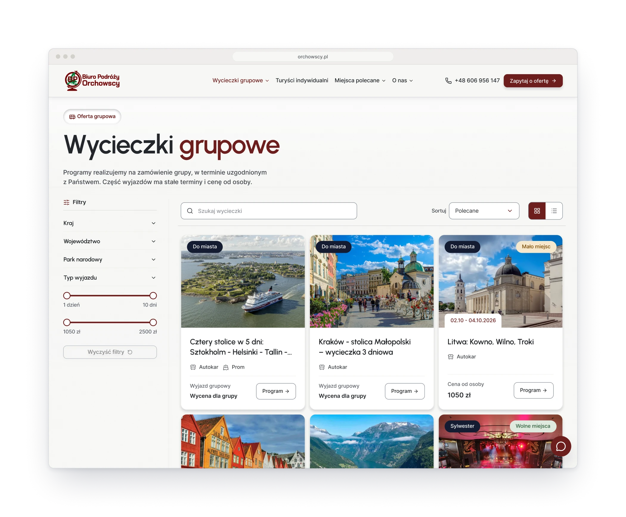
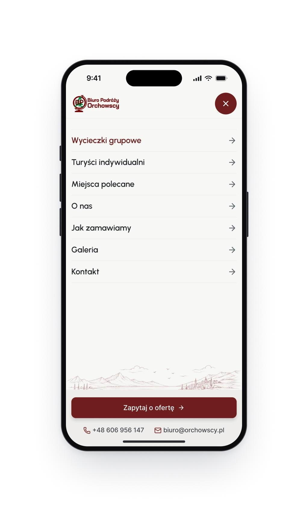
Fig. 02Left: the catalogue with its filters. Right: the menu on a phone.
Design decision
Same logo, calmer voice
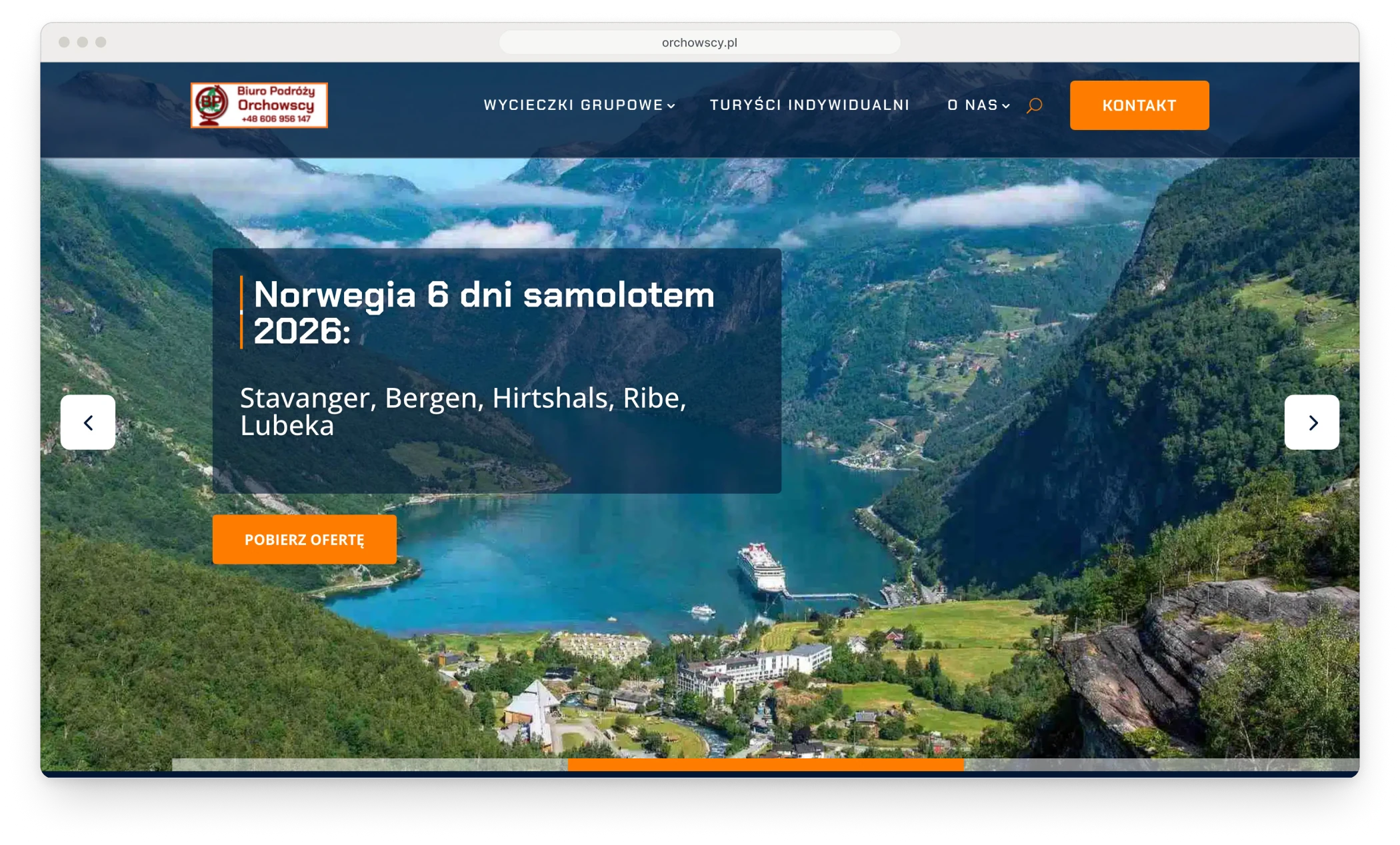
Schools have booked with Orchowscy since 1996, and they should still know the agency at a glance. So the logo stayed, and the red and the navy stayed with it. What changed is the tone around them: the old home page shouted in capitals, the new one speaks in sentences and lets the photograph do the selling.
Before: the old home page.
After: the same tour and the same photograph.
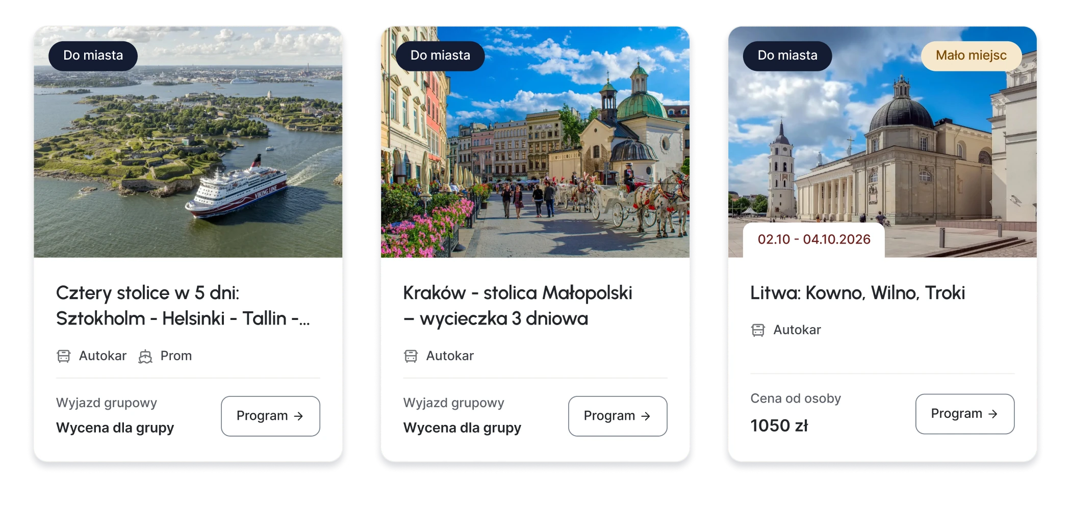
Design decisionOne tile for every tourMost programmes are quoted for a group; a few have a date and a price per person. One tile takes every case: the kind of trip and the availability sit on the photograph, the transport under the title, and the last line is either a price or a note that the trip is quoted for the group.
Fig. 03A tour's programme, one day at a time, on a laptop and on a phone.