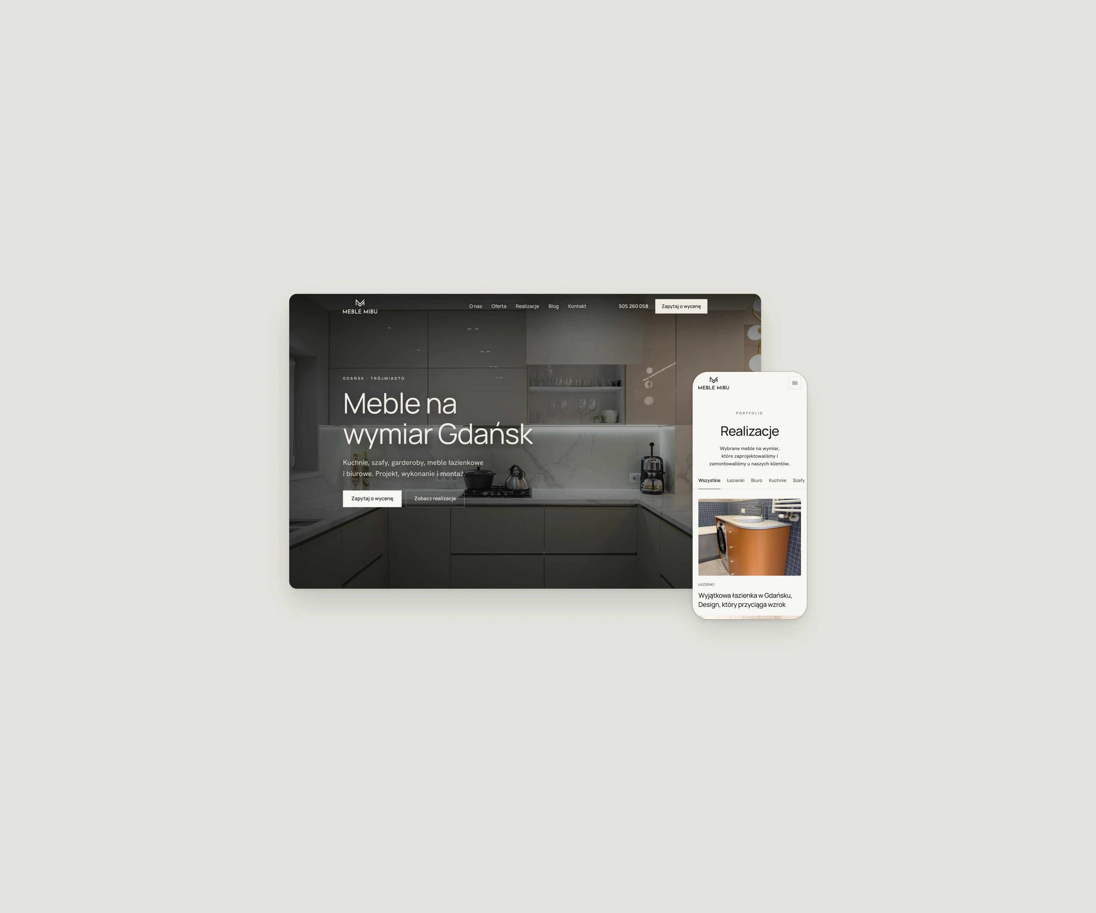
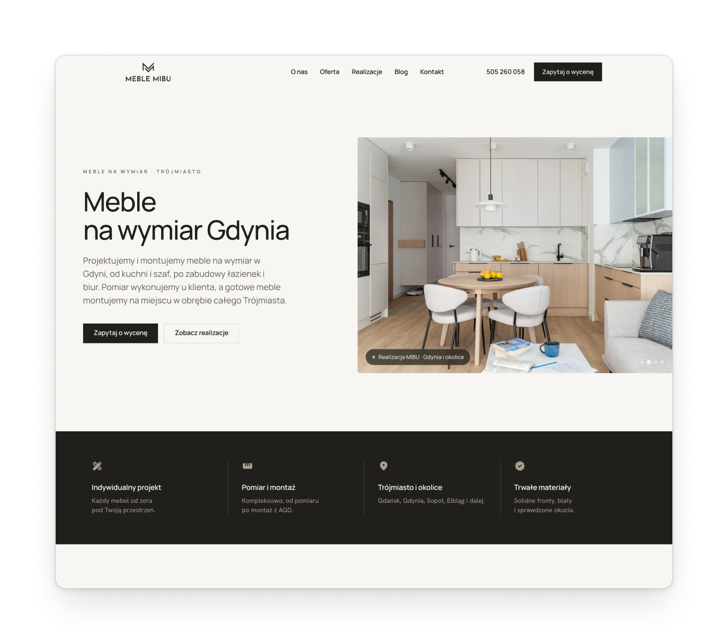
Meble MiBu builds made-to-measure furniture in Gdańsk, and builds it well. Its website ranked high in search but said little of that: a strong portfolio sat out of sight, and few visitors got in touch. I designed a new site that shows the work first and keeps the next step in reach.
Fig. 01The home page, and the projects page on a phone.
Notes
For a workshop like this the website is the showroom. I was responsible for the design: the layouts of twelve page types, the visual system behind them and the motion that holds it all together. The site was moving from WordPress to a custom build at the same time, so every page had to work as a template. Every existing word stayed, because it is what brings visitors in from search, and the work now carries them through it.
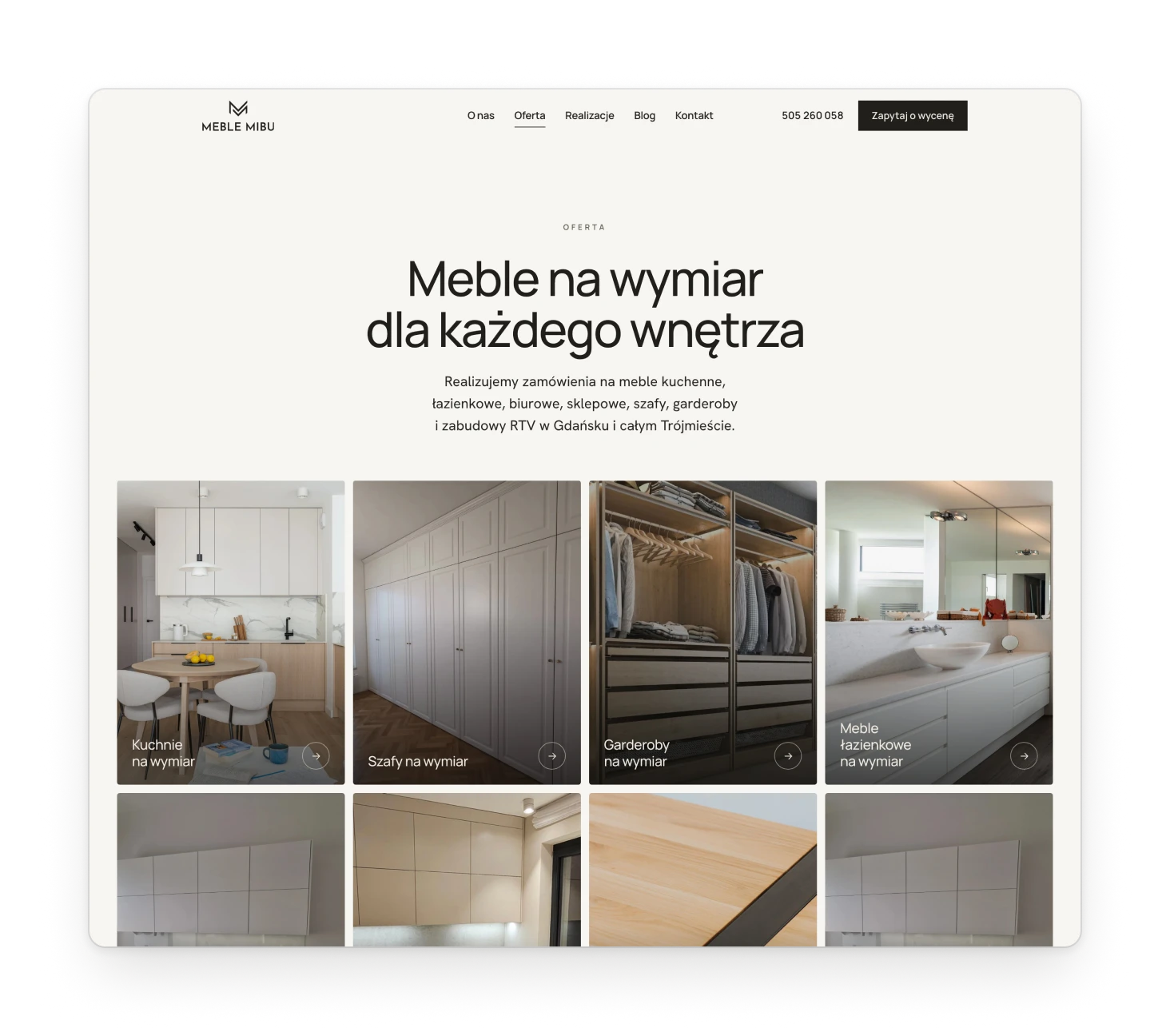
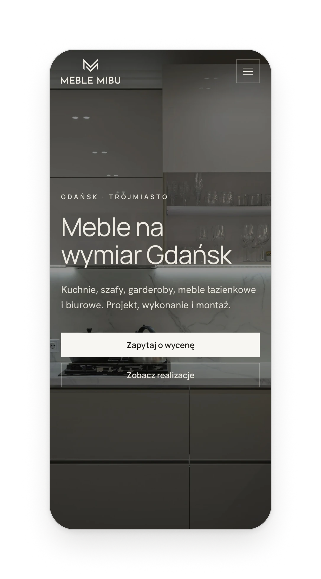
Fig. 02Left: the offer, where every category is a photograph. Right: the home page on a phone.
Design decision
Let the furniture do the talking
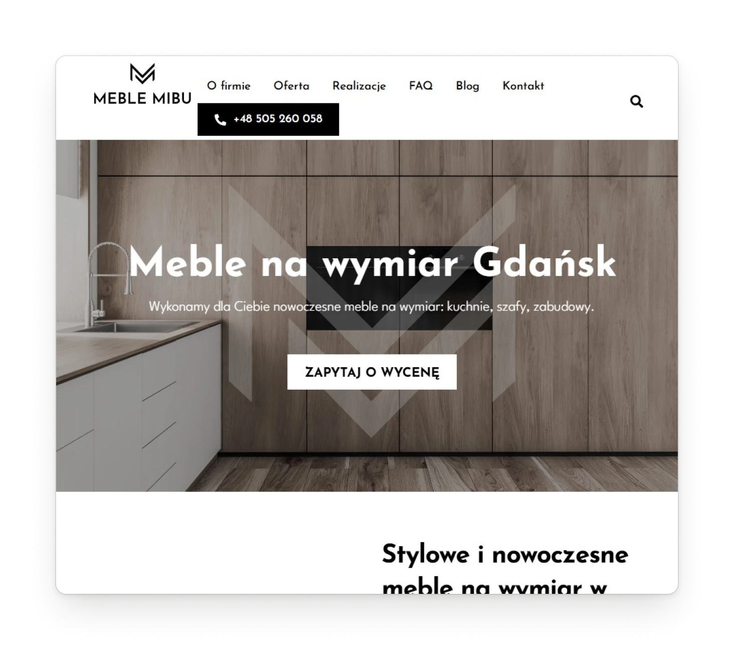
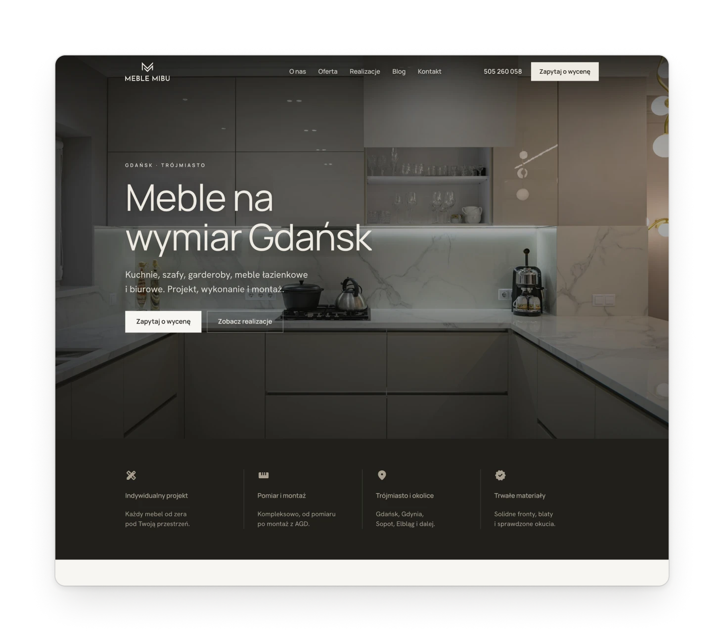
The old home page kept the portfolio, the workshop's best argument, below a headline and a long introduction. The new one opens with a single photograph across the whole window and keeps that promise all the way down. The long texts that earn the search position are still there, lower on the page, broken into sections.
Before: the old home page, archived at 914 px wide.
After: one photograph across the window.
Design decision
A gallery worth browsing
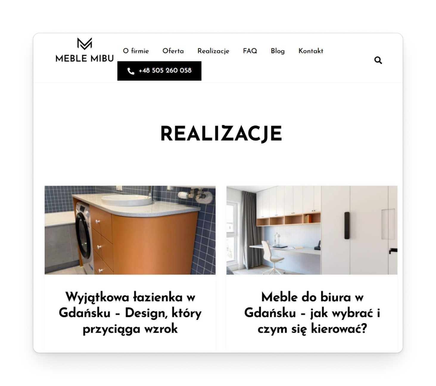
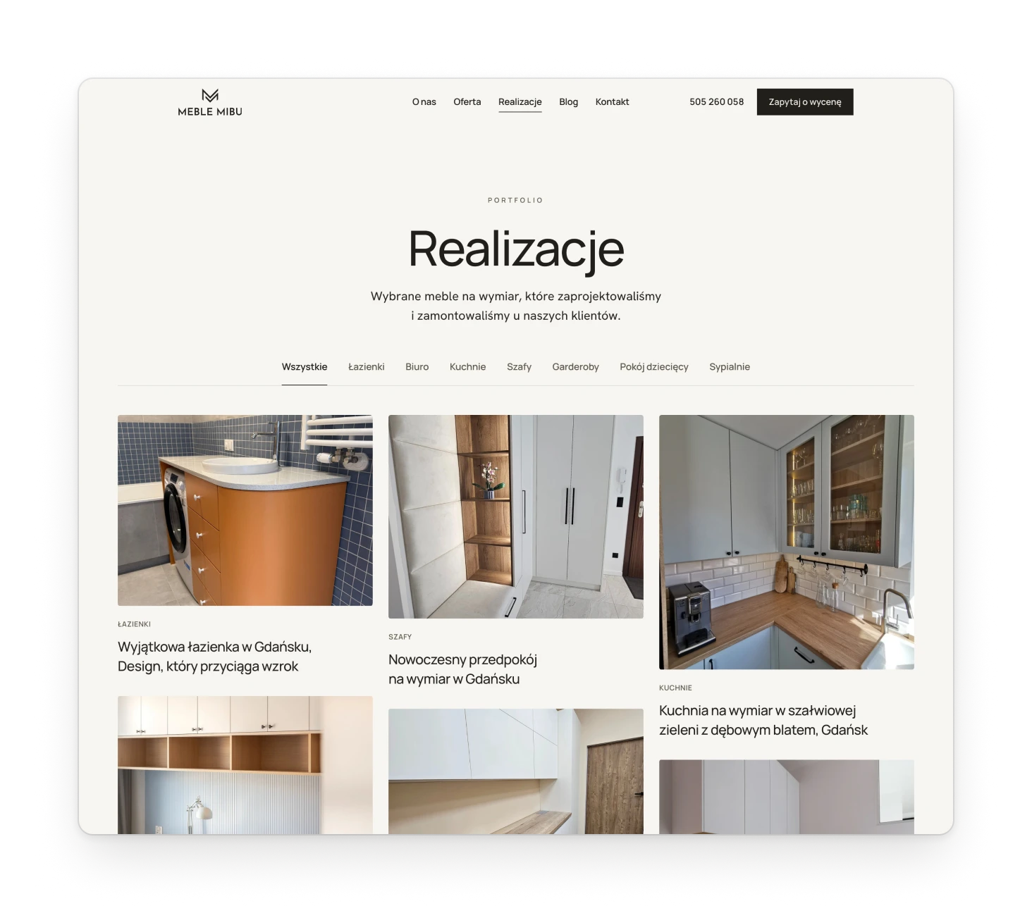
The project list was a plain feed in upload order, and more than half of its entries had a number for a name. Projects became a gallery of 50, filtered by kind of furniture, with cards in three heights that turn the page into a wall of photographs. Switching a filter fades the grid out and back in.
Before: two columns, in upload order.
After: filters by furniture and three columns of photographs.
Components
Two templates, not 23 copies
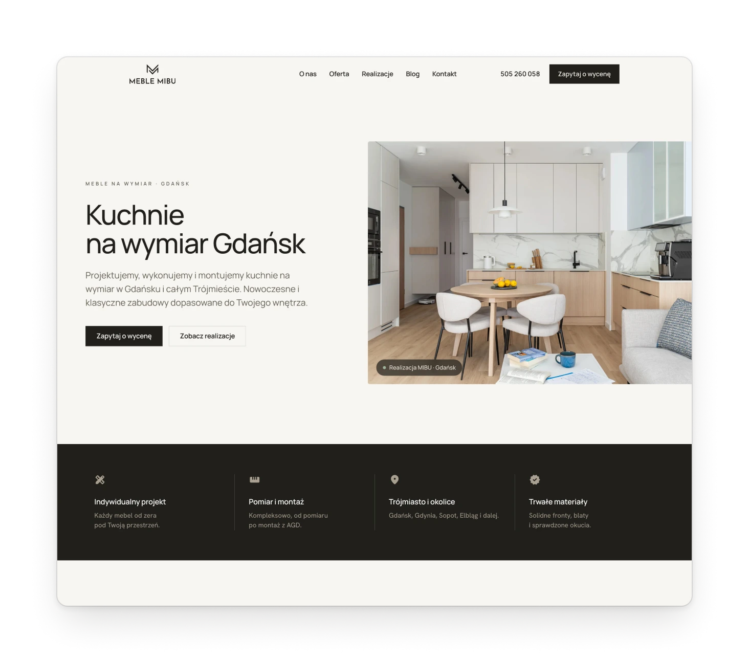
Every service and every city had its own hand-assembled page, so any improvement had to be made twenty-three times. Service and city pages are now two templates built from one set of sections: photos, the projects of that kind, the long text, the process, reviews and questions. Adding a city is now a matter of content, not design.
A service page: kitchens.
A city page: Gdynia. Same sections, different story.
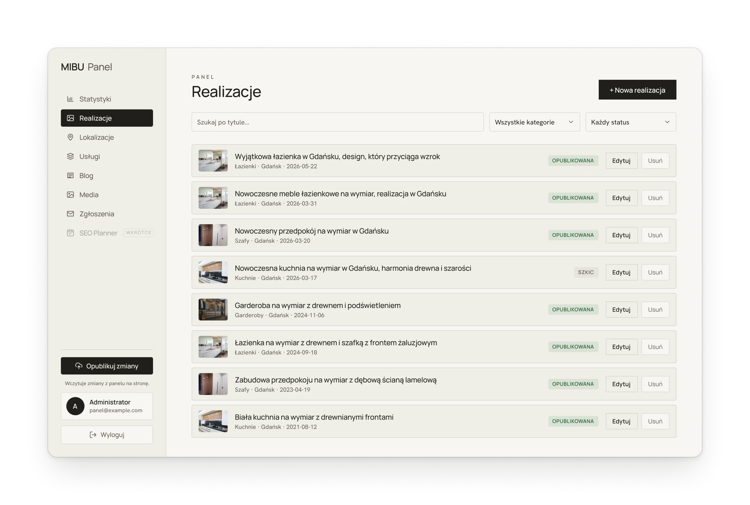
Fig. 03The site runs on a custom content panel in the same palette, where the client adds projects, services, cities and posts. The account shown here is invented.